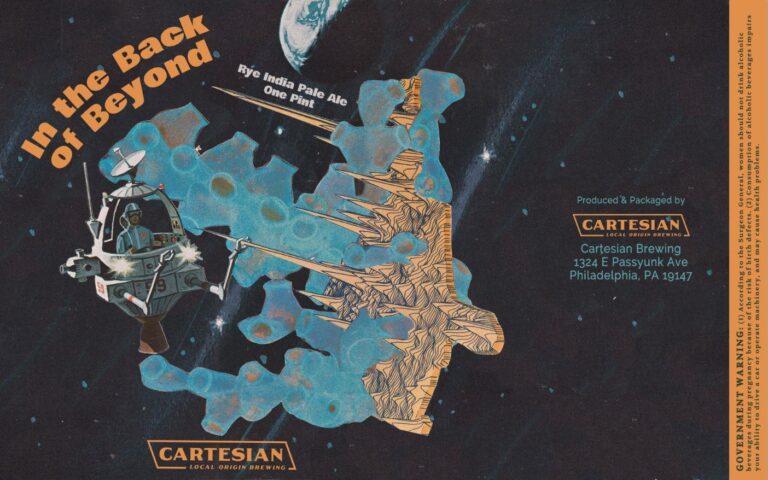
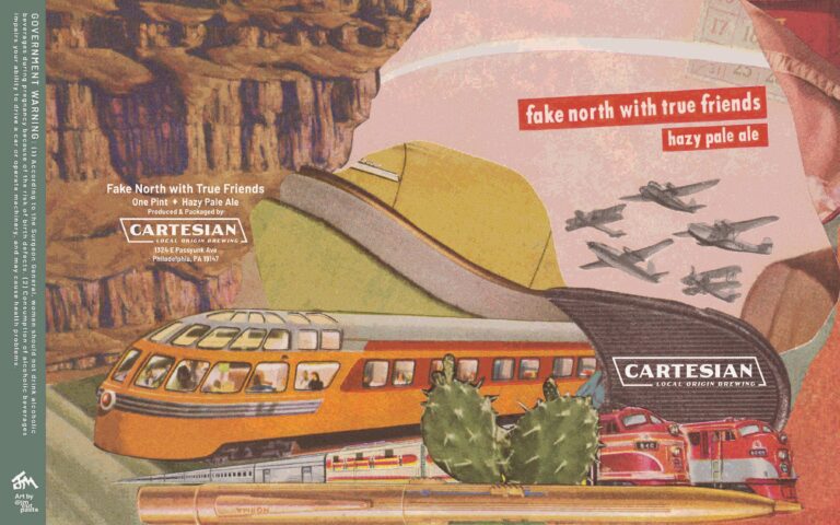
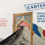
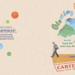
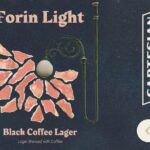
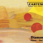
Jack McGavick creates analog collage beer labels for South Philadelphia’s Cartesian Local Origin Brewing.
Maybe you need a more elaborate introduction than that, but, if you do, you missed the part where I said “analog collage”. In a world where breweries are hitting Discord up for AI prompt porn and wetting themselves over the mileage they’re getting out of Canva, there’s a brewery out there paying a guy to cut (not Ctrl+X) and paste (not Ctrl+V) some really phenomenal art objects and typography for their beers.
Right now the world needs more breweries like Cartesian. The more artists like Jack we can be supporting and crediting for their hard work, the better off we’ll all be.
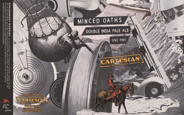
Thirsty Bastards: Our favorite label you’ve done is “Minced Oaths DIPA”? Can you tell me the story behind its conception?
What is your favorite label you’ve done so far for Cartesian Local Origin Brewing and why?
Jack McGavick: I’m gonna go ahead and answer these questions together, since Minced Oaths is my favorite too. When Evan [Roth] (longtime friend and owner of Cartesian) sent me the name, something about it brought me back to our teenage years when he and I were going to a lot of punk and hardcore shows in our angsty little suburb. It seemed like it could have been the name of a hardcore band.
All the bands in my hometown were selling black tees with stuttery jagged graphics in white. So that was my inspiration, and it was the first label that I wanted to make exclusively black and white, but then I had that cowboy hanging around from a previous failed collage attempt, and he seemed like the right pop of color / protagonist.
I also like that there’s a story in the label. Somebody’s watching somebody and something’s maybe about to go down? Or maybe the rider just saunters into another dimension before balloon man can swoop in? Hard to say.
TB: How did you get started making labels for Cartesian?
JM: I’ll blame the pandemic. I’d always messed around with collage, but the lack of Other Things To Do in 2020-21 meant I could invest a lot more time in it. That, and I spent more time scrolling social media (unfortunately) where I realized there was a whole analog collage community on Instagram. I figured I’d try my hand at that, not really with any aspirations. Just a way to share what I was doing with other artists out there.
Meanwhile, Evan was working toward opening the brewery, and he felt like the stuff I was posting could turn into a solid aesthetic for his beers. I’m grateful he stuck with me, as the first couple attempts were rough. It took me a while to grasp the medium of the can, how it’s different from a collage you’d hang on a wall.
I’m also very untrained in graphic design, typography, etc., so I’ve been trying to make progress there, slowly but surely.
Evan Roth: I was struck by [Jack’s] combination of the absurd with vintage. It evoked dated tabloid photos or even old Mad Magazine comics. Some pieces have an irreverence, some seem to have a message or theme, and others are just pictures glued together.
Jack is not an artist by training or trade which in some ways allows him to break rules and conventions with pure ignorance rather than knowing intent, but that means he isn’t boxed in. He is still exploring his style and medium through the label making process. It has been fun to see him grow and to encourage his wildest visions.
I do have to rein him in sometimes, or give him hard “no’s,” but I tend to let him create the piece he wants. He did quit once to spend time with his first daughter, and then I did fire him once so he could spend time with his second daughter.
Just to clarify, I “fired” Jack for his second “paternity leave,” but he came back after saying it was the most fulfilling project of his life.
TB: What’s the best part of working together on labels?
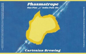
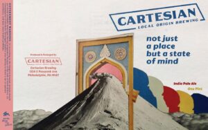
ER: That he lets me go into his back catalog of previous works to repurpose as labels. Sometimes we’re on a real quick time crunch, and we previously made a label that was just color splotches (Phasmatrope), but it lacked heart and soul (and the beer sales suffered). So I started to ask to use finished pieces as labels for quick turnaround, and he agreed (Not Just a Place but a State of Mind).
TB: Evan, what do you think analog collage beer labels says to the beer-drinking world about Cartesian’s brand?
ER: That as a company we are made of odds-and-ends, bits-and-pieces with jagged edges, and, to use a tired phrase, we are greater than the sum of our parts. The people who work with us, the people who visit us and our neighborhood, the local producers of our raw materials, all contribute to the identity of the business.
TB: Jack, where are you from and where did you learn to be an artist?
JM: I grew up in Doylestown, PA, the last stop on the commuter train headed north out of Philly. I was lucky to find myself in the weird/creative clique in middle and high school, so I’d say my friends were my art teachers. My attempts at drawing and painting have always been horrific, though, so I started making collages instead, mostly just as postcards to mail to friends. I haven’t had any formal “art education,” so to speak.
TB: Can you tell us a bit about your process? Do you ever venture into digital?
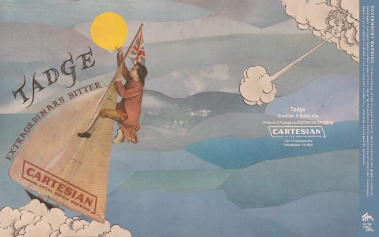
ER: In terms of process, we start with the beer name. Sometimes [Jack] cares, other times he doesn’t. I prefer the latter most times. He’ll often ask me for a color, motif, or theme I’m thinking of. I am often far too coy and cryptic. His frustration is sometimes palpable. But I don’t want the name or style of the beer to guide the art. I want a solid piece with character and spirit to support the beer. Usually there are a few iterations back and forth about background colors or text. Sometimes he abandons ideas and goes “off the rails” as he calls it. See our most recent label Tadge.
JM: The beer labels begin when Evan sends me a name and a beer style. I very much appreciate his unorthodox naming tendencies, which always generate some mental images off the bat. If I need a little more direction, I’ll sometimes ask if he’s got a dominant color in mind. Then I pull out stacks of old National Geographics from a cache I’ve built over the past 10-ish years.
The best material for my aesthetic tends to come from the 1940s-60s, and typically from the advertisements at the beginning of each issue. Even across issues, there’s sort of this consistent color palette with a lo-fi, washed-out quality that newer, glossier paper products just don’t have.
Side note
…for anyone wanting to make images this way, I’d recommend getting some PVA (polyvinyl acetate) and a paintbrush for a very strong bond that won’t cause any unpleasant bubbling or texturing of the paper.

- Neutral pH Adhesive is a high quality art and bookbinding glue
Prices pulled from the Amazon Product Advertising API on:
Product prices and availability are accurate as of the date/time indicated and are subject to change. Any price and availability information displayed on [relevant Amazon Site(s), as applicable] at the time of purchase will apply to the purchase of this product.
With a color scheme in mind, I start cutting stuff out until something cohesive takes shape. Because of the beer can medium, I tend to think in thirds, or almost like a triptych. I want the can to be interesting all the way around, but you’re only going to clearly see about a third of the design at any given time, so I pick one vertical section to focus more on – to pack in more of the visual interest – and that’s the section where you’ll see the Cartesian logo, the beer name, etc.
While the image is analog, the final label has a bunch of components that I create digitally. The main thing is the text for the beer name and style. Around the time of Minced Oaths, I decided I was fed up with searching for fonts that would inevitably break the cohesion of what I’m trying to pull off, just by virtue of being digitally generated and not made of paper.
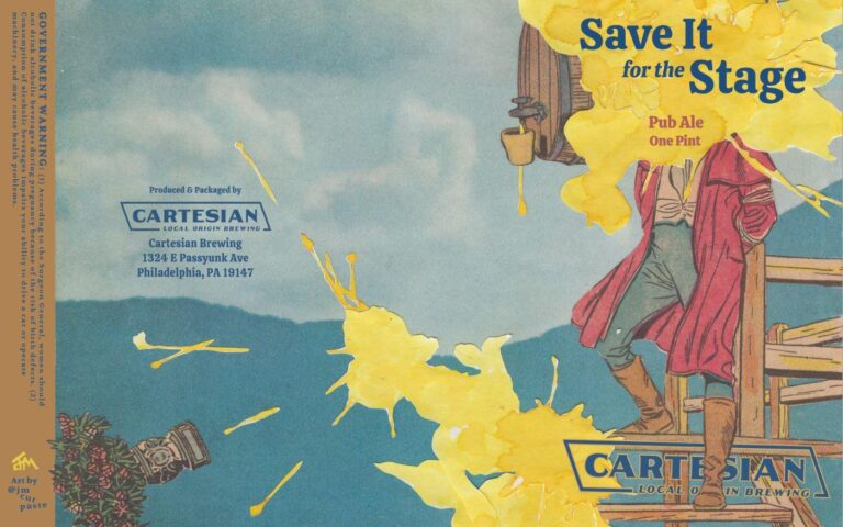
Now I flip through my magazines until I find a chunk of text with an interesting font and at least a majority of the letters I’ll need. I scan that in and do a lot of digital manipulation to reorder, duplicate, and sometimes invent additional letters by frankensteining what’s there. And then, of course, I have to strategically place the legally-required text elements, plus the badass Cartesian logo, which I like to digitally “weave into” the collage elements when I can (emerging from the tunnel in Minced Oaths or nestled behind an ankle in Save It for the Stage, for instance).
TB: Do you make any sketches or roughs?
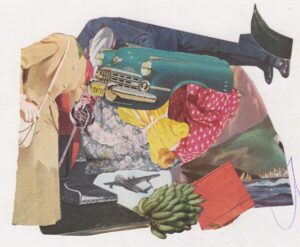
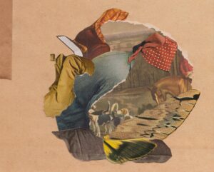
JM: Not sure if these fit the definition of sketches or roughs, but I generally try to make something out of the scraps left behind from a label.
TB: What other art do you make?
JM: This is just about it. Other than some homemade stamps, which I highly recommend trying out. Very satisfying way to make even boring designs/words/etc. look elegant.
TB: How can your fans find you and your work? Can they buy your art?
JM: My instagram is pretty much it. Just a warning that with two kids under three, my cadence of creation and posting is glacial compared to people who really “do” social media. I have dreams of one day opening an online shop for prints, so stay tuned. I’ve created a few commissions, as well. Always open to it via direct message.
TB: Optional Bonus Question – How has the technology of AI image generation influenced your process?
JM: Ooph, not even going to wade into this one. 😆 I’m terrified of it but not for any super coherent reasons yet because I haven’t thought enough about it. I’ll be interested to read what others say on this one.
