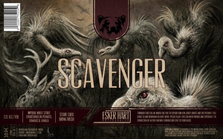
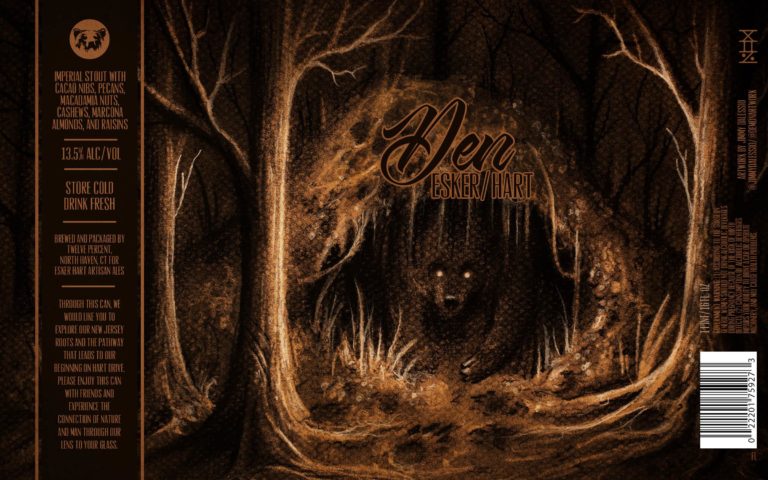
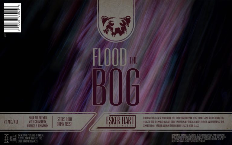
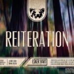
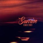
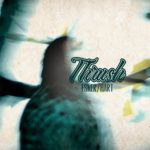
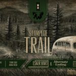
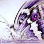
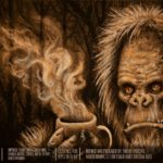
The vultures featured on Esker Hart’s “Scavenger” Stout label are the perfect spirit animal to represent the brewery: air and motion, the cycle of death and rebirth, both light and dark, ugly but necessary. Alternating between the “intimidating” imagery of Jimmy Dalessio and the serene abstract photography of owner Bobby D’Angelo, one would think these styles would clash. In fact, both represent two inseparable aspects of the potent force of nature – beauty and decay – “ominous in the best ways”.
Let’s delve deeper into the world of Esker Hart Artisan Ales.
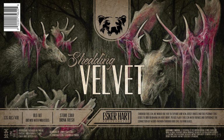
Thirsty Bastards: My favorite label you’ve done is for “Shedding Velvet” Old Ale. Can you tell me the story behind its conception?
Jimmy Dalessio: Thank you! That was the latest beer label that I designed for Bobby [D’Angelo] at Esker Hart. He came to me with this idea and I loved it from the beginning. Moose lose their antlers once a year, and when the new antlers are growing in, there’s a protective skin that grows on the outside. The moose then brutally scrapes its new antlers on trees and rocks to remove that skin and reveal the new antlers underneath. The carnage of bloody antlers and hanging flesh is the shedding process is what inspired the artwork design for “Shedding Velvet”
Bobby D’Angelo: So far for every label Jimmy creates I put a collage together on Photoshop for him with cropped google images to show roughly what I’m looking for. I put the layout of the label together (foreground, midground, background) and tell him which points I’d like him to highlight. I then tell him to put his “Jimmy” twist on it and let him have creative freedom as long as the imagery is mostly what I’ve laid out. Depending on the beer I’ll ask him to give the art a certain feel. For example I haven’t wanted any of my labels to be “scary” yet I do like them slightly intimidating and I feel Jimmy has done an amazing job with the overall “feel” of the imagery!
TB: What is your favorite label you’ve done so far for Esker Hart Artisan Ales and why?
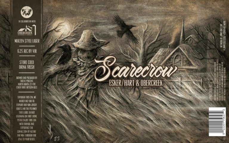
JD: My favorite label I’ve done so far is probably “Scarecrow”. I love all the artwork I’ve done for Esker Hart, but this one really captures an unsettling feeling when looking at it. I am really attracted to dark artwork that leaves some to the imagination. I wanted to give the viewer a story but also have them asking questions. Almost as if they could feel the wind as they wandered through this field at night and came across this scarecrow.
BD: That is a super hard question for me to answer! I love all the pieces he has created for me! Currently my favorite label Jimmy has made for me is probably Scavenger. It’s dark, uncomfortable, and ominous in the best ways. Part of me wants to push the entire feel of the brewery in that direction but I’m just not sure if I’m going to do that or not!
TB: How did you get started making labels for Esker Hart?
JD: Bobby and I went to high school together! He randomly reached out to see if I would be interested in designing some labels for him, which I am forever honored that he wanted my artwork to live on those cans. He creates all of the other labels on his cans through photography and graphic design, which come out super rad!
TB: Bobby, how do you decide which labels will feature your photography and which will have Jimmy’s original art?
BD: If we were able to make it possible I’d love Jimmy to do all of my labels! But sometimes I just need to whip something up quickly and sometimes I have no idea what Jimmy could draw for certain labels such as a beer I have named Brae Bier. All of the labels I created are abstracted images of what the beer name actually is. For example Brae Bier is an abstracted photograph of a hillside. I think my labels create a nice counter/contrast to Jimmy’s mostly black and white monochromatic pieces while mine are mostly colorful and vibrant (to a certain extent). That being said, I focus Jimmy’s work on more high gravity beers like imperial stouts, barleywines, old ales, barrel aged beers, etc. as well as collaborations. Those beers are usually more special to me which is why I’d rather have them presented as such with Jimmy’s artwork.
Thirsty Bastards: Tell me about your photography. Is it a hobby? Do you have a long background in photography?
Bobby D’Angelo: Photography started as a hobby in high school and quickly became a passion of mine early on. I ended up getting a bachelors in fine arts from Rutgers Mason Gross with a focus in photography and graphic design. My beer labels are actually a continuation of my thesis from undergrad.
The subject of the images is the disconnect of man to nature because of the impact technology has had on society. Basically you can see the entire world on a screen from your couch and for lack of a better term “experience” all types of the natural world without ever going, leaving humans more disconnected from nature than ever before.
Every image is a long exposure of a television screen playing a video of whatever the subject matter is. I thought it would be fun to continue this project and actually put it to use for the world to see in a format nobody would expect!
TB: Do you make other types of art? Can people buy prints of your photography?
BD: I used to make much more art with different media, especially in undergrad. Now I primarily just create for my beer labels as making beer has pretty much taken the forefront of my creative life for the past decade! Unfortunately prints aren’t available but if I see there is enough interest, one day when I own a brick and mortar I would love to sell prints of my work and Jimmy’s.
TB: Jimmy, where are you from and where did you learn to be an artist?
JD: I grew up in Raritan, New Jersey, and I have been creating art for as long as I can remember. I was always into the art classes they offered in school and all my electives in high school were extra art classes. I really started pushing my realism when I started taking classes from Marcel Franquelin, which I took for about 7 years. I owe most of my artistic knowledge to him. I am always taking other workshops and classes and looking for the next step to further my artistic career.
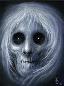
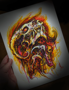
JD: All of these labels were created with charcoal, pastel and chalk on toned paper. Some of the earlier cans you can actually see the texture of the paper that I used before we switched to a smooth surface. I do a little bit of digital work, but it would just be trying to replicate what I can do with traditional mediums, so I definitely prefer hands on. Plus, I can just hand them over to Bobby and he takes care of all the photography and fancy label jazz, then he can hang the original up on his wall!
TB: What other art do you make?
TB: How can your fans find you and your work? Can they buy your art?
JD: My Instagram has most of my current work, which is @jimmydalessio and my artwork page with my brother is @demonartwork that is more for my traditional artwork. I have most of my artwork for sale on www.demonartwork.com as well as in person if you catch me at a convention.
Optional Question: How has AI image generation affected your process?
JD: This is a great question and a huge controversy in the art world right now. I believe AI can be a great tool if you use it for inspiration and references. However, it can easily be abused if used for the wrong intent. I will usually prompt some AI images to see if it may spark some ideas, but in most cases I have an idea in my head that so far, no AI prompt could replicate what I’m looking for.
