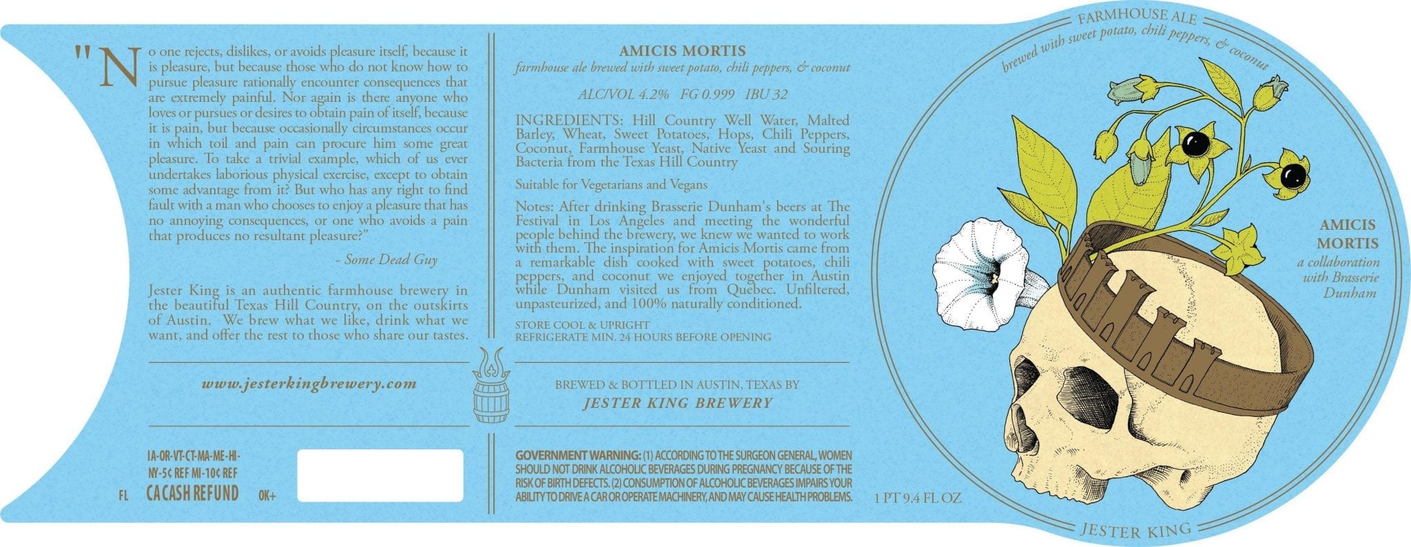
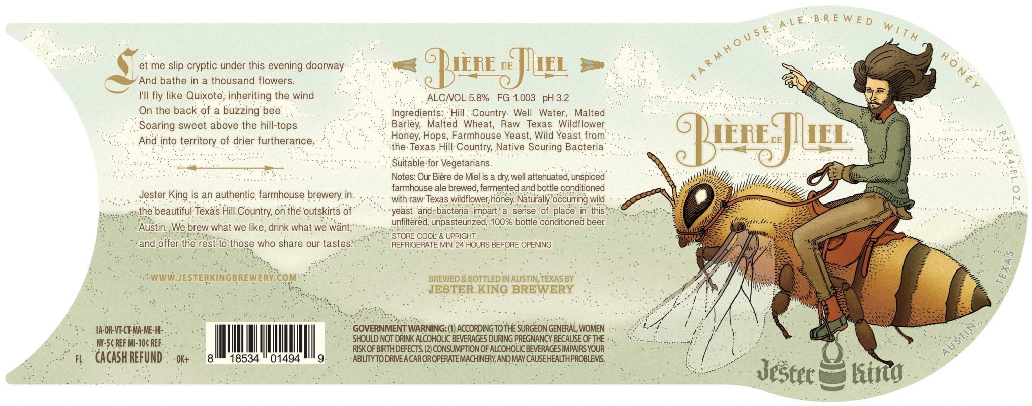
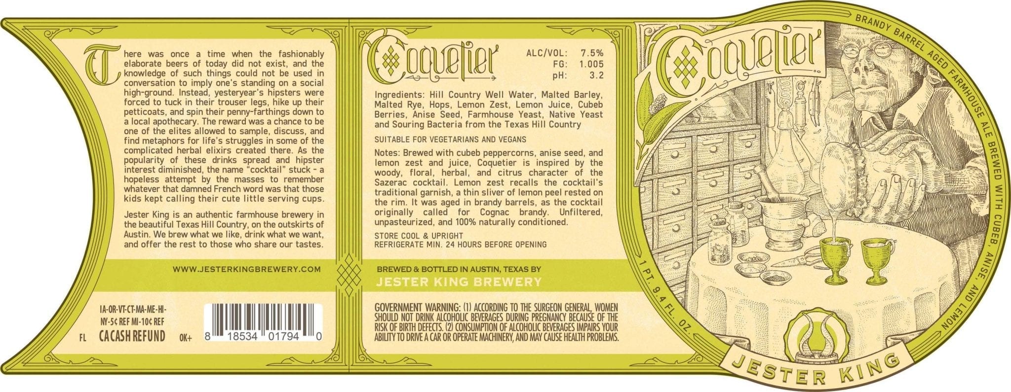
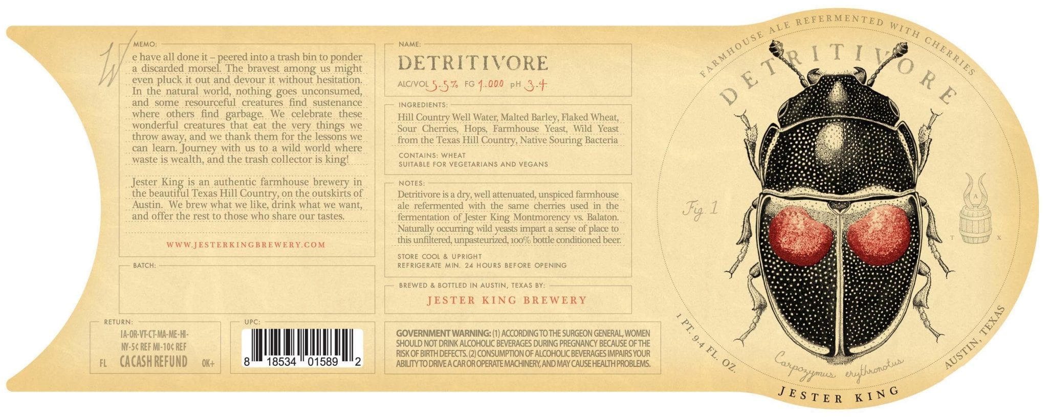
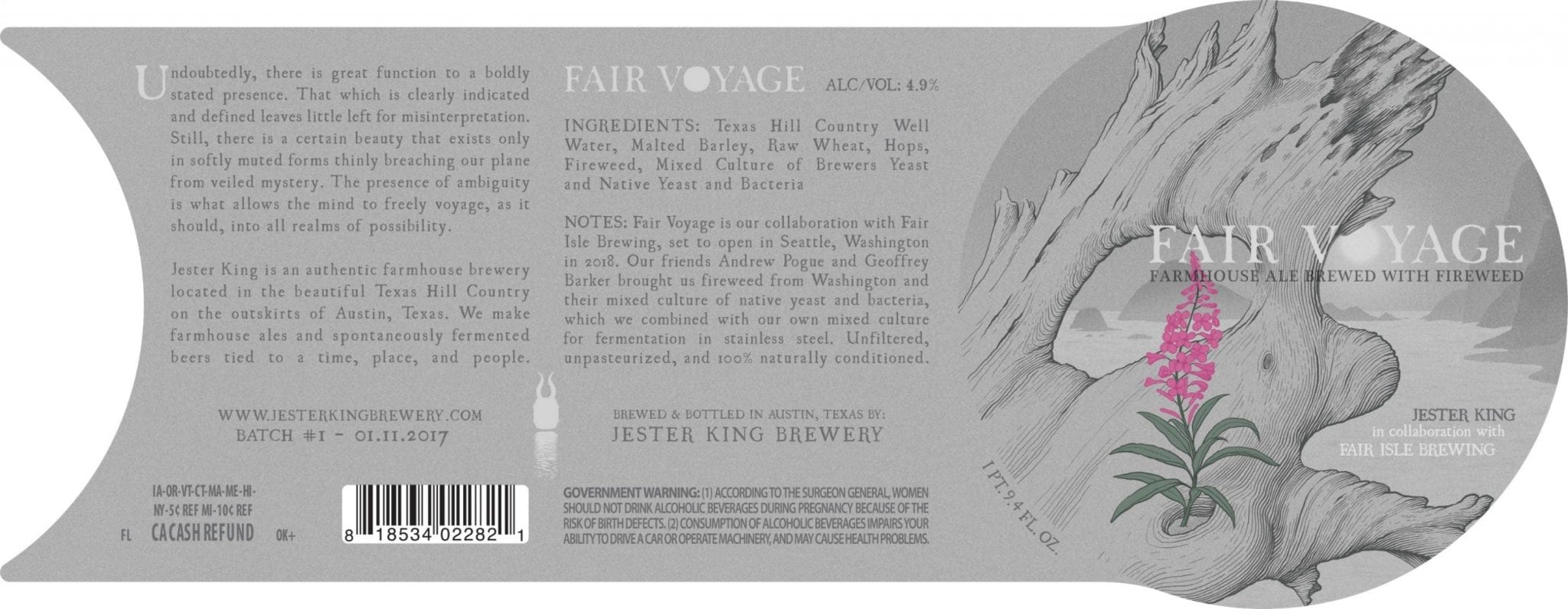
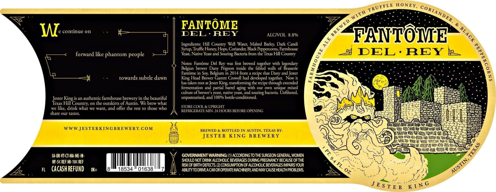
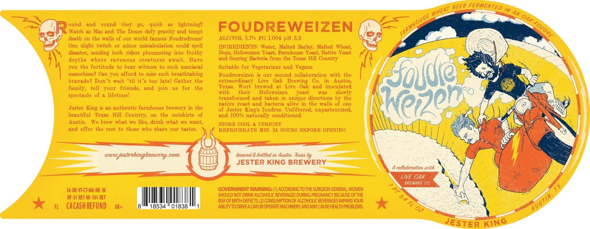
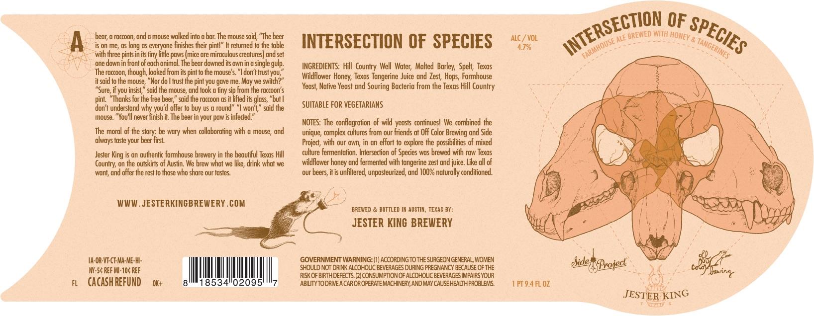
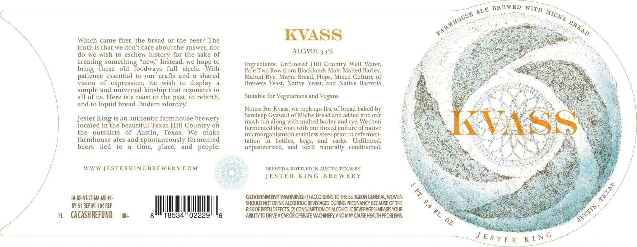
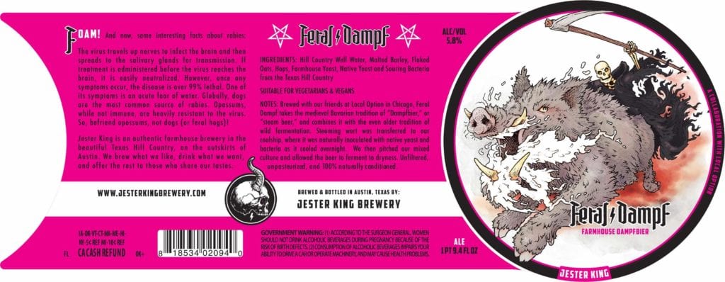
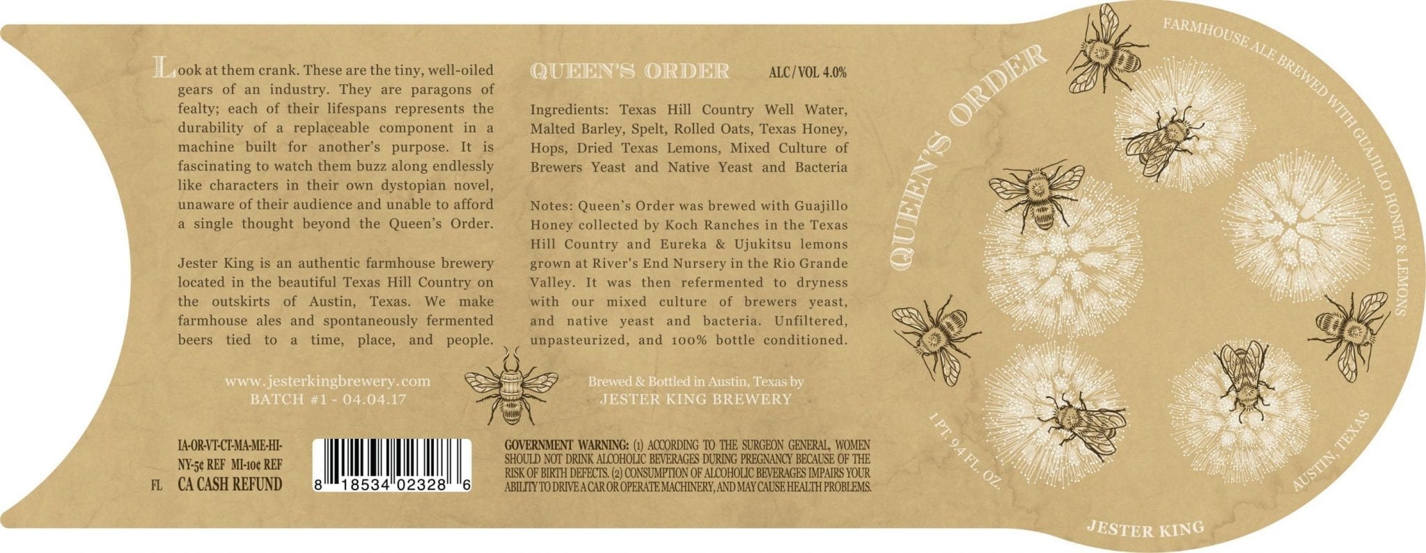
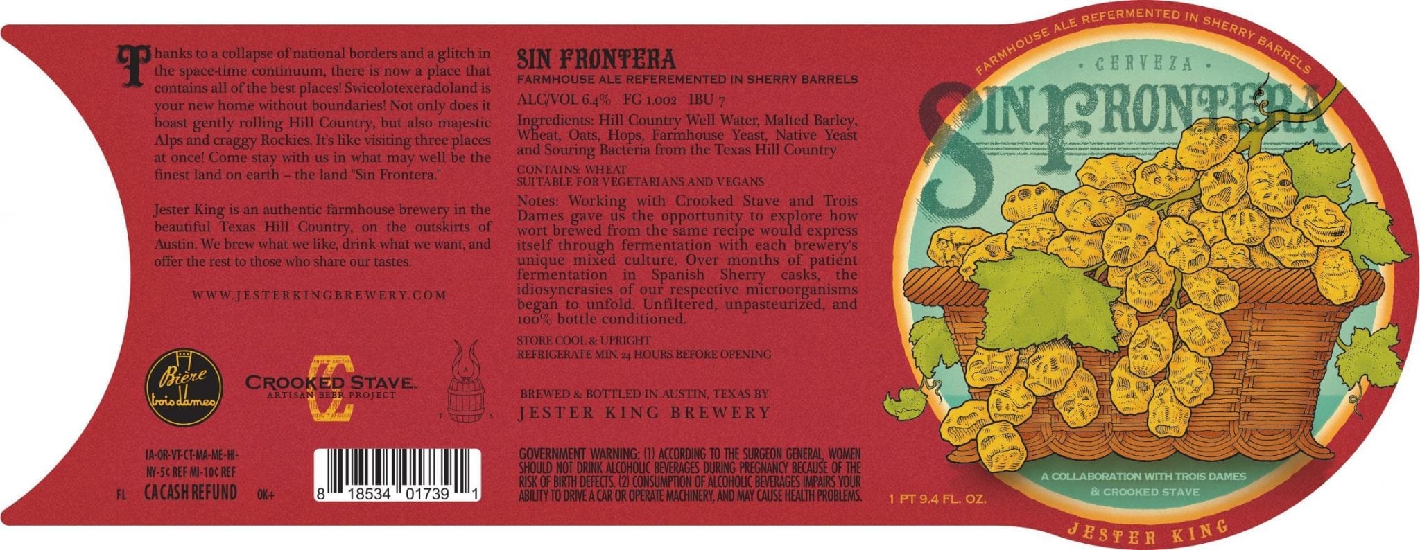
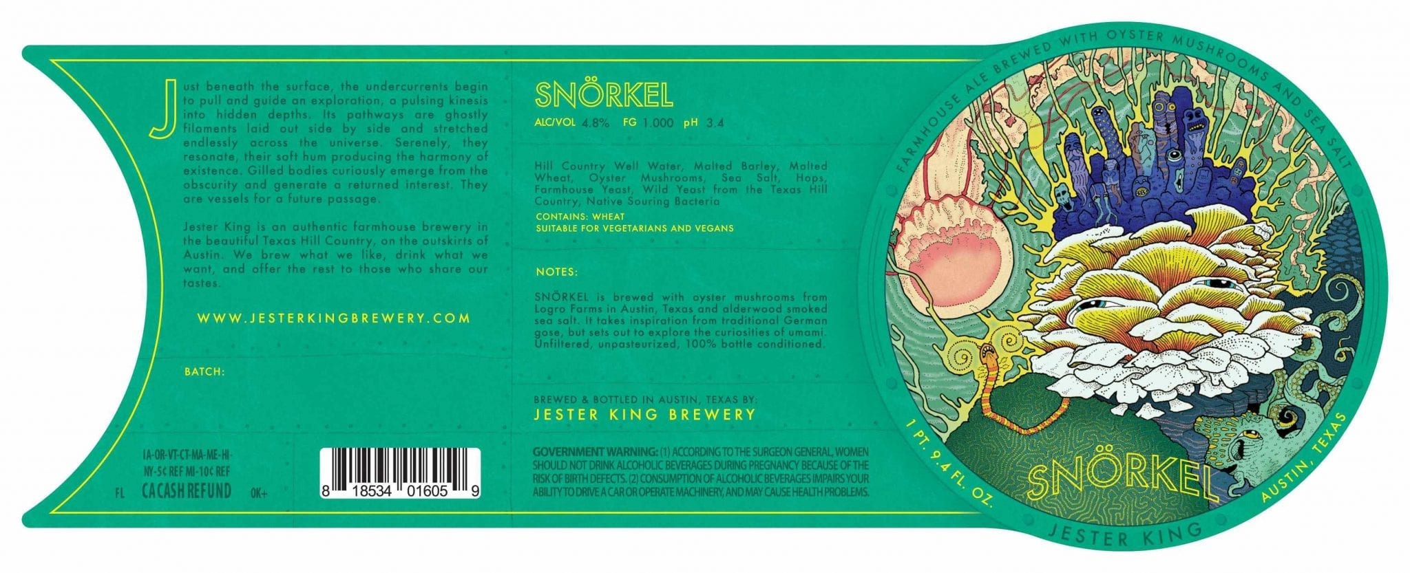
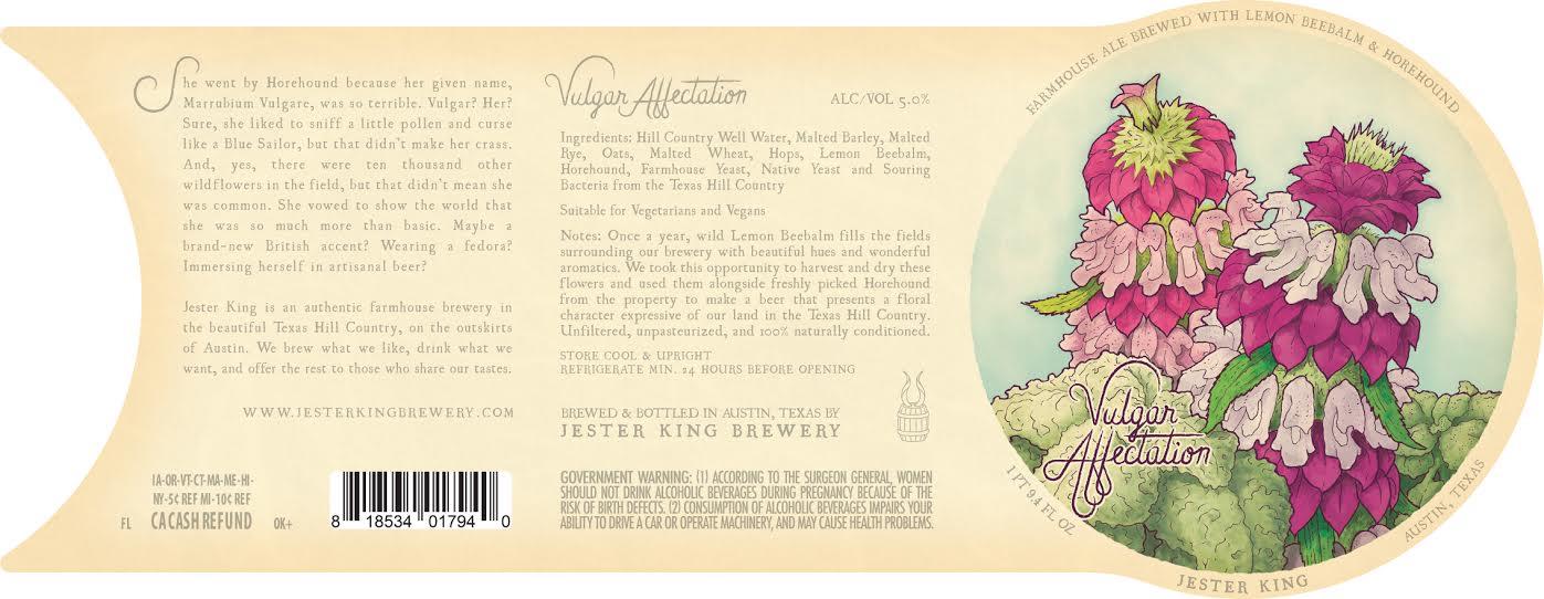
If you were to tell me that Josh Cockrell was a time-traveling illustrator of fine botanical tomes that had been transported here from a Medieval European alchemist’s laboratory in order to properly document the zymurgical heraldry of Austin’s Jester King Brewery, I’d probably go right back to my beer without batting an eye.
Cockrell’s body of work with Jester King is nothing shy of mind-blowing. Delicate botanical art, images of earth, decay, and wild growth, transmutation, illumination, and the occasional re-interpretation of the Crest of Cologne. Jester King specializes in wild yeast fermentation and the majority of the beers you will find on the shelves by them are labeled “Farmhouse”. It’s a magical paring.
Contents
Serious Questions About Serious Labels
Thirsty Bastards: My favorite label you’ve done is Audio Palette? Can you tell me the story behind its conception?
Josh Cockrell: Ha. You picked a serious label to ask questions about!
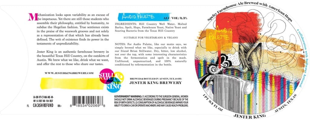 For Audio Palette I followed music as a general theme for creative direction because our head brewer at that time, Garrett Crowell, and co-collaborator Brian Strumpke of Stillwater Artisanal are serious music geeks/musicians. I began by comparing the aesthetic similarities of our mixed culture fermentation to the stochastic compositions of John Cage. Both challenge the expectations of an audience within their fields and include unpredictability as in important part of their compositions.
However, the concept of the beer itself struck me as a bit ironic when held next to aforementioned aesthetic practices. Encapsulated within the general idea of the beer are some very popular beer trends as of late. It is essentially an American dry hopped session pale. Furthermore, it is yet another example of the growing trend of collaborative efforts between two breweries that are popular within the beer world. I liked this as a starting point for the art, because it is only at first glance that it holds to being a product of popular beer culture. The stochastic nature of its fermentation takes what might otherwise be a pop beer and transcends it into something much more layered and complex.
I chose a visual aesthetic that could reflect this irony, and that just so happened to be emerging at the same time as Cage’s first aleatoric compositions: Pop Art, and more specifically the early layered combines of Robert Rauschenberg. The movement seemed to fit perfectly. It is a taking of the commonplace, removing it from its original context, to create something much greater than the sum of its parts. This is paralleled not only in the circumstances of the beer being pulled into a new context by mixed culture fermentation, but also in the harnessing of the mundane unrecognized micro-flora around us to make our creations.
Rather than use some pre-existing elements as Rauschenberg might have, I used all original artwork for the “collaged” composition in an effort to create a contrast of process and organic influence. What you see is the ear of John Cage, surrounded by a palette like graphic score that has been plotted around blind pen drops. An atypical musical staff enters the ear like sound and divides the more organic illustrated portions of the composition from the more processed elements. The eye that is layered into the background of the combine was created specifically for use in the label by the artist of Stillwater, Leeroy Mendoza.
The text in the left panel was constructed with a similar process in mind. It is a rearrangement of blindly selected words from randomly chosen philosophy books.
TB: What is your favorite label you’ve done so far for Jester King and why?
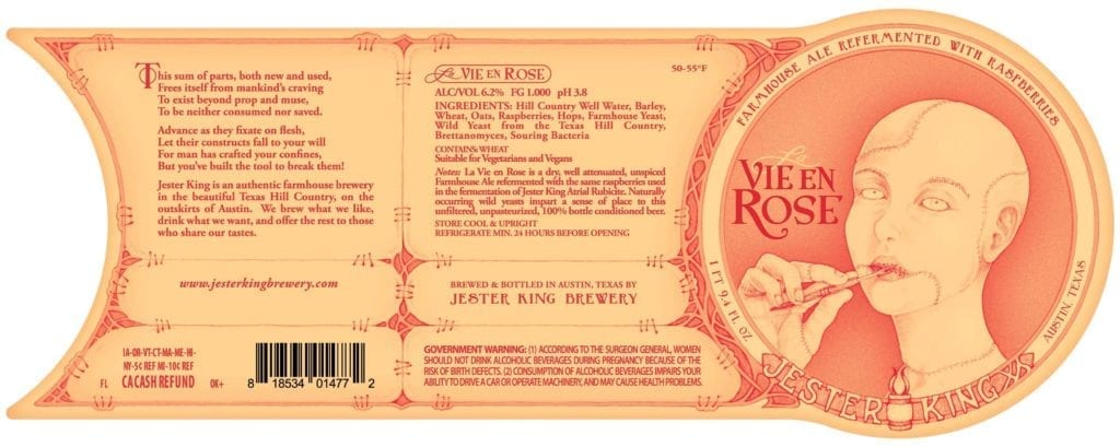
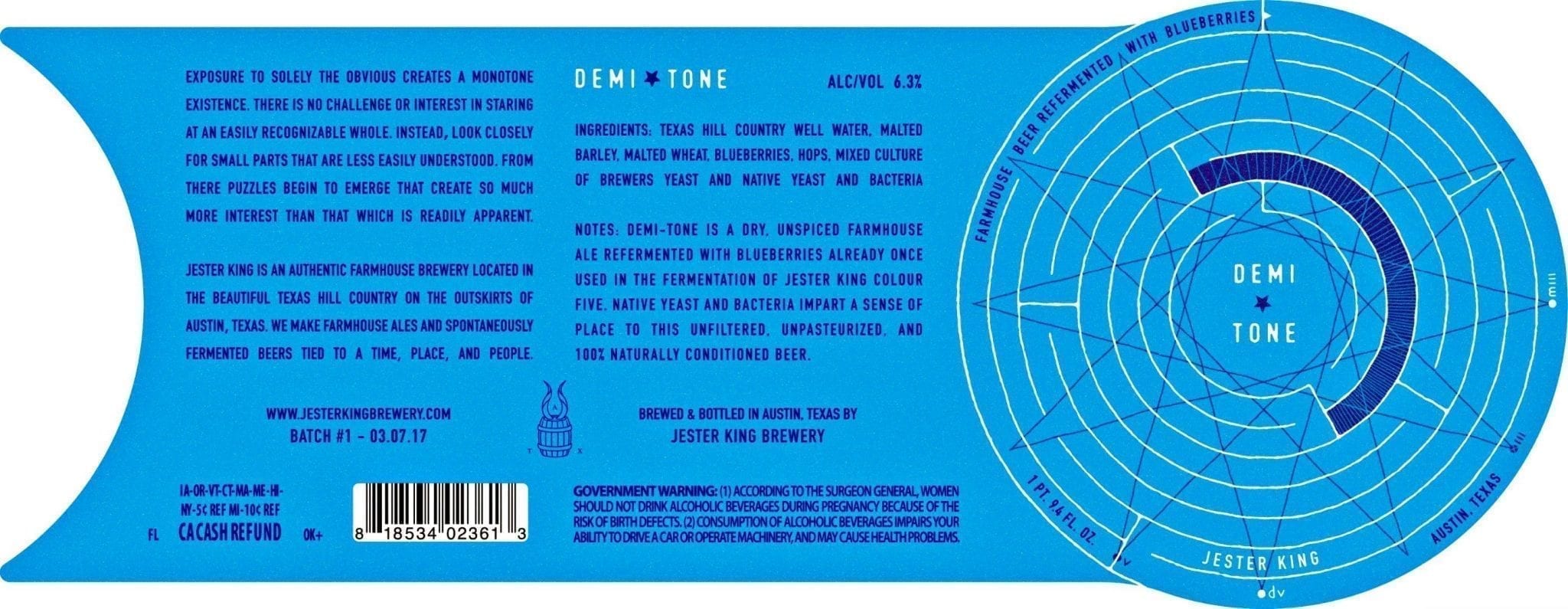
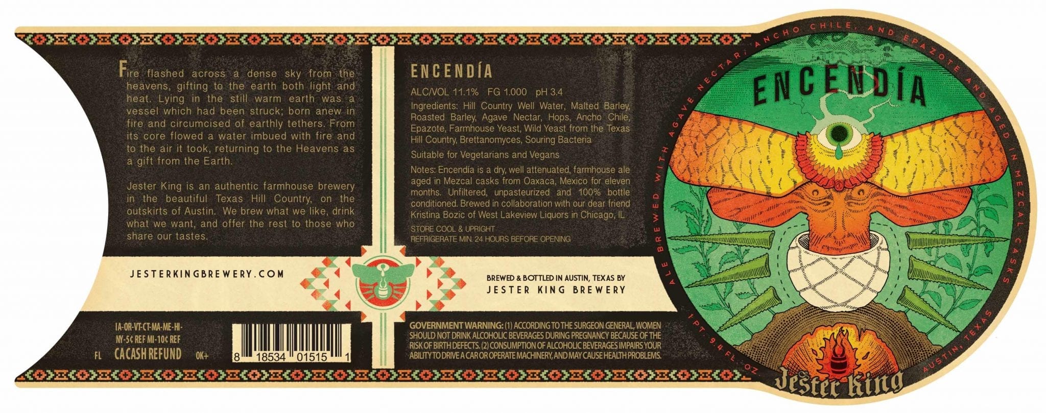
JC: I love La Vie en Rose, Fēn Táo, and Multifarious because they are a representation of ally-ship and present themes that rarely get to have a forward place in this industry. I don’t think I’ve ever been more proud of my artwork than to see the second image on this post during this years pride.
Getting Started at Jester King
TB: How did you get started making labels for Jester King?
JC: I’d been doing freelance design work for a while and when I got into home brewing I started some work with a little beer blog that is now called Austin Beer Guide. Through that connection I ended up meeting a handful of folks starting breweries at that time in Austin. I found out that this fellow Jeff, who I knew from Austin Homebrew Supply, was starting a brewery called Jester King. I felt like they could use a hand with artwork and pitched the idea to them, eventually hearing back with a go ahead. I quickly fell in love with the whole process and ended up being hired as the first non-owner employee. I was doing production, packaging, cellarwork, account management, deliveries, running the taproom and, when I had some time left over, new labels. Fortunately the brewery has long since found people far more talented to take over everything except for the art. So that’s my full-time gig now.
Wrap-Around Labels
TB: I noticed that you are one of the few breweries that do wrap-around labels (Le Trou Du Diable also comes to mind). What sort of challenges come with that?
JC: Wrap around labels are a glorious pain in the ass. Alignment is a bear, especially if the ends mate up like ours do. Just a small alignment error and the whole thing ends up looking caddywhompus. Since it’s a larger area of surface contact, air bubbles can be a problem.
Dichotomous
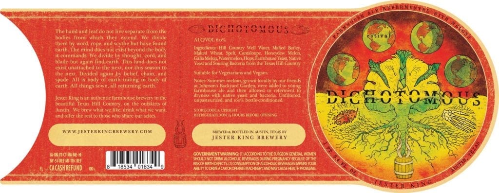
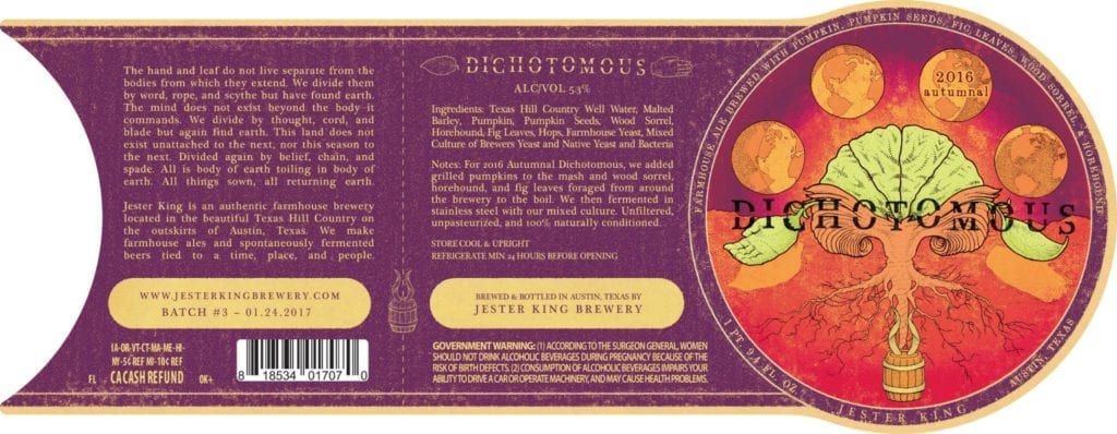
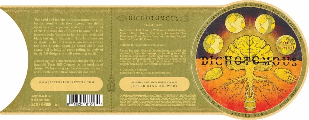
If there’s another annual labels series out there that takes variations on a theme as seriously as Cockrell’s Dichotomous, I’d love to see it. I put these into a separate gallery so you can cycle through the variations and “see the cycles”.
Dichotomous is about life and death, renewal and decay. It’s about being above ground as well as returning to it. The cycles of the planet and the cycles of a lifespan – be it human or plant. “All things sown, all returning to the earth.”
Becoming and Being an Artist
TB: Where are you from and where did you learn to be an artist?
JC: I am originally from Central Texas. I grew up in a Killeen/Belton about an hour north of Austin and moved to Austin immediately upon graduating High School. I’m a self taught artist. My creativity was fostered by family as far back as I can remember. My Mum always provided art supplies and my grandmother had a ‘craft’ closet that I would regularly raid. I took a liking to illustrating critters early on. I remember getting out the binoculars and a Petersons Field Guide of the Birds of Texas as a young boy and just studying the birds I saw with crayons and colored pencils in hand.
TB: What other art do you make?
JC: Oh I stay mostly busy with the full-time brewery work. I really only make time for funny doodles and cards for folks I love these days. I’ve got a funny little side project I barely keep going that involves satirical beer merchandise. I sold out of the only item I’ve put up so far, but I’ve many ideas and there will hopefully be others soon. The site is The Troll Hole.
TB: How can your fans find you and your work? Can they buy your art?
JC: I don’t have any personal artwork for sale at the moment, but you can find my work on every Jester King beer that comes out ;). Brewery merch including posters, shirts, etc. is all designed by myself as well, so that’s another outlet. And, again, there is the personal project site with occasional things.
Odds and Ends
TB: I’m a big fan of Local Option here in Chicago and I even have a Feral Dampf glass. Did you do the art for that release?
JC: Indeed, I am to blame for that artwork as well.
TB: True or false: The best beer label art looks like it could also be Magic: The Gathering card art.
JC: I fucking love me some fantasy art, but I must ultimately say false. That does give me an idea for some label themed trading cards though…
