Here we are at the fourth week of the “best of the week” posts as well as the final week of the year. If you are enjoying these posts, I’d love to hear from you. It’s a hell of a lot of fun writing about labels that haven’t yet made it to the store shelves.
The following labels were registered with the Alcohol and Tobacco Tax and Trade Bureau during the 52nd week of 2014. They have been selected for their aesthetic appeal or simply because I thought they were really cool.
Contents
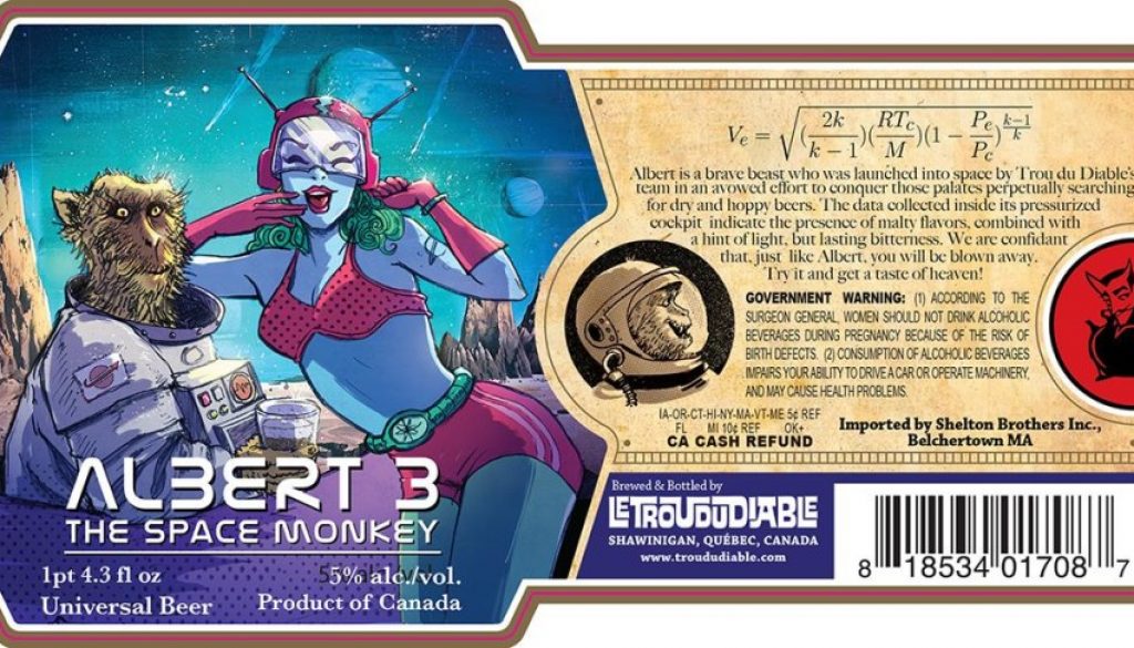
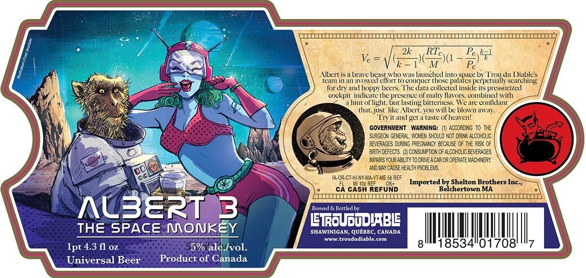
Le Trou Du Diable Albert 3
Yes, I know I featured a label from Le Trou Du Diable last week, but they’ve been busy little labelers. It doesn’t hurt that the art they have chosen is really fucking kick ass!
Albert 3 is illustrated by Canadian comics artist Fred Jourdain.
Space Monkey lands on distant planet. Space Girl hands Space Monkey a cold beer. Space Monkey wins!
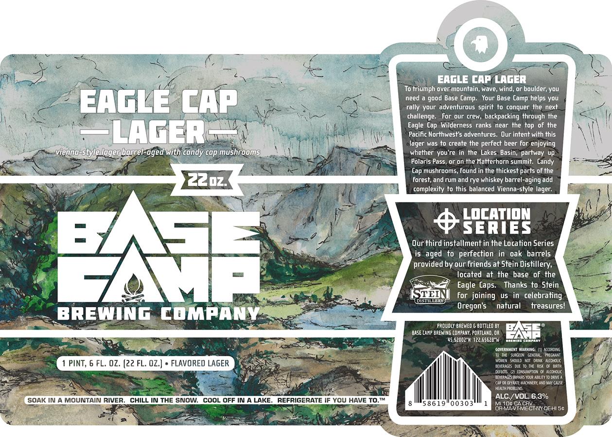
Base Camp Brewing Eagle Cap Lager
Eagle Cap is a mountain range in the Pacific Northwest, at the foot of which you can find the brewery’s collaborator for this beer – Stein Distillery. Stein provided the oak barrels for aging the lager.
This watercolor landscape is the full surface of the label with the text and other elements thoughtfully superimposed over it. The combined treatment allows for a very functional design without compromising the the beauty of the imagery. Everything is readable without compromising the full impact of the landscape. You have to love the mountain-shaped barcode too!
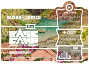
This is the third in their Location Series which feature inspiring Oregon scenery. Below is their second in the series, Saison De Chetco. I couldn’t find a label for the first, Smith Red Rock Lager.
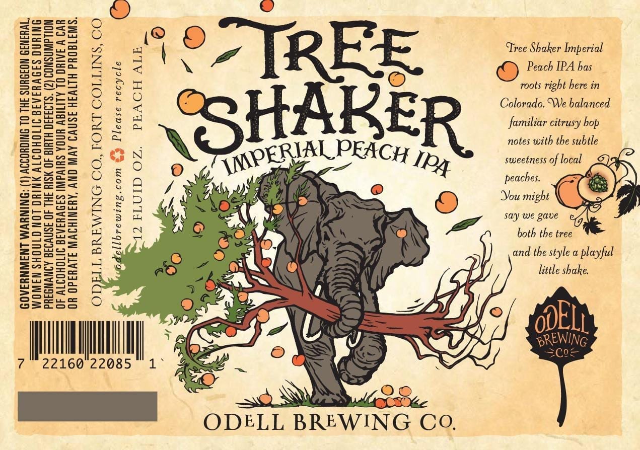
Odell Brewing Company Tree Shaker
I love all of the labels that come from Odell because they are always charming examples of good typography and great illustration.
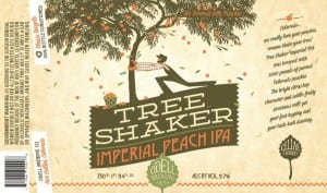
This new version of their Tree Shaker label seems to be a departure from their woodblock print look, much in the same way the old one was (seen below).
I guess we’ll see if a rampaging elephant is a better peach harvester than a bearded country bumpkin.
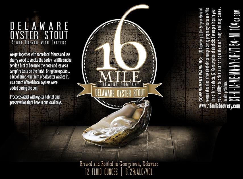
16 Mile Brewing Company Delaware Oyster Stout
I picked the label for Delaware Oyster Stout this week simply because the illustration was masterfully rendered. It’s not earth-shaking in any way except that the artist made this gooey, absurdly moist oyster look really freaking gooey. So good job there.
I can’t tell if this photorealistic oyster is digital or possibly good old fashioned airbrush, but if convincingly drippy wet shellfish was the goal, mission accomplished.
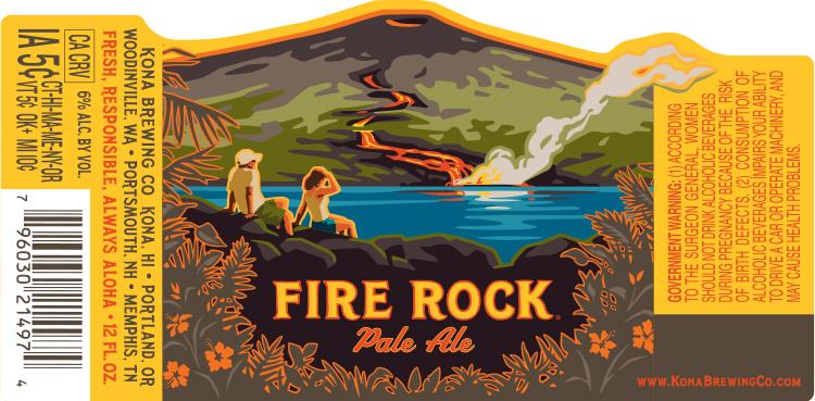
Kona Brewing Company Fire Rock Pale Ale
This Fire Rock Pale Ale label illustration is another fine example of posterization, adapting a colorful landscape into a stunning, limited tone graphic.
I like how the use of color doesn’t push the concept of heat but rather the coolness of molten lava when it encounters water. This isn’t a fiery beer flavored with chili peppers, it’s a product of the Hawaiian islands best enjoyed cold. The art should convey that and I think this is very successful.
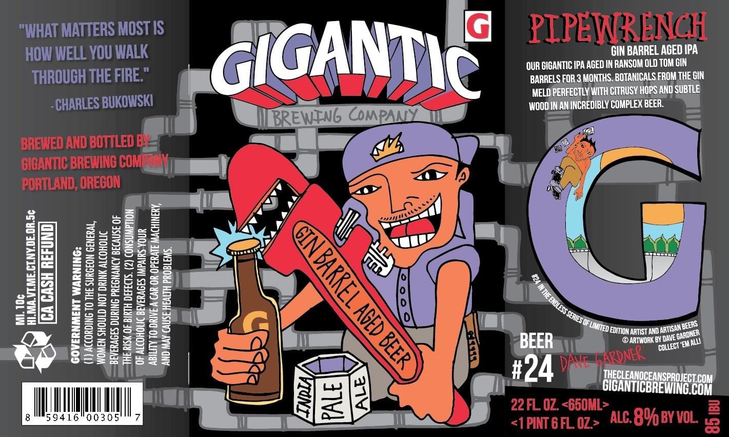
Eyesore of the Week: Gigantic Brewing Pipewrench
Sorry Gigantic Brewing and sorry Dave Gardner, this label is just plain bad. Dave’s underground artwork seems to be popular in the Santa Cruz surf and skate scenes. If you want to sell beer, if you want to stand out on the shelf from the hundreds of other barrel-aged IPAs, and if you want me to part with my hard-earned cash, you simply need to do better.
This label is Number 24 in an “Artist and Artisan Beers” series. Cheers to Gigantic for giving the artists credit on these labels (which I suppose is the point). I REALLY hope to feature future labels at the top of a “Best of…” post instead of the Eyesore. They’ve done some beautiful labels in the past, but this is not one of them.
Label images research made possible using the highly recommended LabelVision search tool at ShipCompliant.

January 2, 2015 @ 11:02 am
Artist : Fred Jourdain http://www.fredjourdain.com