To have a standout beer label in the holiday season, you need to push the envelope to compete on the store shelves. Many breweries are content to add a Santa hat to their company mascot and adapt their label formula to the season. Others try to break the mold. These are the Winter beer labels that do just that.
Contents
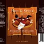
Bryggeriet Djaevlebryg Hjul & Stejl Ryebrett Ale
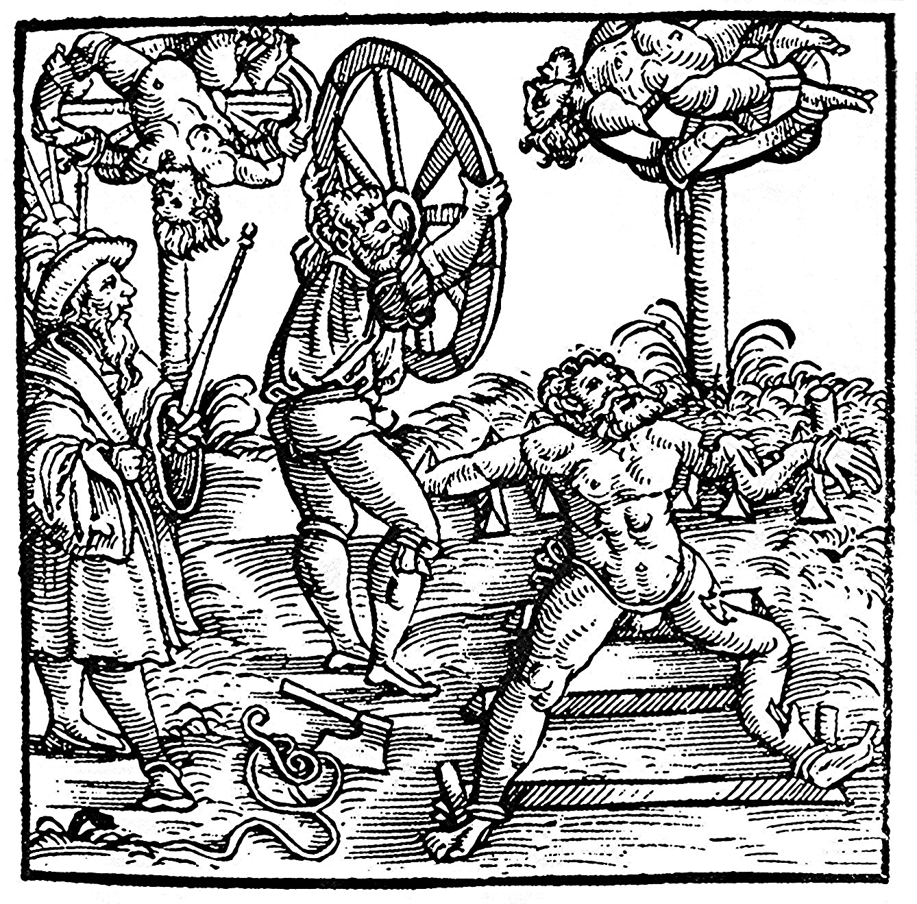
We’ll start our little tour of Winter beer labels by putting the screws to old Saint Nick. If you’re wondering what language that is, it’s Danish and it means “the breaking wheel”. It seems the fine folks at Bryggeriet Djaevlebryg are tired of the old traditional figures of the holiday season: “We symbolically put Santa Claus and the like on the breaking wheel and propose a toast in Hjul and Stejle.” Poor guy.
Tommy B-Kuhlmann who owns and runs Pixit Design
pixitdesign.dk
Bryggeriet Djaevlebryg
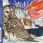
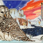
Deschutes Brewery Jubelale 2013
This Winter beer label stands out, not just because it’s mind-blowingly gorgeous, but it’s a rare instance of the artist being credited on the label. Artist Avlis Leumas signature is clearly visible and his involvement in the label creation is well documented on Deschutes’ website. “For the 2013 label Avlis Leumas created a piece that’s balanced with opposites, combining a serene and quiet landscape where there is movement and activity everywhere.” For 19 of the 26 years that Deschutes has produced Jubelale, they have hired a different Oregon artist for their Winter beer label art.
Leumas uses Copic brand markers in his artwork. The company featured him on their website here: Copic Markers
Avlis Leumas website
Deschutes Jubelale
B. Nektar Dwarf Invasion
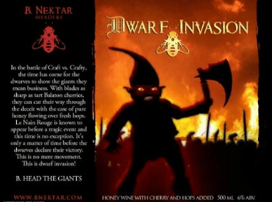
Some of the best beer labels are like card art from Magic: The Gathering. That’s exactly what Dwarf Invasion makes me think of – and that’s a good thing! Only these dwarves want to invade my belly!
Kerri Dahlhofer is the co-owner of B. Nektar (with husband Brad). She is also the artist of this beautiful Winter beer label.
“When I work on a label it’s an all-encompassing project. The art has to support the description/story and vice versa. Sometimes one helps create the other. In this case, we had a name we liked and a vague concept for the descriptive story. We knew we wanted to pull reference from the Detroit Red Dwarf, an urban legend where the dwarf is sighted before a tragic event occurs. The “tragedy” in this story is that the “big guys” (crafty beer or big beer companies), loses to the “little guys” (craft beer). I wasn’t sure exactly how I wanted the dwarf to look, so I usually try to get inspiration on the internet. That’s how most of my images come about. I find an image I like and build from it, adding bits and pieces from other image inspirations along the way until I create something I’m happy with.”
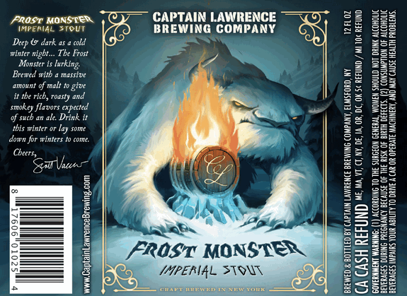
Captain Lawrence Brewing Company Frost Monster Imperial Stout
Another great card for your white deck, Frost Monster is just about the most kick-ass winter beast I’ve seen on a label. All of Captain Lawrence Brewing’s labels feature the “CL”-emblazoned barrel, but only this one is set aflame and guarded by an 8/8 polar behemoth. He’s just awesome!
Captain Lawrence has not replied to my requests regarding who this artist is, but I’ll keep asking.
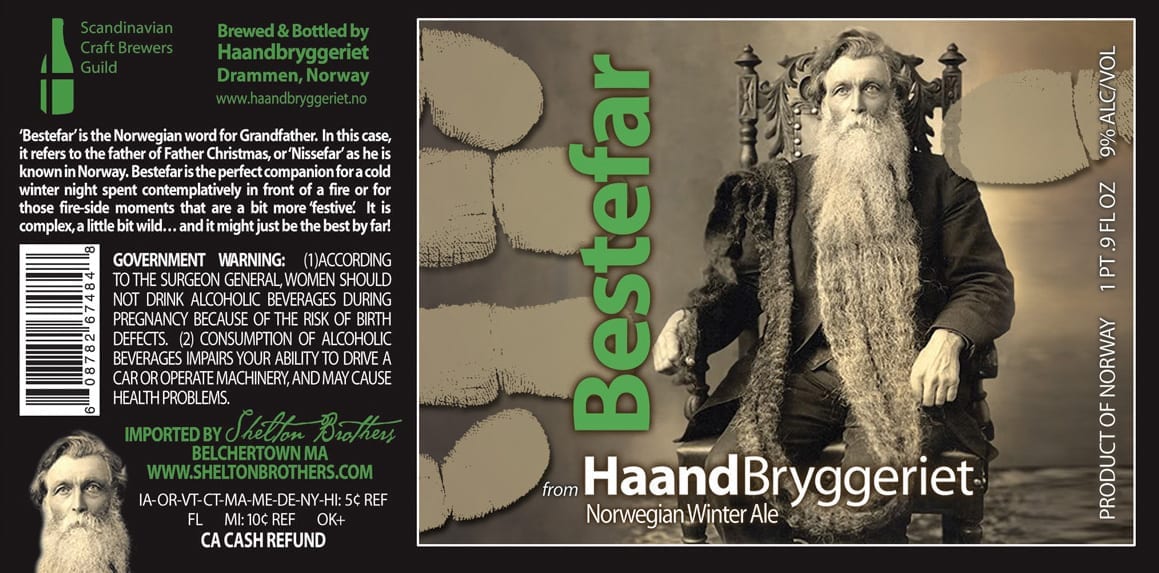
Haandbryggeriet Bestefar
 I love this old-timey St. Niklaus-looking fella. I’m not even sure it’s supposed to be a Santa figure as “Bestefar” means “grandfather”. It reminds me of those creepy old images you can find at holiday time. Yes, I like this cuz it’s creepy. I hope that was the point. This label features HaandBryggeriet’s signature fingerprint theme, as if you needed to know where to put your hand when you hoist this to your face. According to HaandBryggeriet, “All our graphics design is the work of Tommy B-Kuhlmann who owns and runs Pixit Design.”
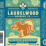
Laurelwood Brewing Vinter Varmer Winter Ale
I admit, I’m a sucker for any image of a squirrel drinking, so of course this little guy is going to make my list. He even appears to have gone through a revision from monotone brown to festive holiday colors. He just wants a little warm up… give that squirrel your beer!
Eric Abel seems to have been the designer of the latest version of the drinking squirrel. According to Laurelwood, “The squirrel drinking a beer was a creation of our owners Mike De Kalb.”
Laurelwood Brewing Company
www.abelarts.com
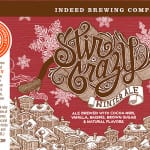
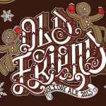
Indeed Brewing Stir Crazy and Old Friend
Chuck U has done the illustration for all of Indeed Brewing’s label art. Back in my college days studying illustration, we would have projects called “illustrated word” where the text was the illustration. That’s what these labels remind me of. Chuck U’s work features very intricate line work and charming characters like bears, astronauts and robots. I love the graffiti-inspired type injected with holiday-style flourishes. You can’t lose with two-fisting gingerbread men either.
www.chucku.com
Chuck U on Facebook
Chuck U on Etsy
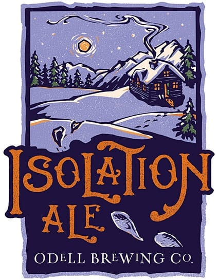
Odell Isolation Ale
Odell’s labels are just gorgeous, if I may make a blanket statement. I adore them and I will try to work them into every post like this I can. I love the old-timey block print look of them. They remind me of old children’s book illustrations and they ooze nostalgia.
This is the beer label I want to take with me to a cabin in the woods. I would strap on snow shoes to spend some time alone with this beer label. It tells a story and that story is, “Leave me alone. I’m drinking.”
The artist is Mona Caron of San Francisco.
@beerlabelsart @OdellBrewing thanks 🙂 only did the illustrations, the type design is by Tbd Advertising!
— Mona Caron (@monacaron) October 9, 2014
