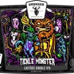
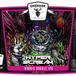
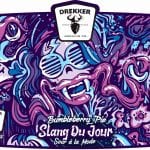
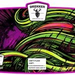
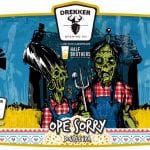
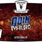
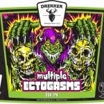
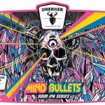
My first awareness of the work of Drekker Brewing’s artist known as Punchgut was when I was assembling the candidates for our Best Beer Labels of 2018 post. What’s that? You’re tired of hearing about that? Tough crap.
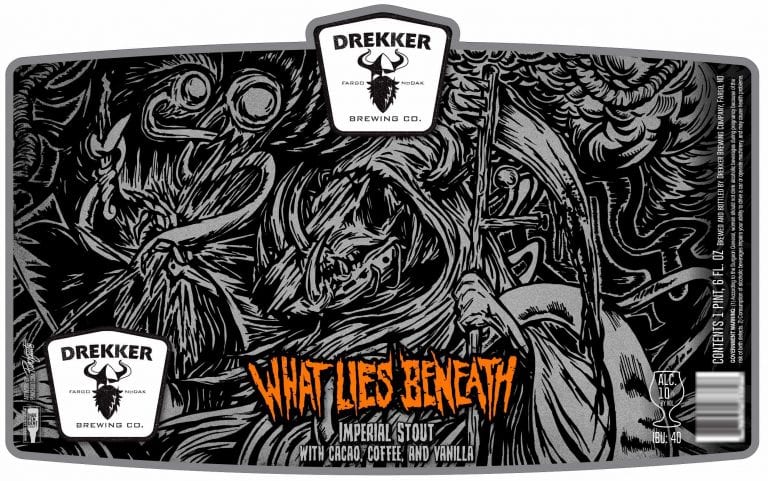
At any rate, Punchgut’s label for “What Lies Beneath” jumped out at me as a potential winner and it JUST MISSED the top ten. I’m not saying you guys need to get off your butts next year and vote for the next Punchgut masterpiece, but he’s determined to crack the top ten for sure.
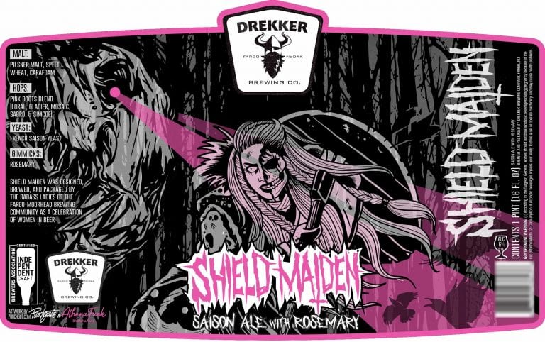
Thirsty Bastards: My favorite label you’ve done is Shield Maiden? Can you tell me the story behind its conception?
Punchgut!: OMGAWDDDD —-You pick the one label I didn’t do the main illustration for!!
This was a beer brewed by the powerful women of Drekker and the main black and white illustration of the femme fatale was done by the local tattoo artist Athen Funk.
I added the rest of the illustrations, layout and colored our collab.
TB: Haha! Let’s try that again… How about What Lies Beneath?
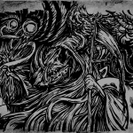 PG: I still take credit for it—-no biggie!! I’m just busting your chops. I just thought it was funny 🙂
“What Lies Beneath” has a super dark vibe and I attached the entire illustration that shows our main character is the “good guy” battling the evils from the deep.
Sometimes I illustrate parts knowing some of the imagery will be cropped off. It just finishes the story for me.
A strong illustration doesn’t always need color to pop…. sometimes the illustration handles it.
TB: What is your favorite label you’ve done so far for Drekker and why?
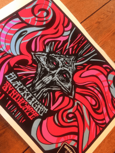 PG: In all reality….it is the current one I am working on. I get hellbent on trying to improve and develop with each label. Most recent one is “Blacklight Syndicate”.
Otherwise “What Lies Beneath” is probably my favorite. I was happy how the illustration turned out and looked strong with just grayscale tones.
TB: How did you get started making labels for Drekker?
PG: They were familiar with my work thru concert posters and other works. We yapped and mesh together very well. Proud to now call them friends.
Our initial goal was to develop a label template… and now here we are! Sometimes they have ideas for imagery and other times they just give me the beer title and I start sketching.
TB: Where are you from and where did you learn to be an artist?
PG: I am from Fargo, North Dakota. I was the kid with his head down in math class drawing monsters on his desk and pissing his pants when a girl talked to him.
TB: Can you tell me a bit about your process? Are you all digital? Traditional? Mix of both?
PG: Everything starts with a rough pencil sketch and sent to Drekker for initial approval. Then the illustration is cleaned up and inked with a pen or on a tablet.
Scanned, colored and dropped into our label digitally. I post my process pics on IG. Sketch/Ink/Full Color. Stop by and say HELLLLLO
TB: What other art do you make?
PG: I dabble in a lot of styles…doing the same style and art is boring for my ADD.
Huge collages, illustrations, concert posters, package design, logos and lately I have been into illustrating on old photos.
TB: How can your fans find you and your work? Can they buy your art?
PG: I like to be FULL SERVICE and available for any commissions or jobs.
TB: True or false: The best beer label art looks like it could also be Magic: The Gathering card art.
PG: FALSE – The best beer labels looks like they were drawn by wizards on shrooms… shit… so actually that is a TRUE statement.
Label images research made possible using the highly recommended LabelVision search tool at ShipCompliant.
