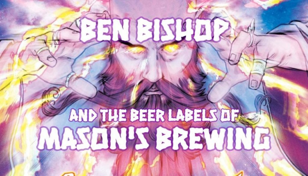
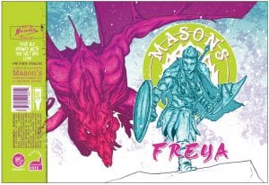
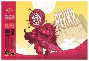
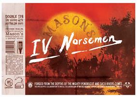
We’re getting to the end of the list of artists whose beer labels YOU voted for as The Best of 2018. You might remember the burly, spear-wielding Norseman for Mason’s Brewing’s REKKR. That’s Ben Bishop, little leaguers!
Don’t let that barbaric presentation fool you. He’s about more than just “hack and slash”, kids. Bishop is a storyteller worthy of a saga of his own.
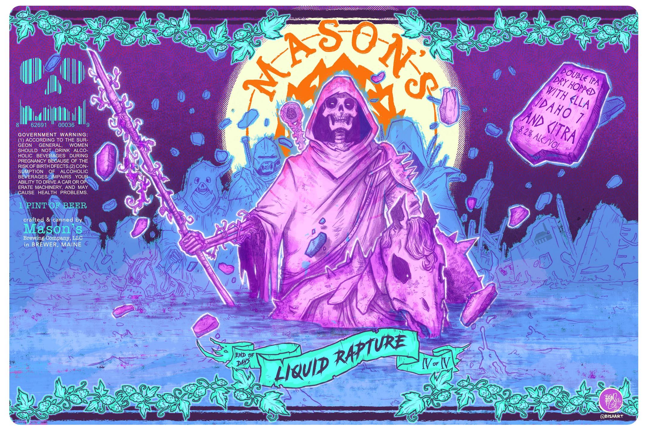
Thirsty Bastards: My favorite label you’ve done for Mason’s Brewing is Liquid Rapture? Can you tell me the story behind its conception?
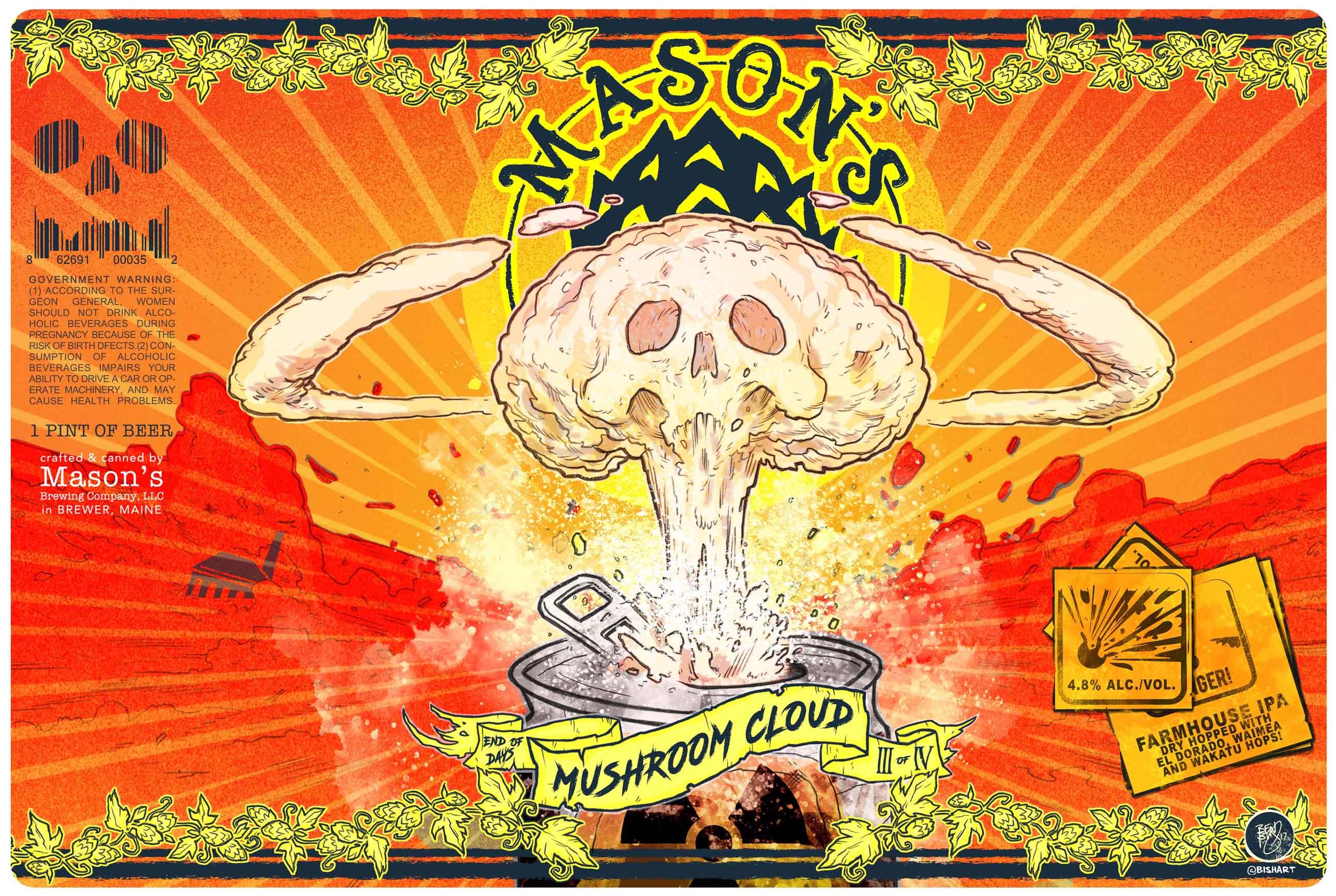
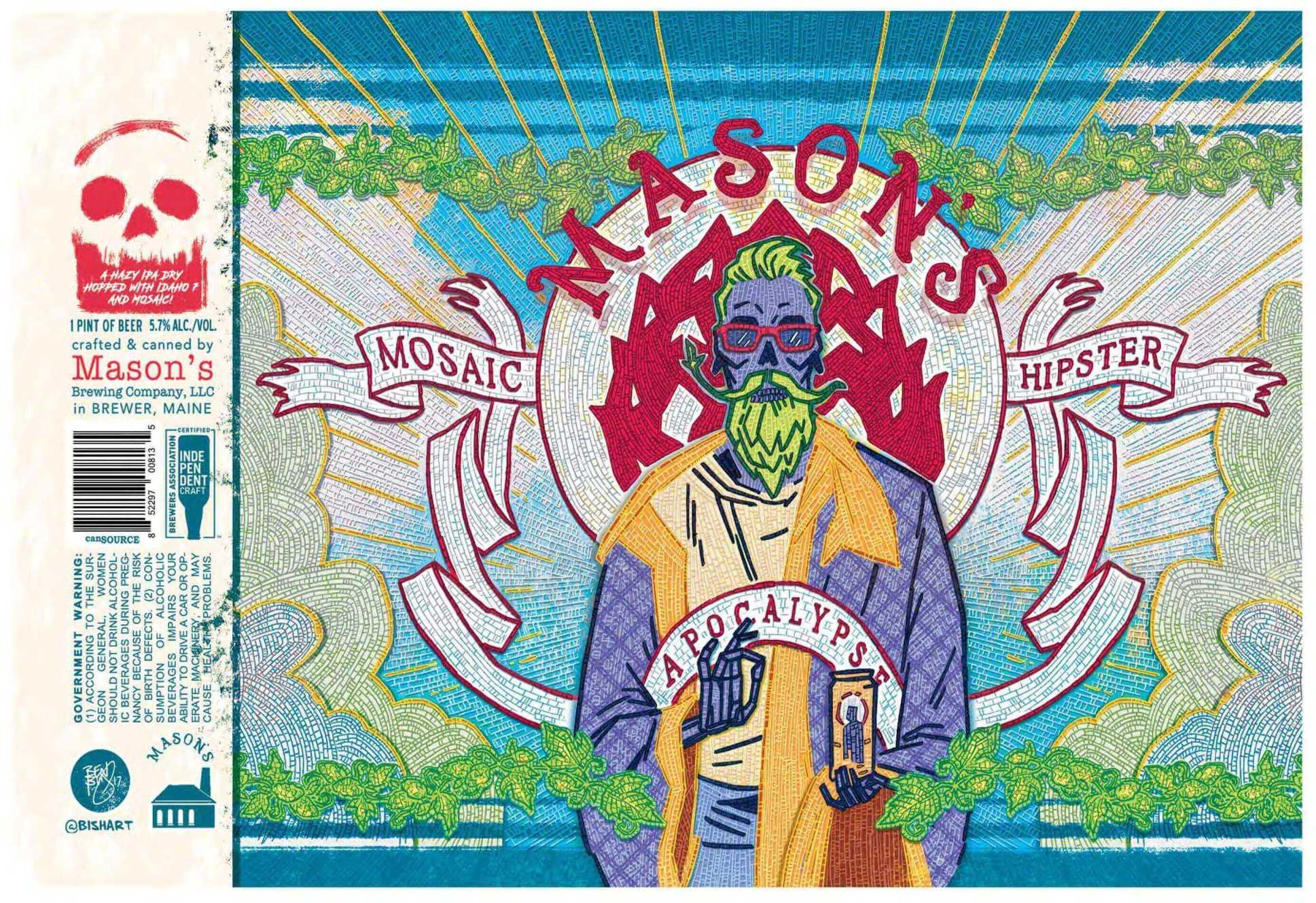
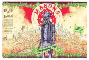 Ben Bishop: For Liquid Rapture we wanted to stick with our END OF DAYS series theme we started with Hipster Apocalypse, which is essentially skulls, skeletons, demons, and badass looking shit. haha
I started thinking about the rapture and people floating up into the sky. originally I had sketched a full skeleton horse with a skeleton rider that was floating up out of a lake while holding up a glass with the beer in the glass also being pulled up into the sky. It was a cool image, but ultimately, enough roughs led to us showing the moment before. The calm before the rapture. With all the horses and riders kind of wading creepily in a bog, about to bring upon a rapture. You can see I’ve got some rocks and rubble and whatnot starting to float up. Of course, there are 4 of them, the 4 horsemen of the apocalypse.
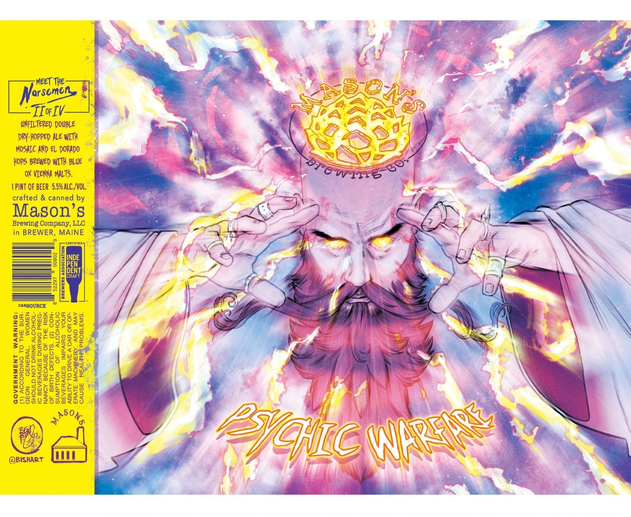
 As far as the colors go. Chris (owner of Mason’s Brewing) is always wanting the colors more vibrant and extreme so I went with really hot pinks, purples, and blues.
It’s one of my favorite labels, and beer as well, so I’m glad it’s one in the main line-up, and a little easier for people to find in stores. It may have also been the first Mason’s Brewing beer I had. I was visiting the brewery and Chris poured me one from the tap. At the time it was like 12% or 13%. I got really drunk that night.
TB: What is your favorite label you’ve done so far for Mason’s Brewing and why?
BB: I think it’s either FREYA or REKKR. I was trying to simplify the color palette on both of those and keep them really striking and focussed on the character. Both of them really spotlight the character up front.
I’m a comic and toy creator/collector, so I am always thinking of these cans from a collector standpoint. Or with comics you’ve got a ton of variant covers. You want to collect them all. With the first couple batches of labels I did for Mason’s Brewing I was really pushing the gotta catch em’ all aspect. These two were 2 of 4 in the IV NORSEMEN series. Much like the END OF DAYS cans, you know there are 4, if you have only found 2, you’re going to want to chase down the others.
Making them character-based and creating these backstories behind the waves and groups of characters adds another level for me, and hopefully everyone else.
TB: How did you get started making labels for Mason’s Brewing?
BB: A mutual friend of ours thought Chris and I should meet. So one night when we were out drinking we were introduced and started talking about what kind of labels and can art we liked and didn’t like.
Chris and I were pretty much polar opposite as far as our design taste. He was a big fan of a more simplistic, iconic, logo-centric can. I, of course, was all about the comic book, character, story-based stuff, and no one was really doing that sort of thing. We drank. We argued. We got together anyway and now both of our design sensibilities come through in the final cans. It’s a great compromise of iconic branding, recognition, and cool comic looking stuff. We have a cooler end product because we have slightly different tastes in what we like to see on the shelves.
TB: Where are you from and where did you learn to be an artist?
BB: I grew up in NH, but moved to Maine in 2004 and have been here ever since. I love Maine. I’ve been drawing since I was 4, wrote to Marvel asking for a job when I was 11, (I didn’t get it. I was 11. haha) and started self-publishing when I was 18. I’m self-taught. Just learning by doing and of course by studying other artists and work that I’m into.
TB: Can you tell me a bit about your process? Are you all digital? Traditional? Mix of both?
BB: Mix of both. I always start with digital roughs. It’s easier to work things out digitally and have the freedom of sliding things around, resizing, stretching, flipping, etc. Once I have a rough I like, I’ll send it over to Chris at Mason’s and he will give me his feedback. There’s almost never changes, nothing major anyway.
We’re surprisingly on the same wavelength most of the time which is really nice. We discuss the ideas and concepts a bit before I start drawing anything, so I have a pretty good idea of what he wants.
Once the rough is good to go, I print it out and lightbox it on my desk with a fresh sheet of paper and pencil. Essentially inking the rough, but in finished pencil (I never really use ink). Once the final lines are done, I’ll scan that back into the computer and do my colors digitally. So it’s a real back and forth. I just like working that way.
TB: What other art do you make?
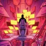
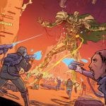
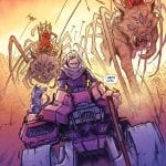
BB: Lots of comics. That’s my main thing. Like I said, I started making comics when I was 11 and haven’t stopped since haha. Recently I’ve done work for Teenage Mutant Ninja Turtles, Savage Dragon, some covers for Batman, Transformers, G. I. Joe, Ghostbusters…
THE AGGREGATE BOOK 1 has 4 beginnings, 7 endings, and 20 something choices in between, so you can really read the book like 100 different ways, experiencing it differently each and every time. I’m working on BOOK 2 right now, which I funded through Kickstarter, raising $53k to make it. BOOK 2 continues with 7 beginnings and just keeps getting bigger and bigger. Can’t wait for everyone to get their hands on it. Oh, I should also mention, Mason’s Brewing is doing an AGGREGATE beer. It’s on tap right now and the cans are coming out this summer in Maine and Rhode Island!
The other big thing I’m doing right now is Volume 2 of this book called DRAWING BLOOD with this guy Kevin Eastman, he’s the co-creator of the Teenage Mutant Ninja Turtles (also from Maine). We say it’s the fictional true story of how the Turtles were created, except instead of Kevin Eastman, it’s this guy Shane Bookman, and instead of the Teenage Mutant Ninja Turtles, it’s the Radically Rearranged Ronin Ragdolls… Samurai cats named after famous anime creators, who love sushi. Book 1 raised $100k on Kickstarter. It’s a ton of fun, and it’s absolutely insane to me every day that I’m now working with the guy who co-created the TMNT 3 years before I was born. Turtles changed my life. haha
TB: How can your fans find you and your work? Can they buy your art?
BB: Yeah definitely! I’m pretty active on Instagram and Twitter and you can see some of my stuff my website, and grab THE AGGREGATE below.
TB: True or false: The best beer label art looks like it could also be Magic: The Gathering card art.
BB: Haha. Um, yeah, I think that’s probably accurate.
