I’m not sure what YOU were doing during Craft Beer Week, but your favorite breweries (and some you’ve never heard of) were submitting beer labels to the US government for approval.
I had some great beers during CBW:
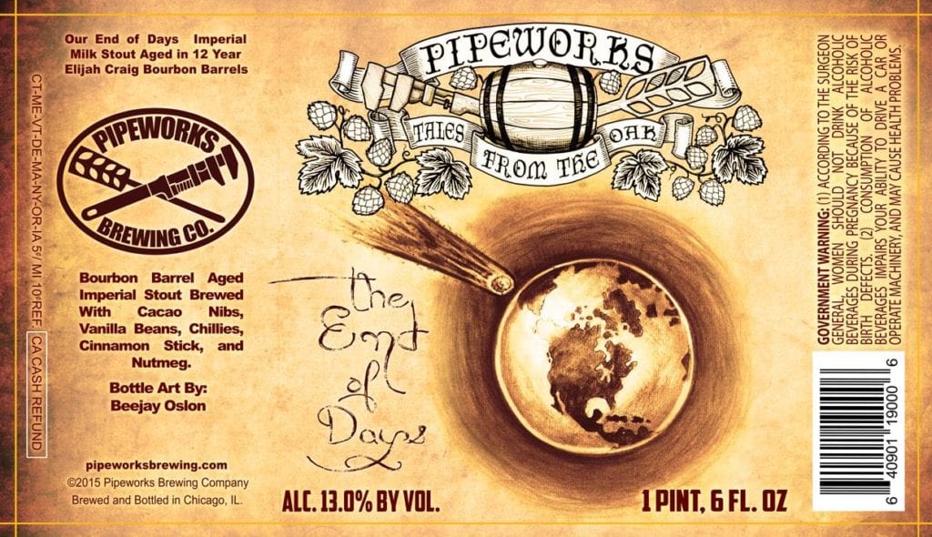
- Pipeworks Imperial End of Days
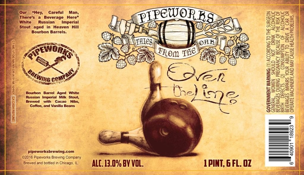
- Pipeworks Over The Line
- Both 2012 and 2014 Goose Island Bourbon County Stout
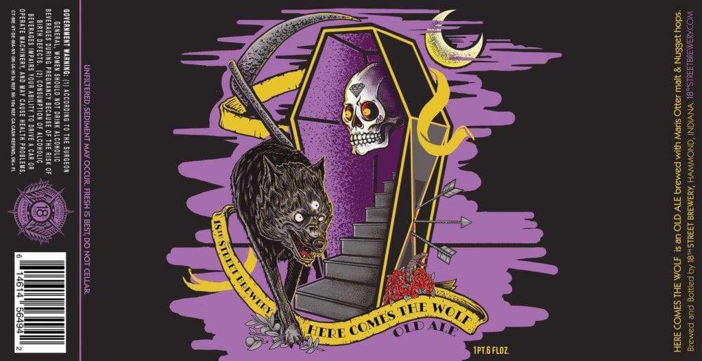
- 18th Street Brewery Here Comes the Wolf (awesome foil label on this one)
There are some gorgeous labels on the horizon. Let’s dig in!
The following labels were registered with the Alcohol and Tobacco Tax and Trade Bureau during the month of May, 2017. They have been selected for their aesthetic appeal or simply because I thought they were really cool.
Contents
- Wicked Weed Brewing Southern Ambrosia
- Cloudwater Brew Tremendous Ideas
- Jester King Final Entropy Kölsch
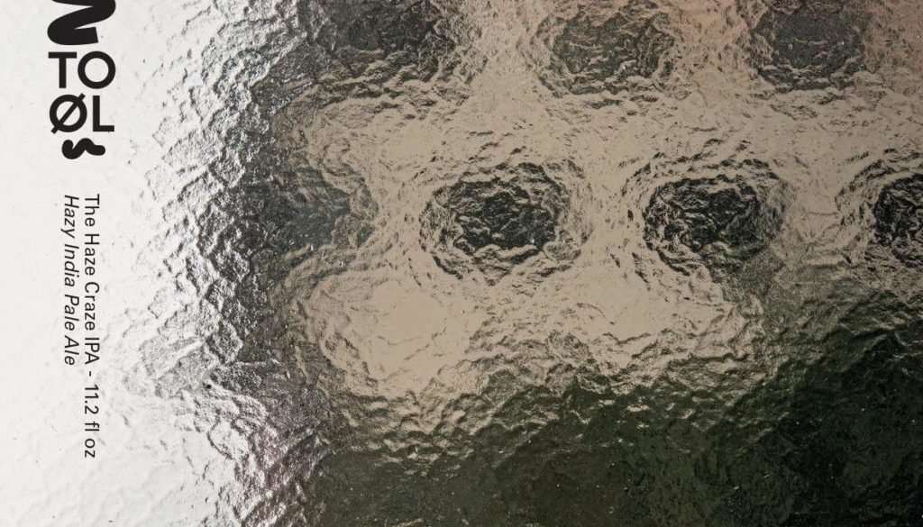
- TO ØL The Haze Craze IPA
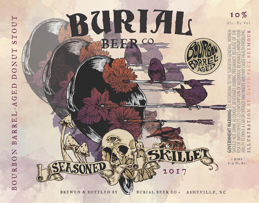
- Burial Beer Co. Barrel-Aged Seasoned Skillet Donut 2017
- Three Floyds Brewing Battle Of Charro II
- Wisconsin Dells Brewing Okto Beard Fest
- Greenpoint Beer Continuous Feedback IPA
- Relic Brewing Funeral Song DIPA
- Victory Brewing Storm King Imperial Stout
Wicked Weed Brewing Southern Ambrosia
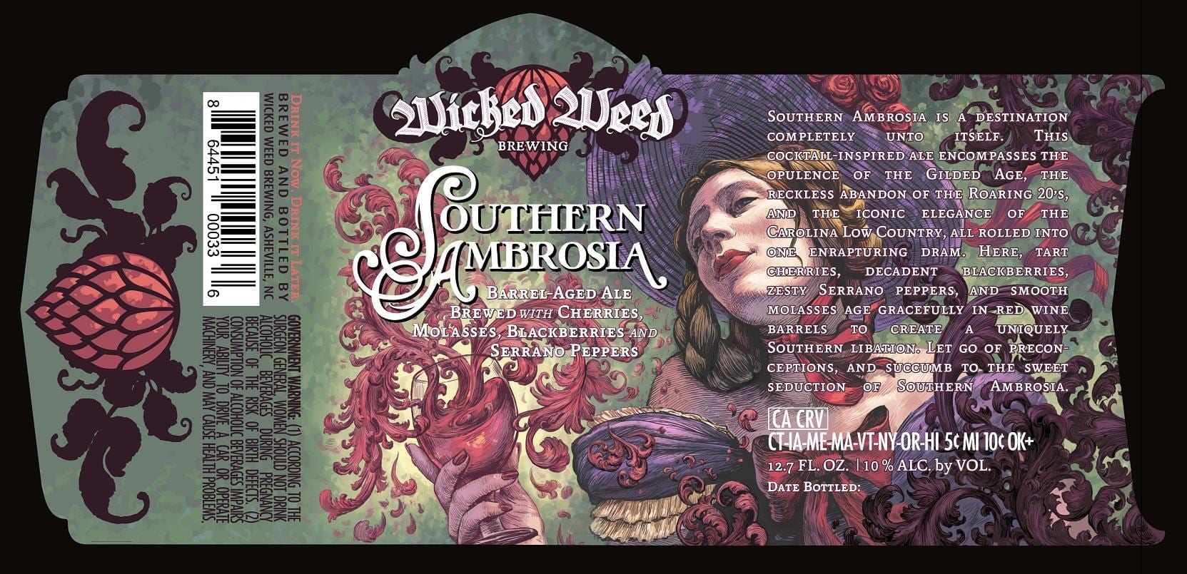 This label is a bit of a departure for Wicked Weed. So much so, I had to reach out to them because I was worried that Howell Golson was no longer creating their label art. As it turns out, he still is and this is yet more of his gorgeous work!
Cloudwater Brew Tremendous Ideas
 This label, as well as the Cloudwater logo, was created by Chris Shearston of Textbook Studio in Manchester.
May was a great a month for abstract label art, as you’ll see as you read on.
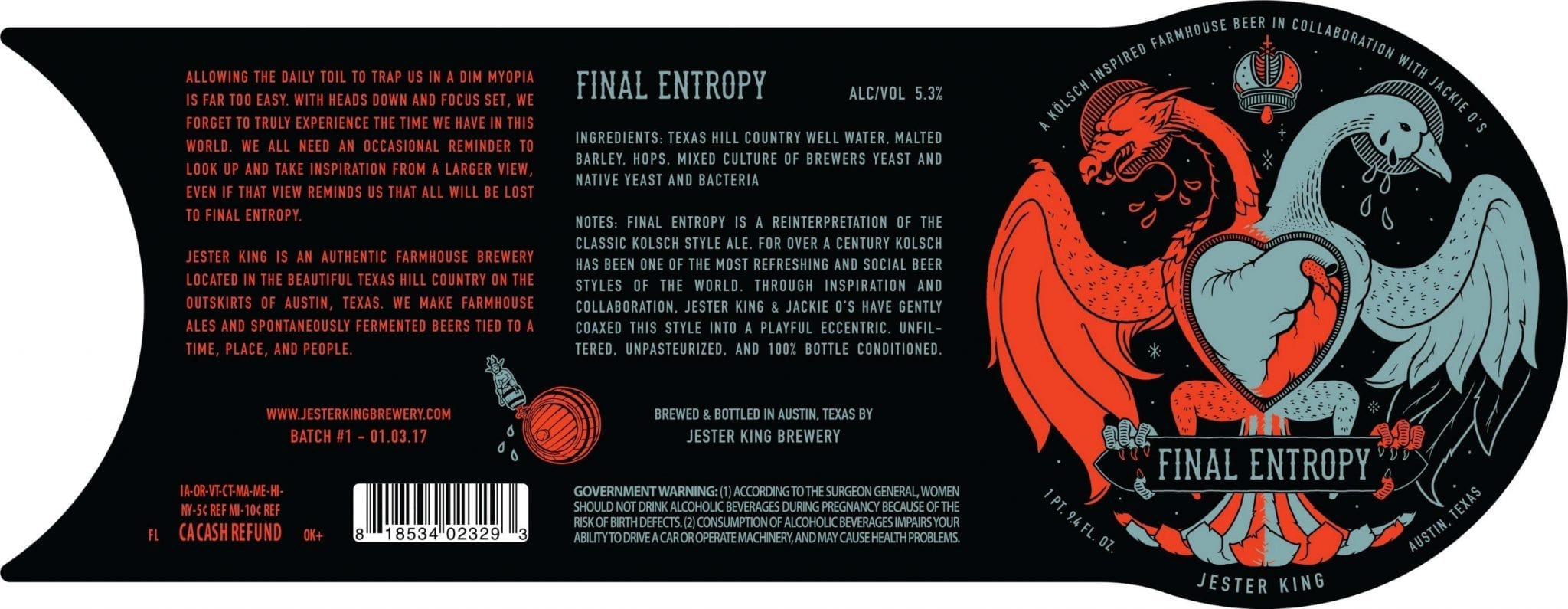
Jester King Final Entropy Kölsch

“The art concept really begins at Kölsch and is built around a number of visual components that were initially connected to it. The general form of the design pulls from the Crest of Cologne, the birthplace of the Kölsch style. The crest features a two-headed eagle, which immediately caught my interest as good opportunity to represent the collaborative nature of the beer. 11 ‘drops’, a shield, and several crowns are also present on the original crest, but from there it began to deviate from its original form as I created a new personal context for much of it, just as the beer itself is more inspired by Kölsch than actually being Kölsch itself.
“I replaced the shield section of the crest with an exposed and shared heart to represent the (philosophical) aesthetic overlap of the breweries and the rather exposed personal philosophy displayed in the artwork. Though the two-headed creature of the original crest works well to represent collaboration, I wanted to draw a bit more from it as well. The cold ‘lager’ finishing fermentation of the Kölsch style in contrast to its initial warmer ale fermentation and even warmer birth had a poetic element to it that reminded me of the slow cold fade of the universe towards entropy. This became the backbone the concept and is what gives the design its rather dichotomous appearance, though it’s more meant to depict a lateral shift. Considering that I tend to have a rather romantic appreciation for nihilism, it seems fittingly ironic that a dichotomous theme emerged. I began to expand on the concept of creation/energy/life moving towards loss/entropy/death. All eleven ‘drops’ from the original crest are accounted for. This was important to incorporate into the aesthetic as a carry over from Bryn Perrott, the artist who created the amazing works for Jackie O’s mainstays. Energy and drive for life are represented in the salivation of the dragon, loss in the tears of the transient snow goose, and waste in the bleeding ‘sacred’ crown (a personal and specifically nihilistic viewpoint on religion as a wasteful endeavor). There is a very tender detail that I chose to subtly include as another overlap in the breweries. There are five larger stars that start at the red star in the crown and disperse from there to represent the astrological sign Cancer. There is a personal significance to me and to the owners of both breweries in the loss that the constellation represents. As the general theme of the label concludes, sometimes great inspiration can come from the very real recognition of loss, and for me, such loss inspired a philosophical departure. The ultimate resulting nihilism is present in the label but does not condone defeat or inaction, rather it encourages one to recognize the limitations of existence and learn to work with purpose instead of wasting precious effort searching for meaning.
“The art on this label and all Jester King labels was created by me. The name and text are indeed my creation as well, which is the case for nearly all Jester King beers. For this label, I had a specific thought on the concept and how it would come out in both writing and in the art. I created the artwork first and then worked afterward to gather and articulate the concept into words for the left panel.”
TO ØL The Haze Craze IPA
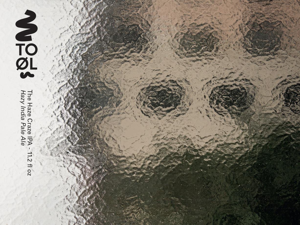
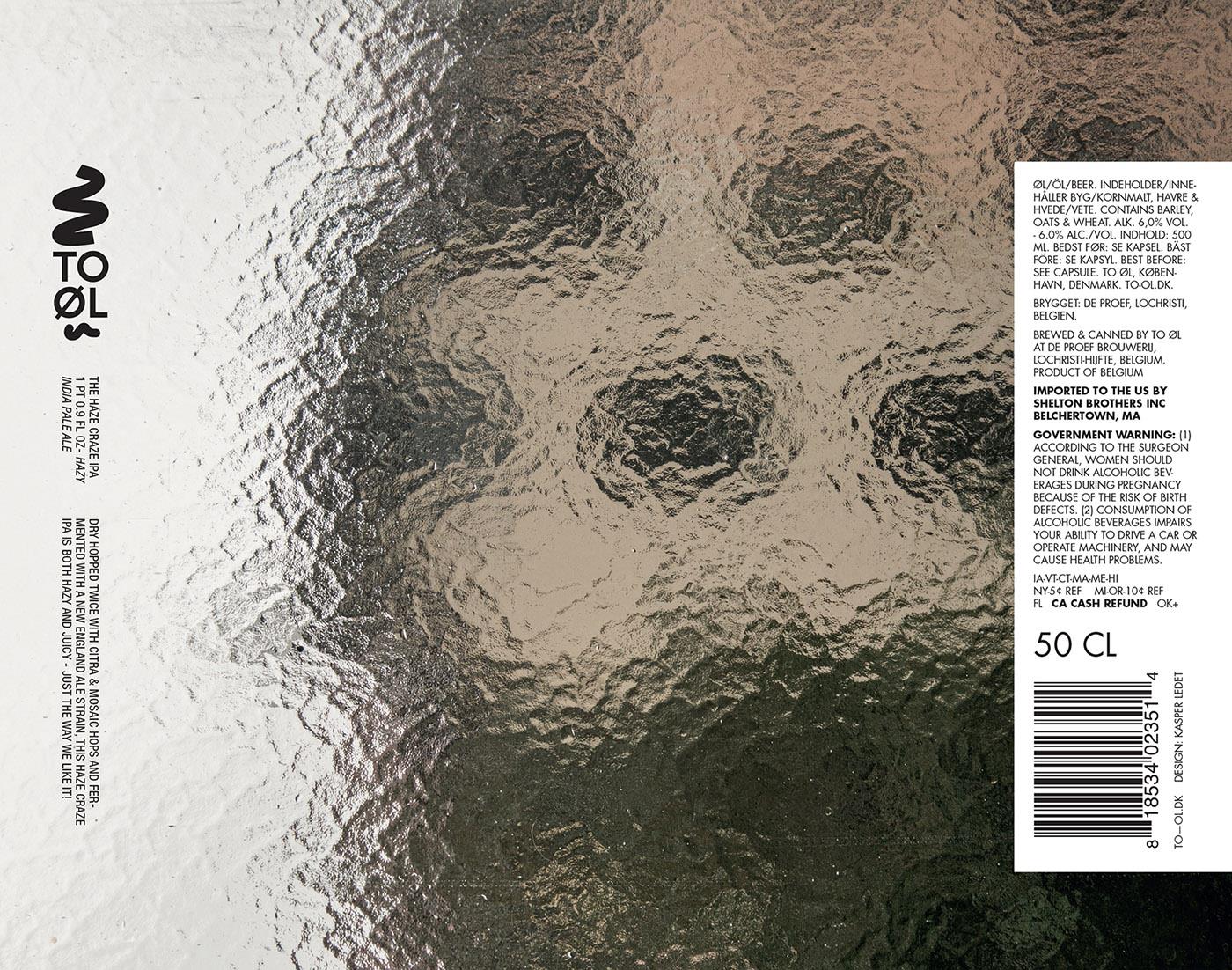
TO ØL’s art photo labels are a favorite of ours.
Buy TO ØL Beer from Inside The CellarBurial Beer Co. Barrel-Aged Seasoned Skillet Donut 2017
Three Floyds Brewing Battle Of Charro II
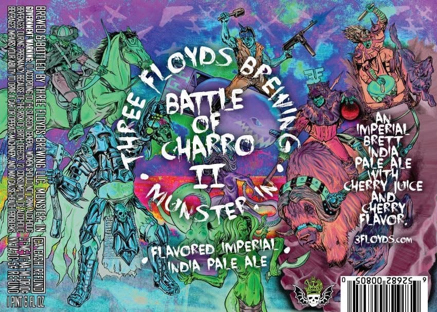
There’s some insane stuff going on here. Words don’t do it justice and to be honest, every time I try, I find something new and I don’t know where to go with it. Definitely check out the original artwork on Jones’ site.
I’m also first noticing that Three Floyds gives artist credit for their labels on the website! Is there anything they can’t do?
Wisconsin Dells Brewing Okto Beard Fest
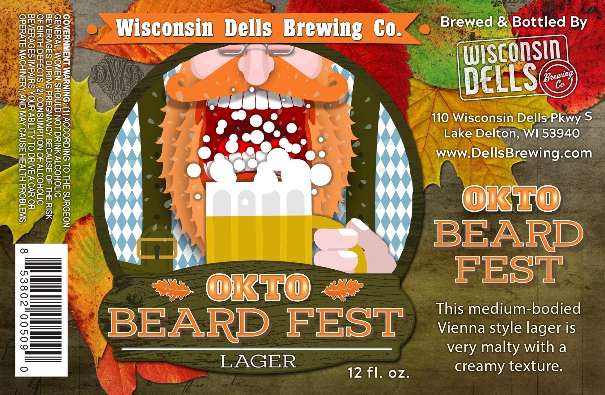
“The pumpkin market seemed like it was oversaturated this last year and we get great reviews on the Okto Beard Fest, so we put it in the fall seasonal bottle spot instead. We left just a touch of the traditional blue and white that you see as the main color on pretty much everyone else’s labels. Hopefully, it goes over well – it’s one of my personal favorites.”
Greenpoint Beer Continuous Feedback IPA
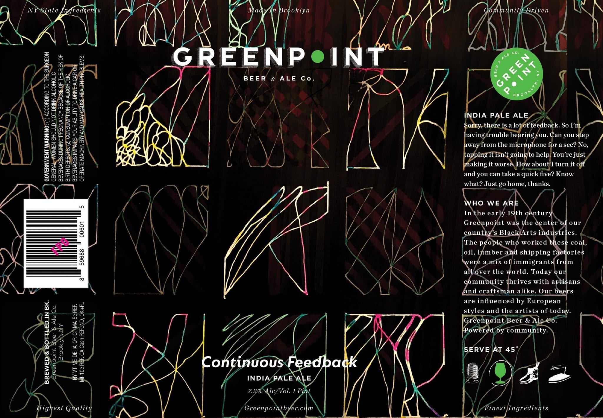
Greenpoint likes abstract art for their can labels. I’m guessing because titles like “Constant Reassurance” and “Instant Credibility” don’t offer up obvious imagery. Plus the literal interpretation of “Grey Matter” wouldn’t sell a lot of beers.
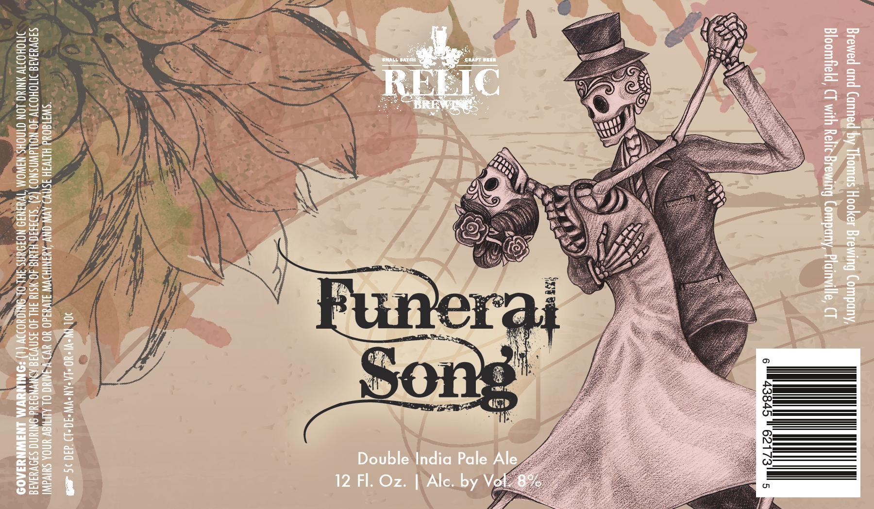
Relic Brewing Funeral Song DIPA
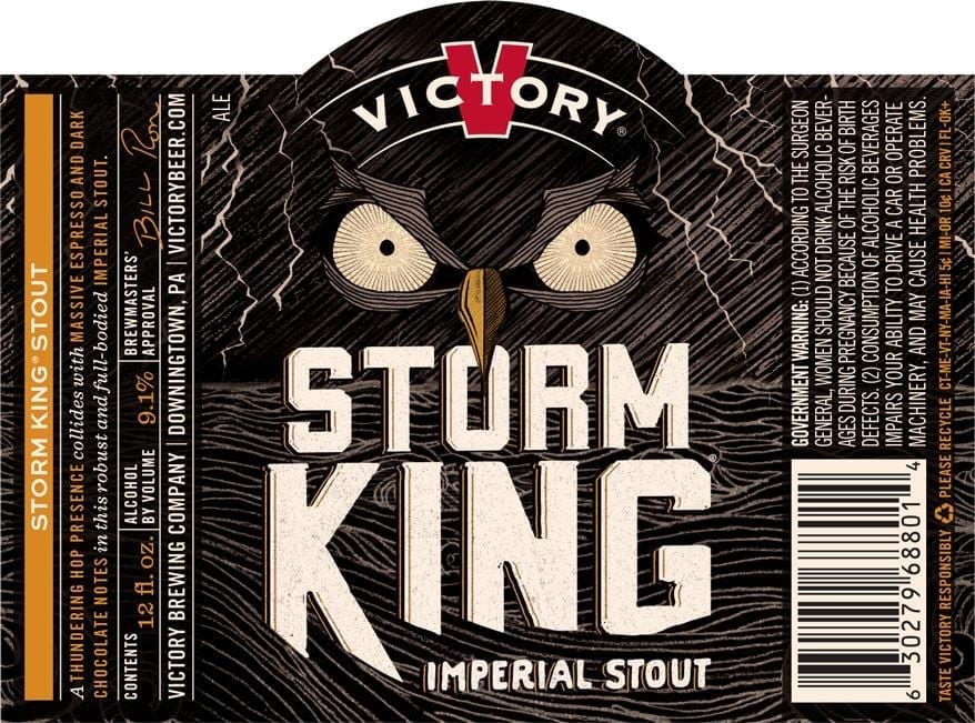
Victory Brewing Storm King Imperial Stout
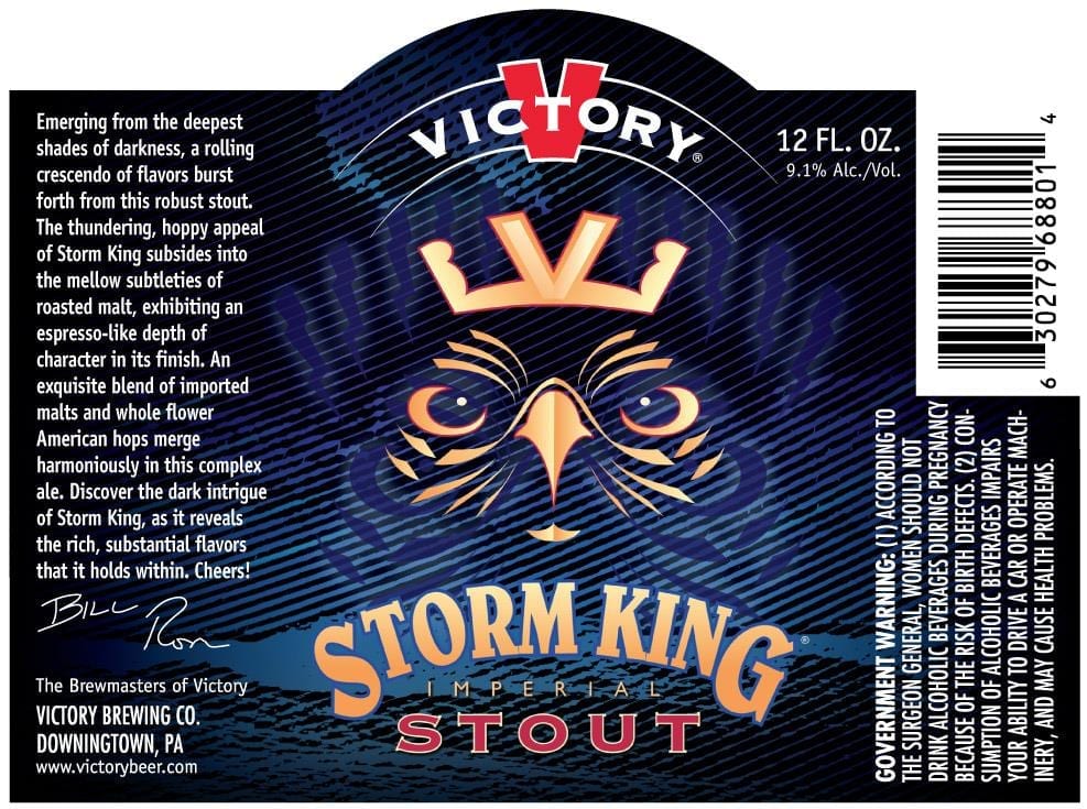
According to the Wikipedia section about owl symbolism, “In general, owls are viewed as harbingers of bad luck, ill health, or death.”
Label images research made possible using the highly recommended LabelVision search tool at ShipCompliant.

