There’s not much of a story here – companies rebrand all the time. As of this writing, they haven’t even updated their website and their Facebook page has teased the new look, but nothing official is there. Perhaps you’ve already seen the new Blue Moon Brewing commercials where oranges rain down from the sky like giant citrusy hail. The new logo is tough to spot, but it’s there.
That said, I thought a little before and after might be fun. This is my first post using a fancy image comparison slider. Below each is a little slider handle. Drag it back and forth to see the before-and-after. Let me know if you think I should do more of these.
Contents
Blue Moon Belgian White
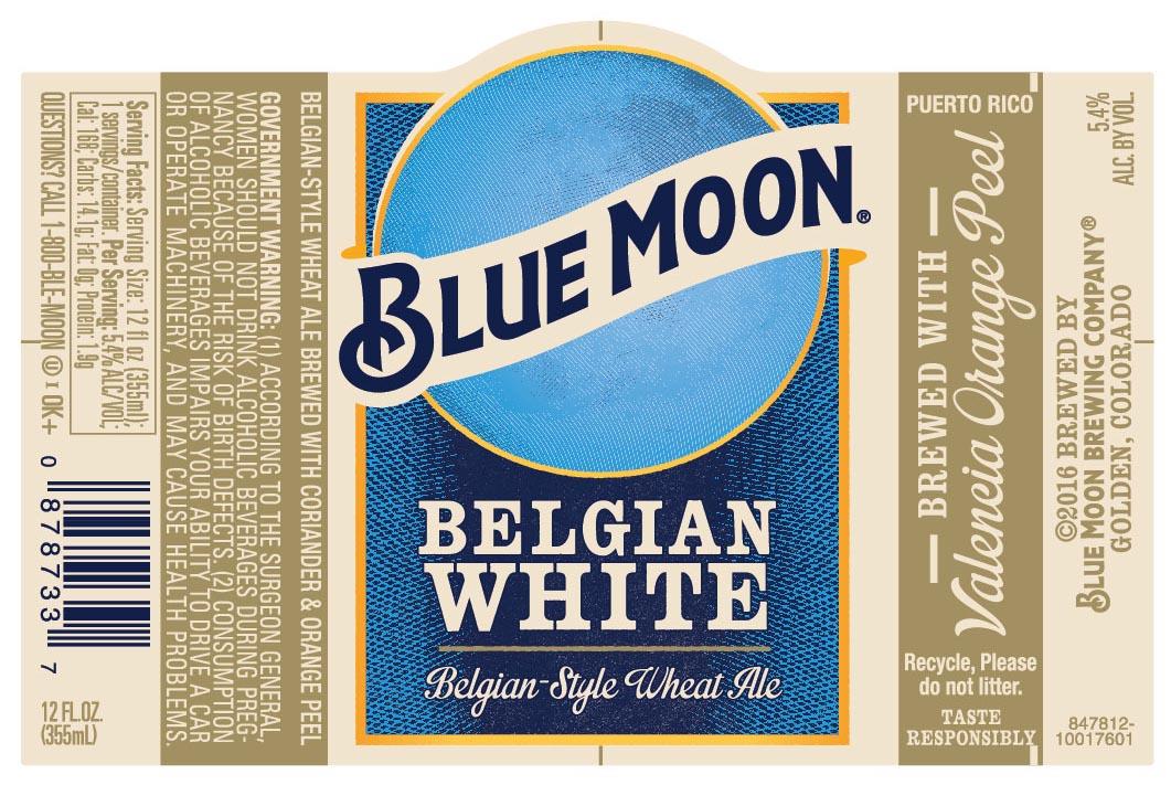
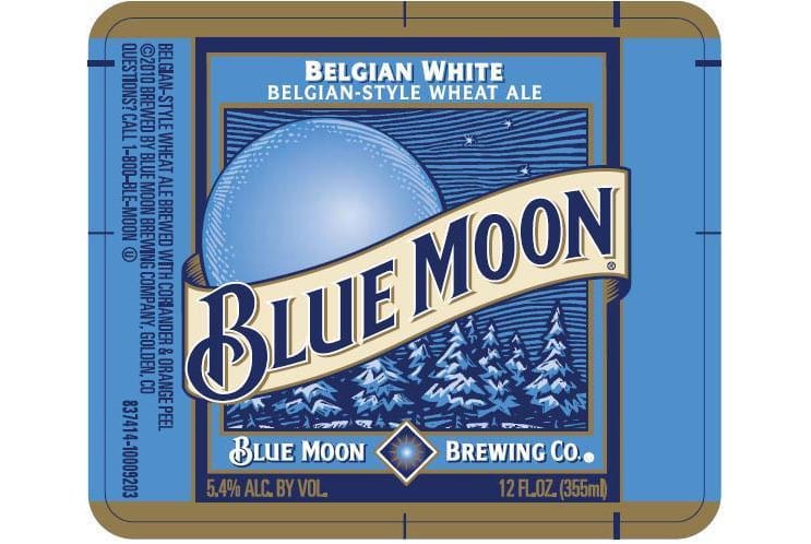
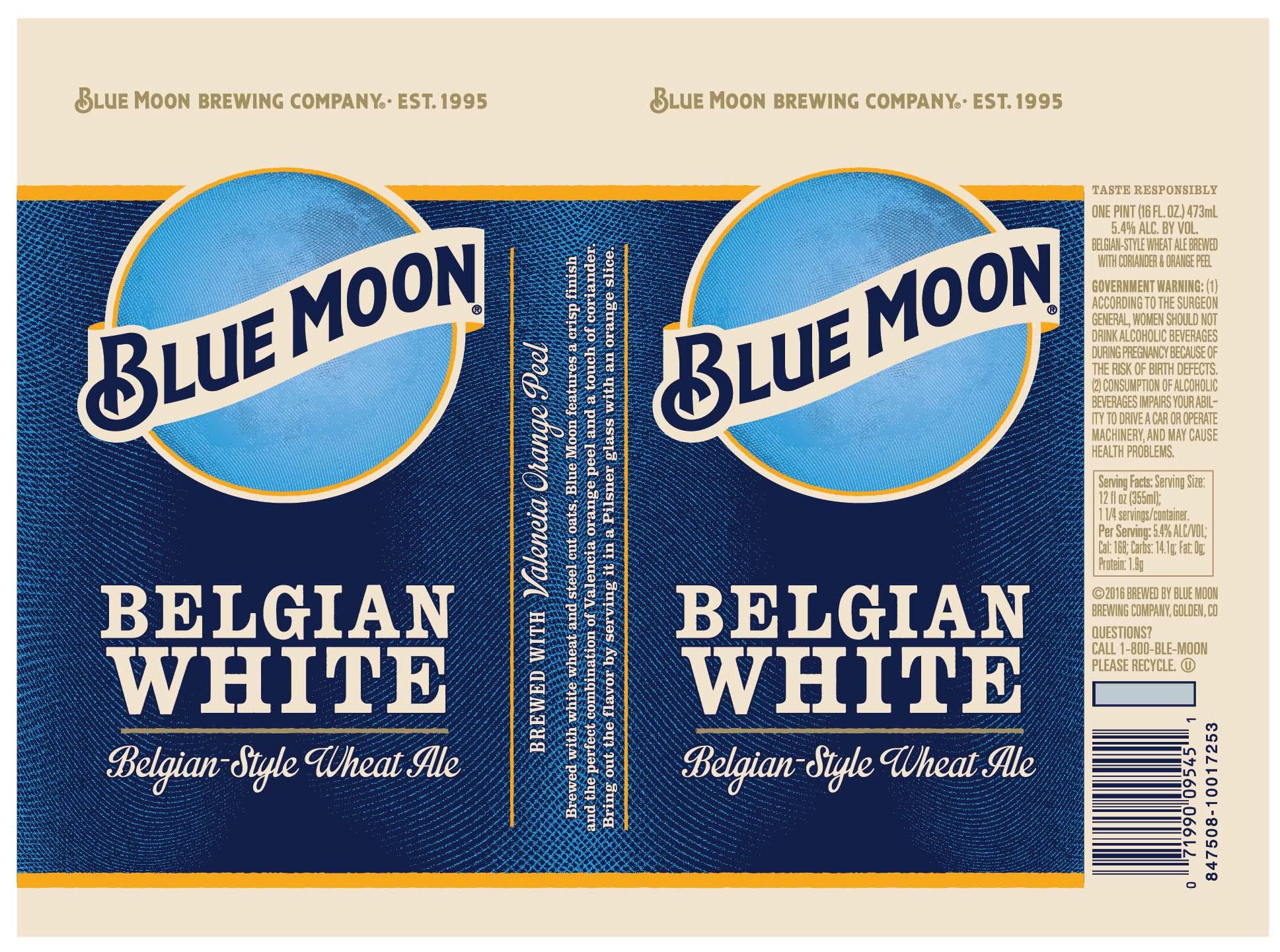
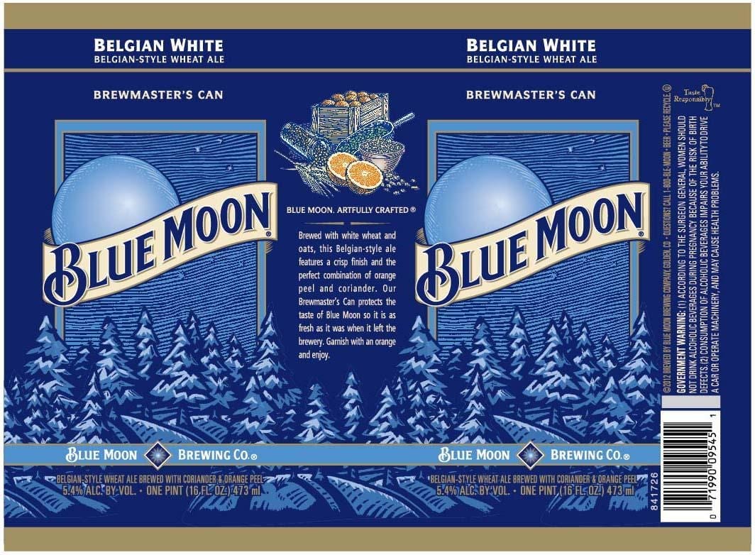
Look out, Wedge Head, it’s the old Blue Moon standby, Belgian White. Goodbye, woodblock-style engraving. Hello, engraving-style engraving, but with a flatter banner and logo. So long, snowy trees. Greetings, nondescript etchy gradient plane. I really like the flatter logo and how the banner shape is much more of a suggestion than a three-dimensional representation. It just kind of breaks the image plane and hints at a curl at either end.
I feel that the rebranding was an opportunity to make that Moon much more, well, moon-like. Why not a crater or two? Instead, we have the same old ominous orb. I mean it looks nice. I love the texture. But it’s the texture of an engraving and not that of our crater-blemished satellite.
Coincidentally, I was heading out to my folks’ in Easter Sunday traffic and I thought a little R.E.M. would help pass the time. I fired up Spotify, hit the artist page, and put it on random. I was very surprised to see an undeniably moon-like blue moon staring me in the face. This from their 2003 “best of” album, In Time. Now that’s a moon.
(Yes, that’s an Amazon affiliate link. I figured adding that would be easier than risking copyright infringement with the cover image. This isn’t an album review, after all.)
Blue Moon White IPA
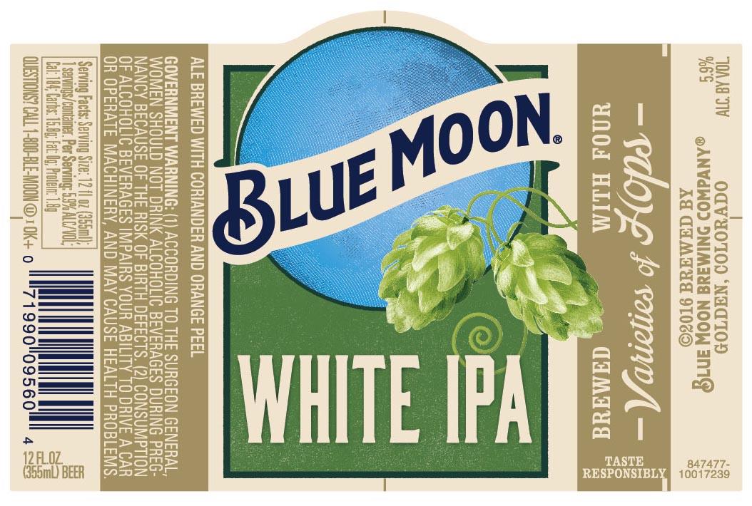
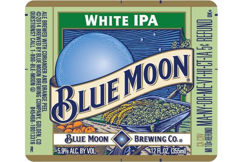
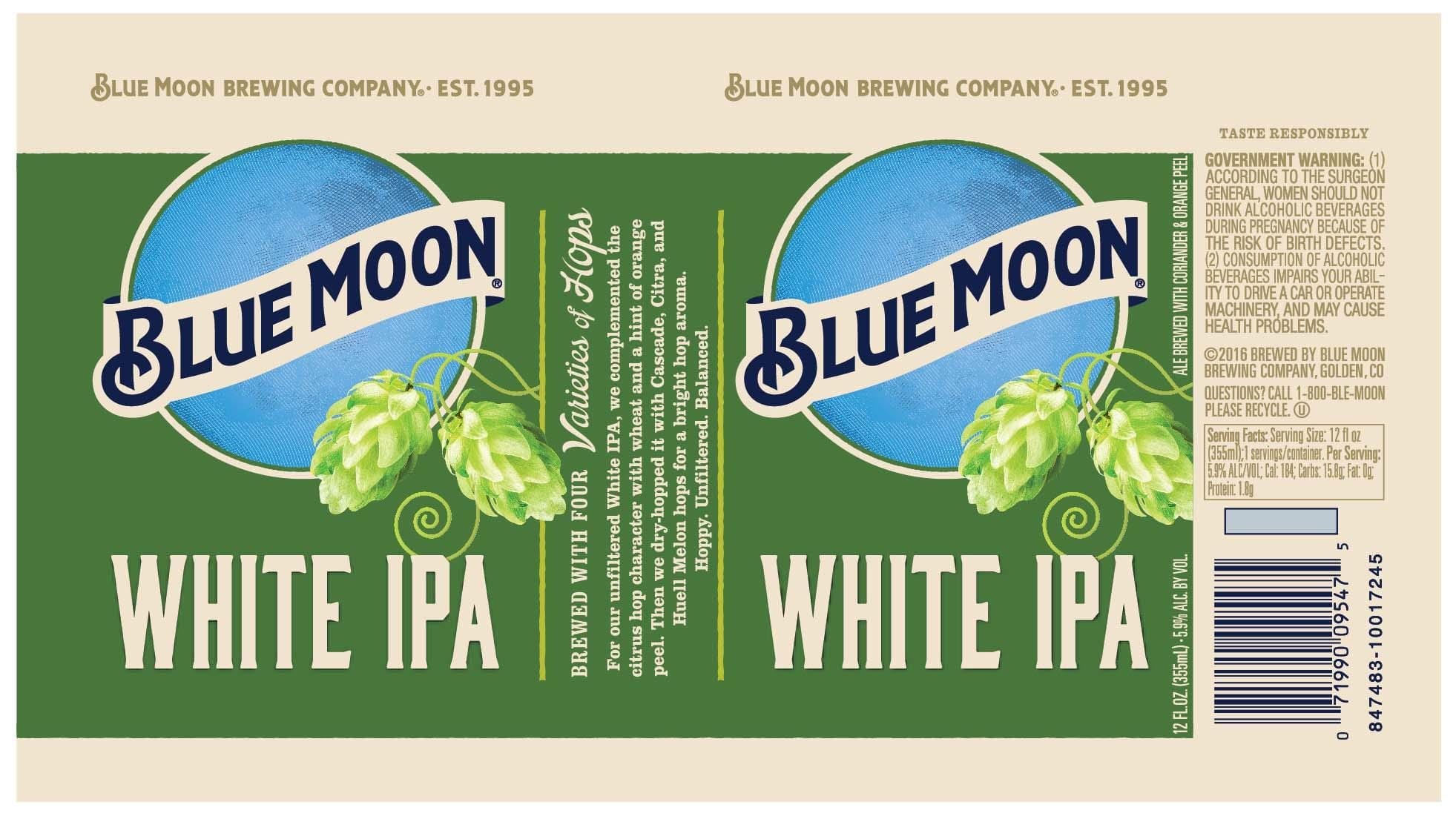
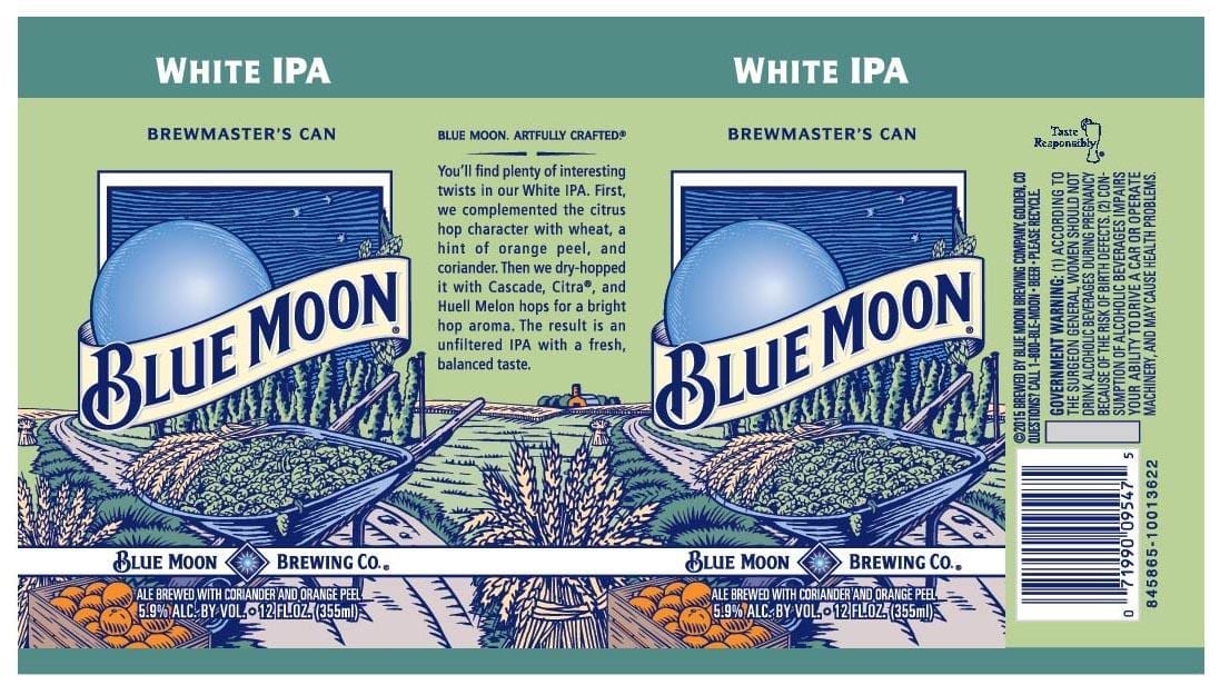
So using the Belgian White as the base design, we see now where Blue Moon has decided to inject variations for each of their other beers. The new White IPA label still has a green color scheme (presumably the color of hops), but the wheelbarrow of ingredients has bee replaced with vines and a couple of hop cones. It’s pretty nice, as hop illustrations go. We’ve also traded the gradient background for a more solid, lightly textured one.
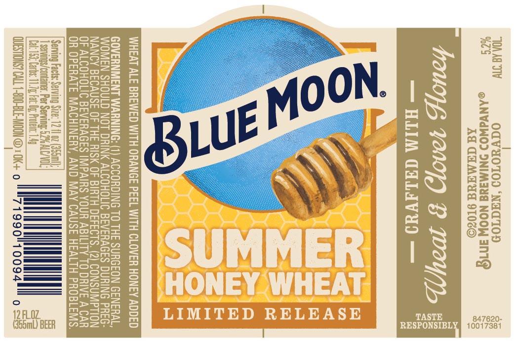
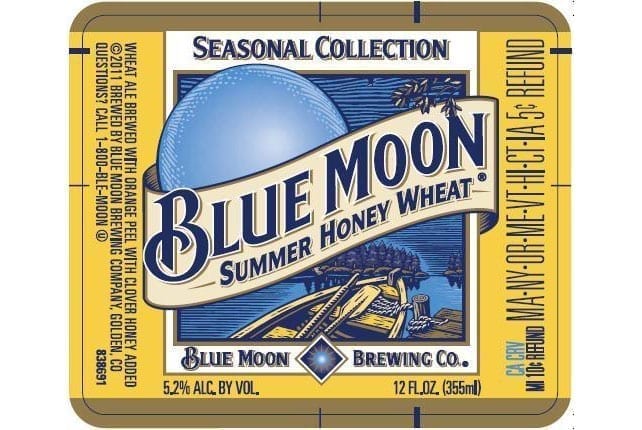
Blue Moon Summer Honey Wheat
Again, the color scheme of the old label is carried over to the new one. This time, the emphasis on Summer and all of its boat-rowing glory takes a back seat to the ingredient of honey. We also see a change from this beer being a “Seasonal Release” to a “Limited” one, which is kind of interesting.
Am I the only one wondering where the gratuitous gooey drip of honey is? It should be dangling off of whatever that honey utensil is called.
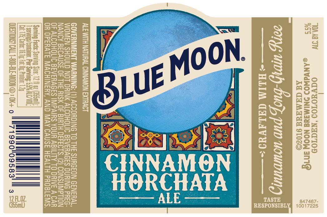
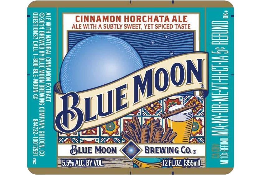
Blue Moon Cinnamon Horchata
Of all of these redesigns, this one seems to be the only one where visual elements were reused. The Mexican tile background pattern from the old label has made its way onto the new one. It seems strange that this one also does not feature an ingredient, especially since the cinnamon was so prominent on the old version.
It’s also worth noting that the typeface used for the beer name has a Mexican feel to it.
I can never bring myself to try this beer. It sounds disgusting to me and it seems I’m not alone in that evaluation.
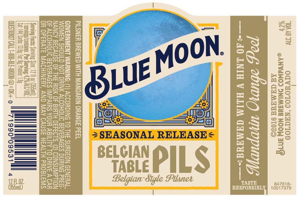
Blue Moon Belgian Table Pils
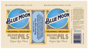 This label seems to be for a brand new beer, so nothing to compare. I don’t know what to make of the background image unless it’s somehow “Belgian-y”. A bit of a tweak to the font here too to make it more European looking. This is also a Seasonal release.
The label text hints at Mandarin orange peel being an ingredient for Belgian Table Pils. Why not work that into the design? I’d live to see a spiral of orange peel breaking in from the right much like the hops on the White IPA.
What do you think?
Well, there you have it. I think the new designs are successful in getting away from what was considered dark and gloomy, especially for the Belgian White. Is it enough to steer you away from what else is on the shelf? Perhaps not. I suspect the beer cooler at my local grocery store just got a bit easier on the eye, but that’s about it.
The flatter logo is a win, IMO, but again, I wish that blue orb was more Moon-like. The more I look at it, the less it seems like a moon. In fact, now I’m starting to see a planet with no land masses like some… well, I guess I see Waterworld. Now I can’t unsee it.
What do you think?
The Blue Moon redesign comes to us courtesy of Chicago design agency, Soulsight.
Label images research made possible using the highly recommended LabelVision search tool at ShipCompliant.

