My nerdy background really shines through in discussing this week’s best beer labels. I make a handful of D&D and M:TG references and really let my geek flag fly. No apologies. I call ’em like I see ’em.
The following labels were registered with the Alcohol and Tobacco Tax and Trade Bureau during the 21st week of 2015. They have been selected for their aesthetic appeal or simply because I thought they were really cool.
Contents
Firefly Hollow Dire Chinchilla Imperial Pale Ale
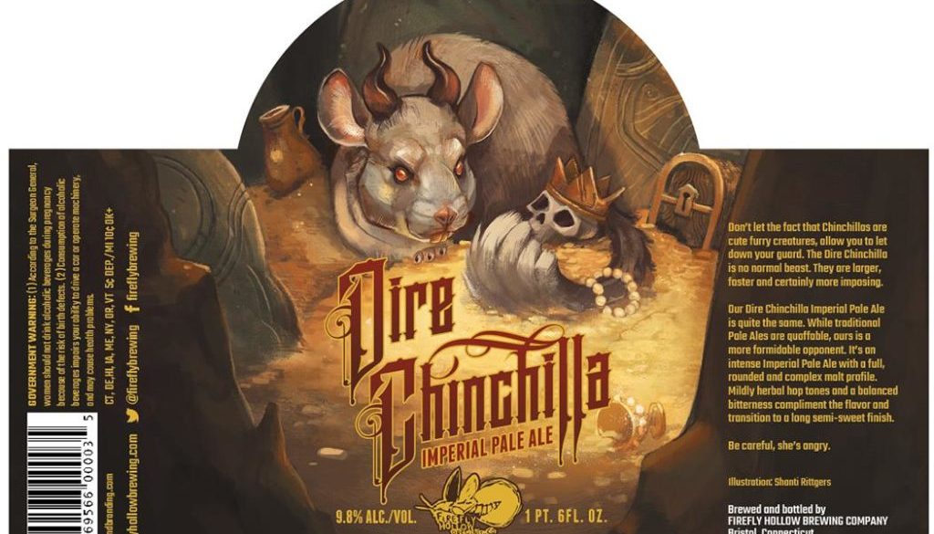
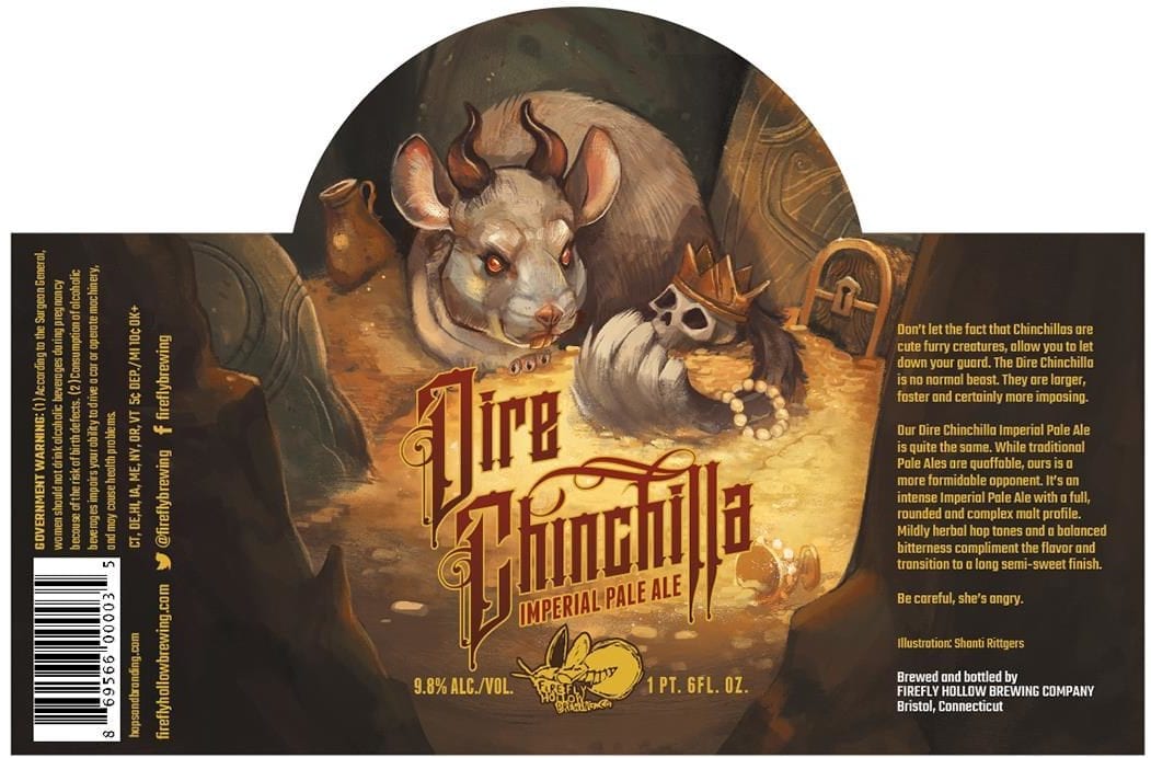
If I’ve said it once, I’ve said it a thousand times: The best beer label art looks like it could also be Magic: The Gathering card art. All this one is missing is its Power and Toughness. Based on his description and size, I’m guessing he’s a green 6/6.
This is a beautiful and hilarious take on the classic beast in his lair, surrounded by the spoils and loot it’s acquired in all of its battles. If you’ve ever seen one of these rodents roll around in Chinchilla dust, the idea of him kicking up gold coins in the same way is pretty funny. If Frank Frazetta painted a gold-hoarding, man-eating chinchilla, I’m sure it would greatly resemble this one.
The artist for this label is the extremely talented Shanti Rittgers. Check out her work from her links below.
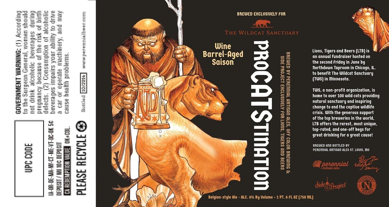
Perennial Artisan Ales ProCATStination
It’s tempting to call this a fantasy illustration as well, but I guess it’s entirely possible that this beer-drinking monk could have a large jungle cat as his companion. I just saw this on a t-shirt this week.
Beautiful washy monochrome inks and light hatchy linework give this man of the cloth a foreboding look.
I like how this image breaks on the edges in different ways – the staff makes a nice vertical, the plant forms in the lower left are mimicked on the lower right to crop the lion’s body, and the irregular edge on the left all make for a natural border.
It looks like there’s an extra image of a jungle cat looking out from under a cloth. Or perhaps out from under the monk’s robe?
@PerennialBeer @beerlabelsart @TheNorthdown our friend Tim Biedron did the art: http://t.co/tZm5L5orcd & badass @miasodesign did the layout
— Lions Tigers & Beers (@LTBChicago) June 30, 2015
@beerlabelsart @PerennialBeer @TheNorthdown @miasodesign nice! Here’s the full image: pic.twitter.com/CNvUN2AIjK — Lions Tigers & Beers (@LTBChicago) June 30, 2015
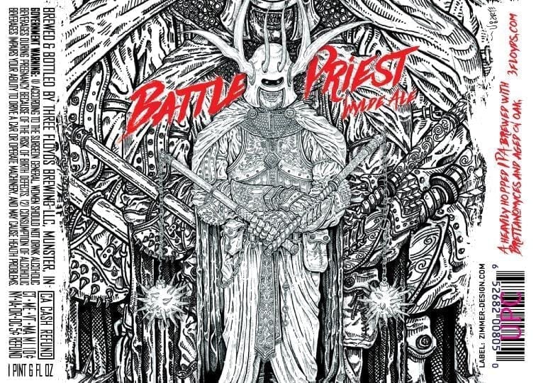
Three Floyds Battle Priest Wylde Ale
Those Three Floyds guys like it dark and they like it metal. This beer label delivers on both. The Battle Priest looks like he was lifted straight from The Dungeon Master’s Guide.
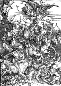 This pen and ink drawing has the feel of old woodblock illustration for extra medieval darkness. It looks like elements of the figure have been enlarged and repositioned to fill out the background. I guess they liked this figure so much, they didn’t really need a background to create a usable label. When enlarged, the overlapping elements have the same effect of Albrecht Dürer’s Four Horsemen.
All of Three Floyds labels are created by Chicago’s Zimmer Design.
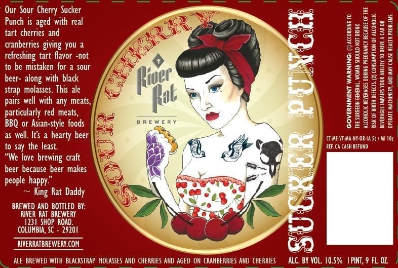
River Rat Brewery Sour Cherry Sucker Punch
Apparently Sucker Punch is a bad-ass, cherry flavored, rockabilly lady enforcer. I wouldn’t mess with her, that’s for sure. “Bitches get stitches!”
She’s drawn simply, but with nice use of color. There’s a subtle pinwheel background that works nicely to bring the focus in on her. I like the fact that the tattoo on her shoulder appears to be a rat skull. Nice touch.
@beerlabelsart it was a concept I shared some info with Chelsea a tattoo artist in Columbia. Then went to my graphics design person Colleen
— River Rat Brewery (@RiverRatBrewery) July 9, 2015
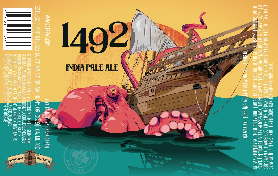
Toppling Goliath 1492 IPA
The brewery decided not to say anything about this beer or image, so I can’t really add to it. I guess if there were any humans on this boat, they were either eaten or swam away.
I like the cell-shaded handling of the color. It reads like a silk screen print.
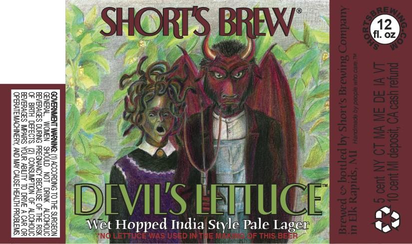
Eyesore of the Week – Short’s Brew Devil’s Lettuce India Style Pale Lager
You squares out there might not know this, but the Devil’s Lettuce is a slang term for Mary Jane. This makes for the second Devil’s Lettuce beer label I’ve written about.
This American Gothic parody has all of the qualities of a skillfully rendered crayon drawing. In keeping with my Dungeons and Dragons theme in this post, this one reminds me of something I would find on the notebook of a member of my high school’s Trenchcoat Mafia.
Label images research made possible using the highly recommended LabelVision search tool at ShipCompliant.

July 18, 2015 @ 8:17 am
Hey, head’s up, I did the drawing for Three Floyds Battle Priest, also did Man o Awe, Zes zes and few others. Link to my site on Floyds website.Cheers!
Albert