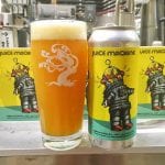
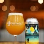
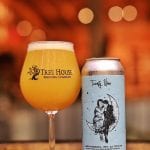
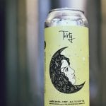
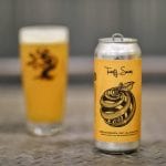
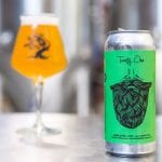
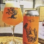
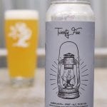
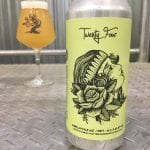
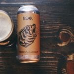
Every once in a while, I like to poke around and see what other label art beer writers are looking at and enjoying. Recently, Adam Nason from beerpulse.com recommended that I check out Dean McKeever’s work for Tree House Brewing. He wasn’t wrong – it’s great stuff!
Dean is very versatile. As an artist working in a world of dozens of beer styles, your art should reflect that diversity. It’s a great quality to have in the making of beer label art.
Photography by Tree House head brewer Nate Lanier except where noted.
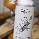
Thirsty Bastards: My favorite label you’ve done for Tree House is “Thirty Two” Can you tell me the story behind its conception?
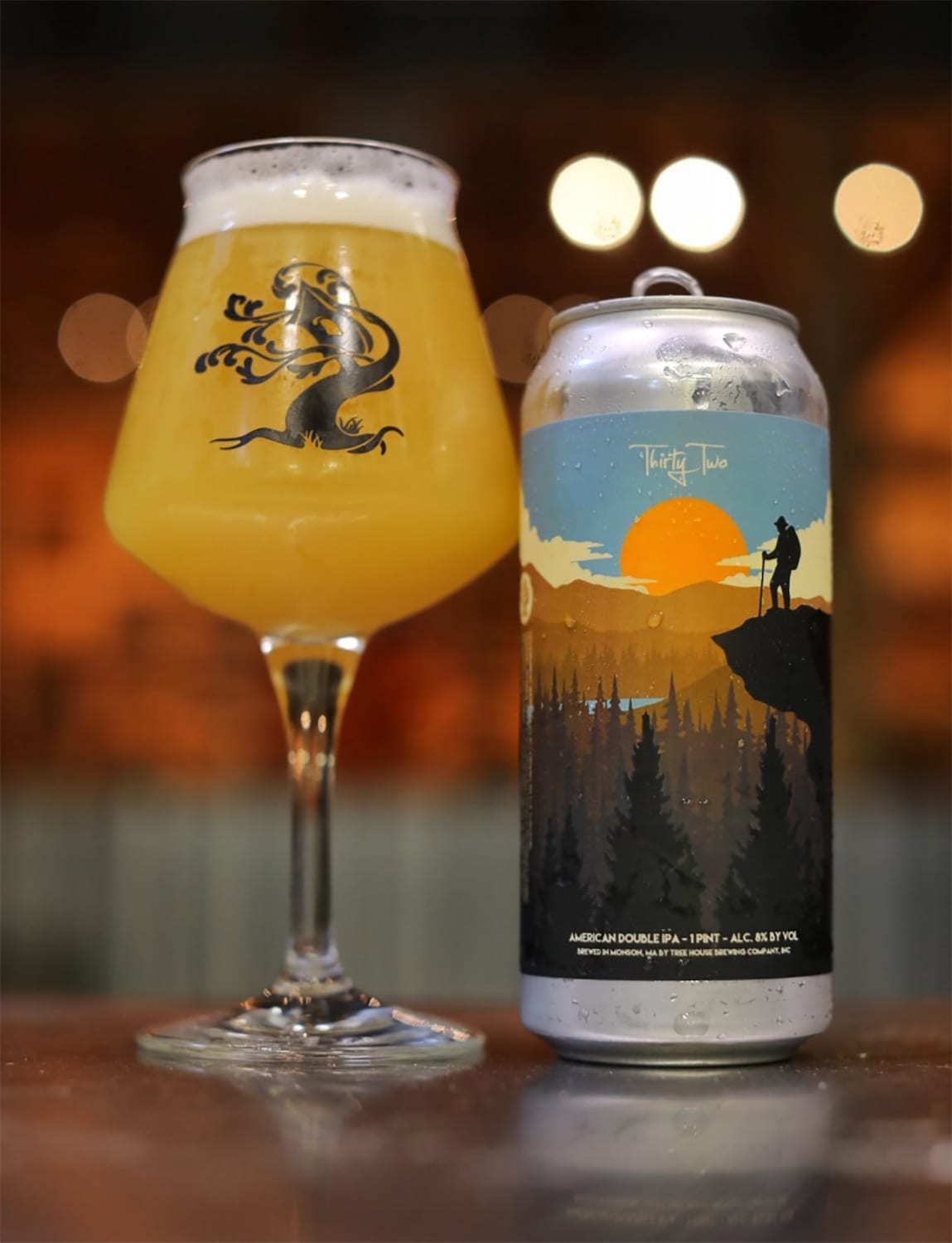
Dean McKeever: I’m glad you dig that one! Nate at Tree House sent me a generic screenshot from Google images of an adventurer overlooking a valley. He requested something with that kind of vibe, so I ran with it! 32 is special because it marked the beginning of the “new” look for the Curiosity labels.
TB: What is YOUR favorite label you’ve done so far for Tree House Brewing and why?
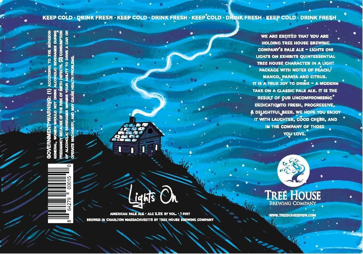
DM: It’s hard to pick one, but I think Lights On has to be my favorite. It features one of my cabins, which has become a signature ‘character’ of mine.
TB: How did you get started making labels for Tree House?
DM: I really wanted to work with a brewery – back in 2015 it was a goal of mine. I tried Tree House for the first time that summer and it blew my mind. I saw an opportunity to potentially achieve my goal and emailed the brewery through their website. I finally got a response and they enjoyed my work.
Initially, I was hired to illustrate three t-shirt designs, but two of the three never saw the light of day. The third design wasn’t used as a t-shirt but instead was applied to the Curiosity 18 label as a ‘test run’ since it looked so different compared to the other THB labels. It was well received amongst the beer community and the rest is history!
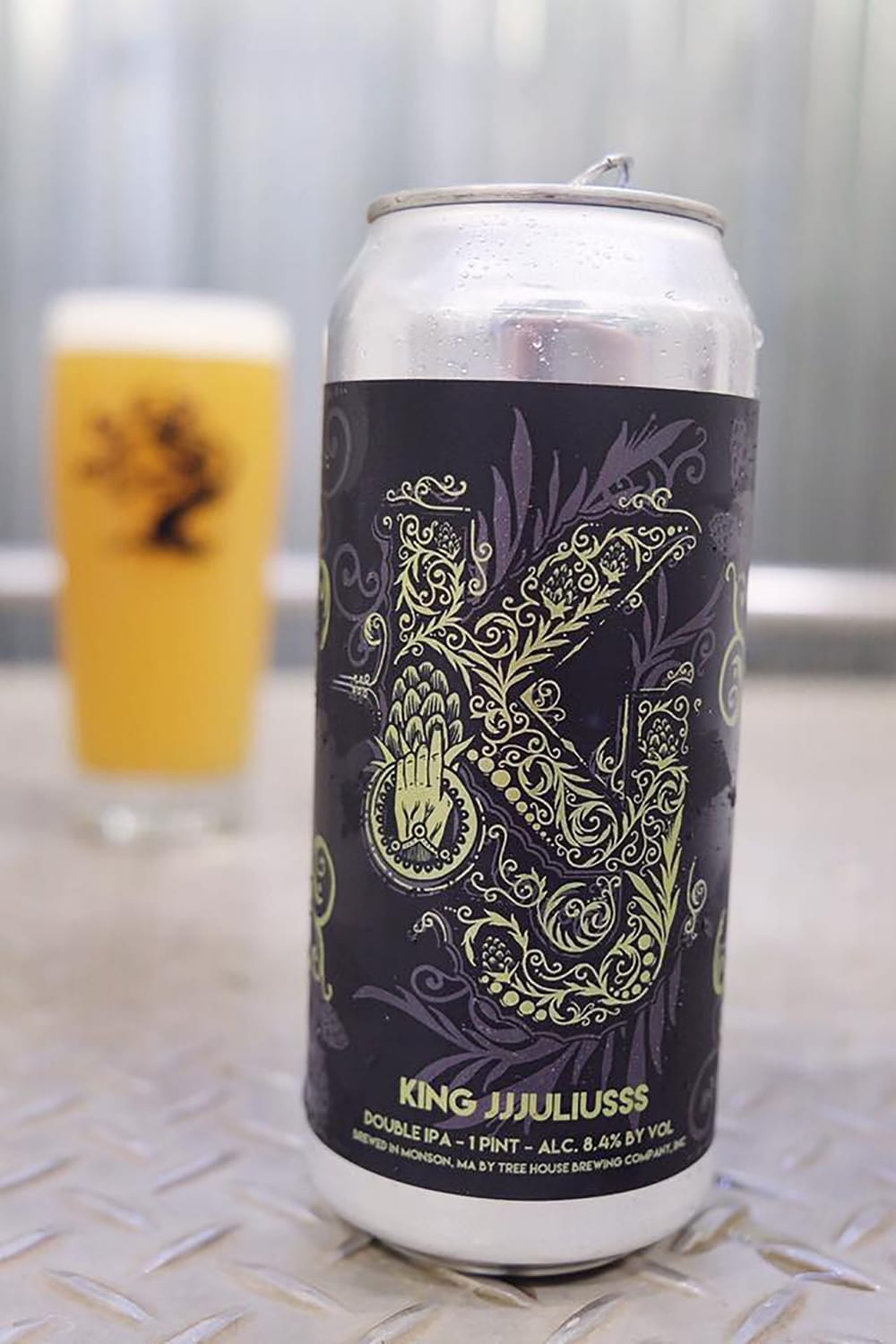
TB: I don’t see nearly enough typographic-style beer labels and your King JJJuliusss is a GREAT example. Can you tell me a little about what inspired you to take that approach for this label?
DM: Thanks! Nate sent over a very basic concept of the letters K and J sort of staggered and overlaid on one another. He also mentioned that it would be printed on a metallic label, so I really wanted to utilize silver/gold contrast and unique design elements to suggest the shapes of the letters.
TB: Since you’ve done labels for other breweries, can you tell me what it’s like being a Beer Label Ronin?
DM: It’s very exciting and challenging! I try to keep a consistent style guide for each brewery I work with, but at the same time illustrate in a way that sets them apart from one another.
TB: Where are you from and where did you learn to be an artist?
DM: I am originally from Wilbraham, MA but I now reside in East Longmeadow, MA. I acquired my artistic abilities from my father and I have been drawing since I was six or seven years old.
TB: Can you tell me a bit about your process? Are you all digital? Traditional? A mix of both?
DM: My process varies from brewery to brewery, but mostly a mix of digital and traditional methods. Most of the time I will start with a rough pencil sketch, move on to a clean ink drawing which I scan into my computer. From there I clean it up in Photoshop and bounce it over to Illustrator where the coloring and final production happens.
TB: What other art do you make?
DM: I love creating original illustrations for people! (I’m available for commissions) I have also been painting with acrylic paints a lot more these days.
TB: How can your fans find you and your work? Can they buy your art?
DM: Visit my website www.keeverart.com and my Instagram: @keever I always try to have a selection of prints and originals for sale on my site.
