Happy New Year, beer label aficionados! It’s good to be back. I have yet another batch of government-approved, beer vessel-adorning, eye-catching, guaranteed-to-cure-your-dry-eyes, label art about which to wax non-poetic. Let’s wax!
The following labels were registered with the Alcohol and Tobacco Tax and Trade Bureau during the 1st week of 2015. They have been selected for their aesthetic appeal or simply because I thought they were really cool.
Contents
Shipyard Brewing Red Rye IPA
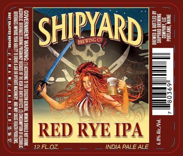
Beer labels on the shelves of your local beer store with redheaded pinups are a dime a dozen, but this illustration of a pirate lass from Shipyard stands out. She’s not busting out of her blouse, so that’s different. I love her Mucha-inspired tendrils of hair.
I’d have drawn her with a more threatening (and convincing) grip on that cutlass. It looks like if you clinked glasses with her, she’d drop it out of her hand.
Did I just say she was holding it like a girl? Aye.
Adroit Theory Brewing Company Lux
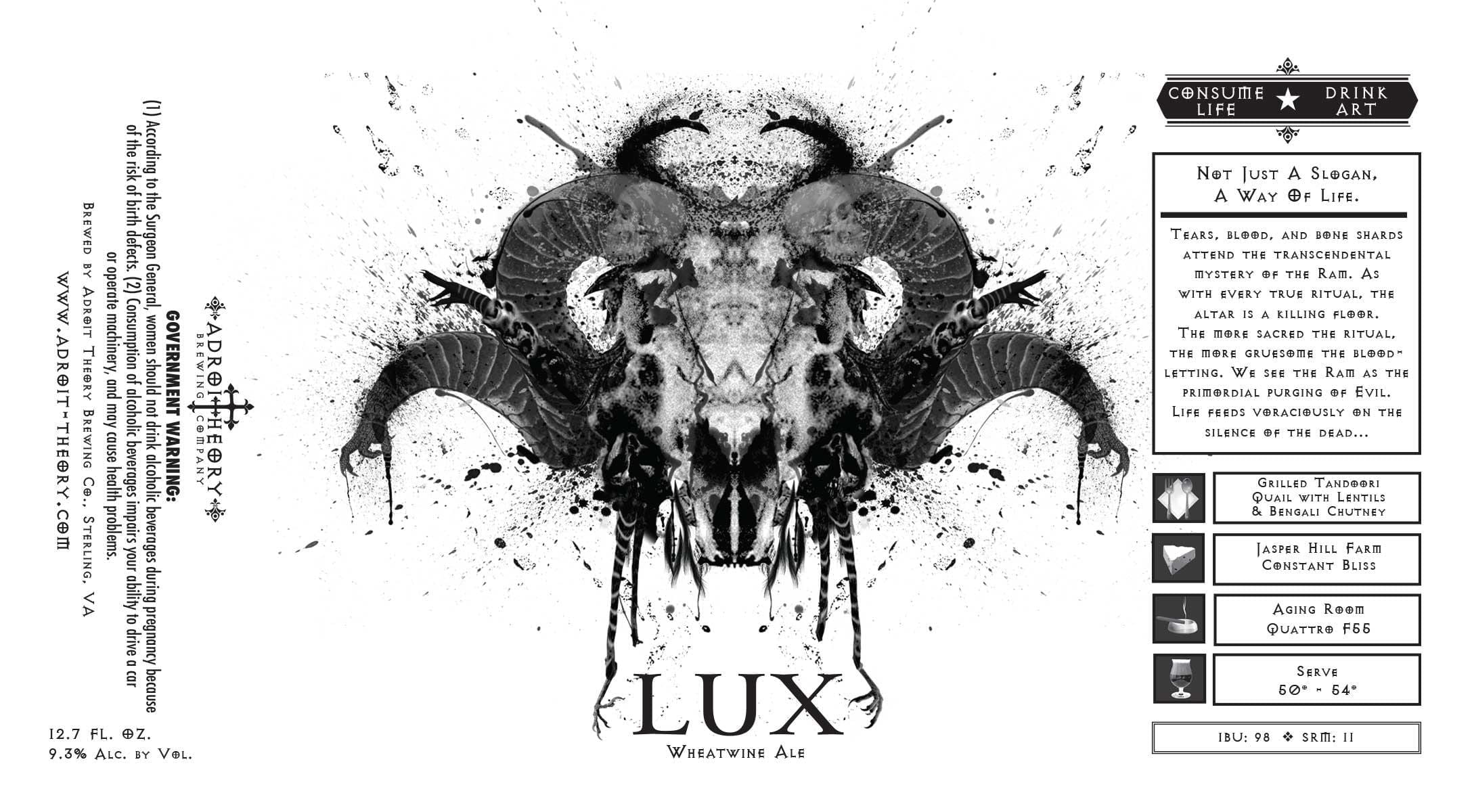
You don’t see a lot of abstract art on beer labels. This one is one part Rorschach Test, one part photomontage. There’s lots of creepy imagery in there if you look for it – skulls, tentacles, gargoyle faces. And chicken feet.
I love me some Wheat Wine and I don’t think I’ve ever seen pairing recommendations this specific on a label before.
Points off for that goth font that everyone was using in the late 90s and makes its way onto the CD cover of every high school metal band.
This ominous image was created by Shawn A Johnson.
Twisted Pine Brewing Company Northstar
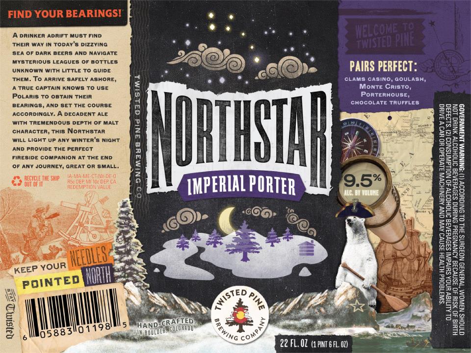 Here we have another montage of images, this time far less foreboding. This is a really cool mix of original illustration, clip art, old timey engravings, and cartography.
The theme of this beer is finding your way in “today’s dizzying sea of dark beers” – being confronted with the decision of what to grab off the shelf when there’s infinite choices. This label pushed the “lost at sea” metaphor with waterways leading into the horizon, navigational implements, alien creatures, and the stars in the night sky to keep you on course.
And speaking of parinings, these are pretty specific as well.
According to Twisted Pine, their new labels were designed by Anthem Branding of Boulder, CO.
Pabst Blue Ribbon
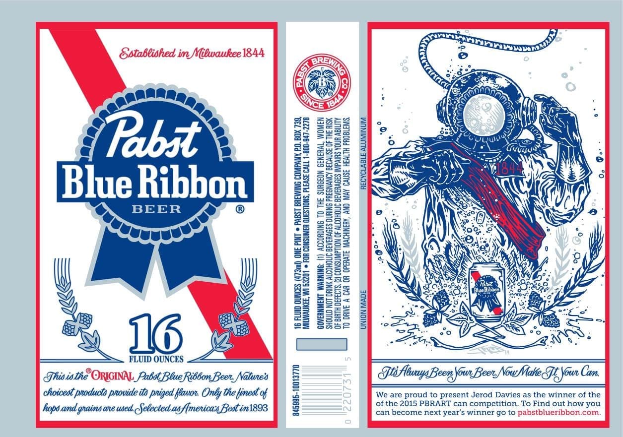
Bet you never thought you’d see a PBR label on this site.
Pabst held a contest back in March – August 2014 taking submissions to “Design the limited edition 2015 Pabst Blue Ribbon Art Can”. According to the can, the winner is Jerod Davies. A quick Google search brought me to the site of Jerod “DTOX” Davies who I believe to be the artist.
The artwork will appear on PBR 16 oz cans some time in 2015.
Thomas Creek Brewery Conduplico Immundus Monachus
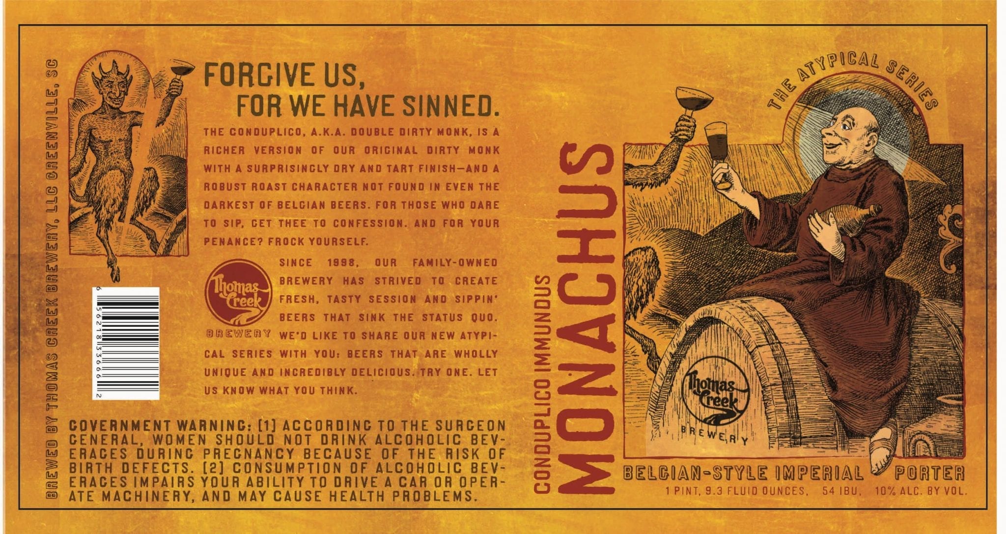
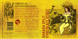 There’s a couple of these labels from Thomas Creek and I feel like they are trying to tell a series of stories. In each one (I only found two) a character representing the beer raises a glass to toast the disembodied but furry hand of an unknown drinking companion. Part of a leg is also visibile and a cloven hoof suggests with whom we might be imbibing. Turing the bottle reveals that the fur-covered arm belongs to The Devil himself!
This seems to be a re-release because this label was originally registered back in November. What’s the difference? The image of the Devil appears with a vertical tear which severs the arm and leg. It’s really pretty clever. I hope it’s intentional and I’m not reading into it.
Roughtail Wee Heavy
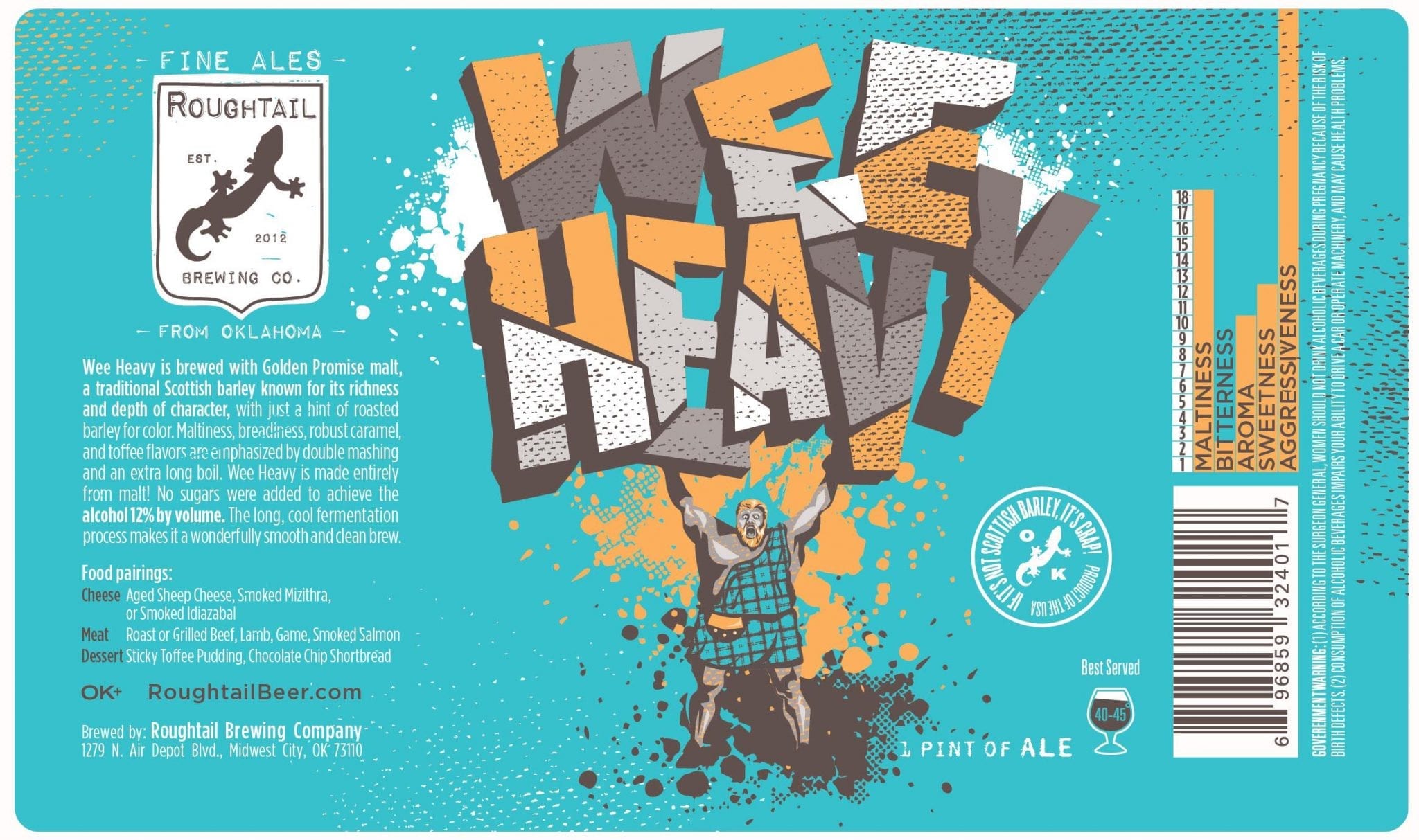
The Wee Heavy is one of my favorite styles. As you may know, “heavy” does not refer to weight, but cost. “Heavier” beers cost more in the nineteenth century.
This hasn’t stopped Roughtail from interpreting the term literally. And it’s pretty hilarious.
I wish all beer labels had the “flavor ratings” you can see here. That’s pretty cool.
Firefly Hollow Twinkler Barley Wine Ale
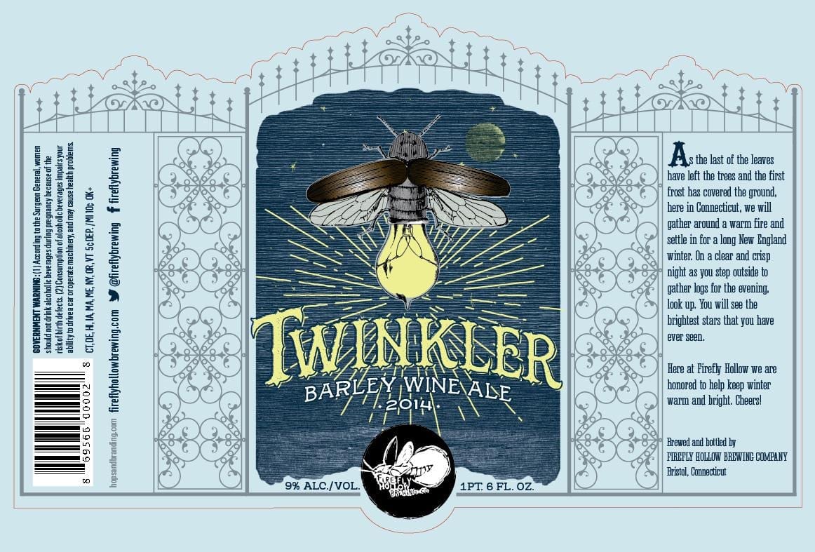
What do I like better than a Wee Heavy? Barleywine of course! Nothing warms the innards quite like a nice malty 9%.
The brewery compares the stars in the sky during Winter to fireflies, invoking the warmth and brightness of more tolerable weather. We could use some of that here in Chicago this week.
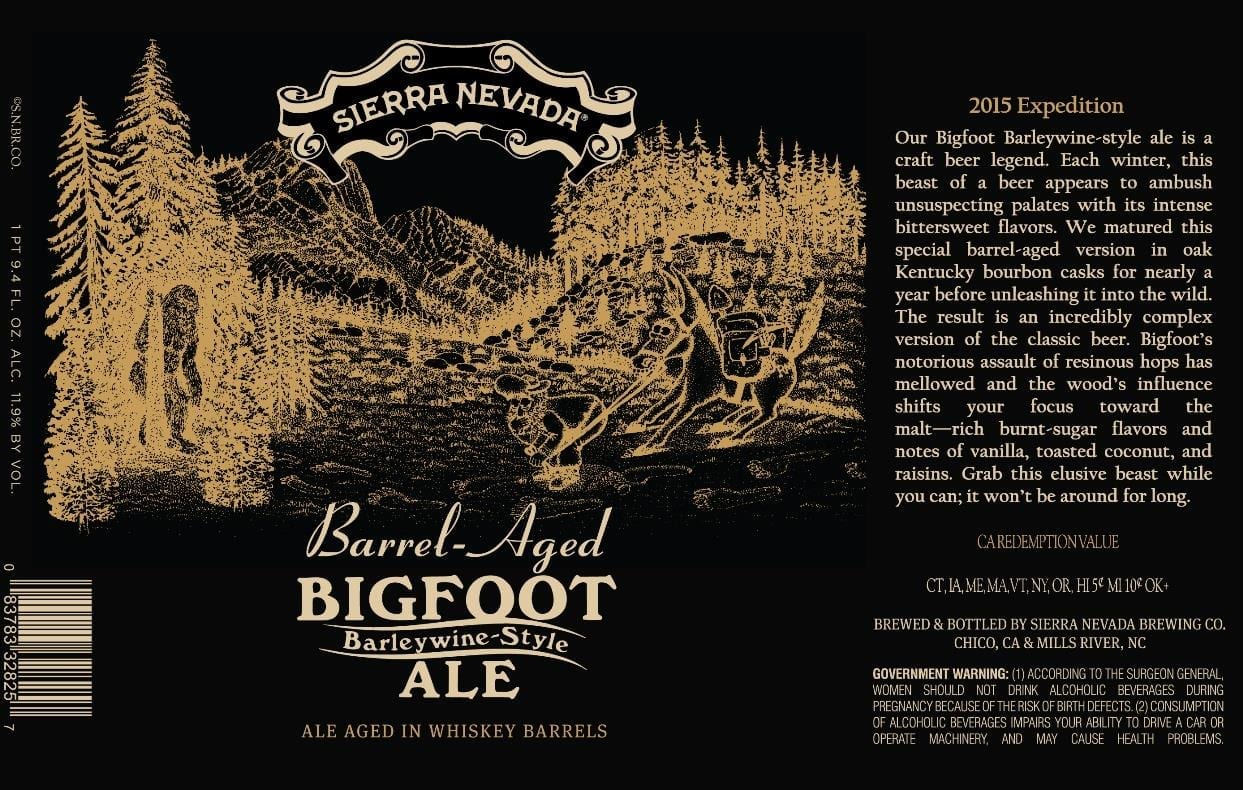
Sierra Nevada Barrel-Aged Bigfoot
I’m as surprised as anyone that such a legend in the craft beer world would end up as my Eyesore of the Week, but here we are. I should mention that, while I’m not a fan of hoppy beers, I have an appreciation for SN. I attended Beer Camp this Summer and LOVED it. I even bought the collaboration 12 pack and drank (or sampled) every single beer, hoppy or otherwise. I have mad respect for this brewery.
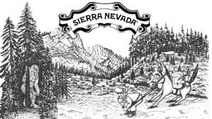
I ran the image through the filters which would restore it to its original color and contrast, and here’s what it looks like. It still isn’t anything I’d be proud to put on a label. It reminds me of the underground comix art of the sixties. Like The Fabulous Furry Freak Brothers.
Sierra Nevada’s labels follow a pretty strict format in terms of layout and imagery. You know what to expect. But come on. How does a craft brewery this large expect to slap this label on a bottle and not get a snub or two? It just goes to show you, no one in the beer marketing business is immune to bad taste.
Label images research made possible using the highly recommended LabelVision search tool at ShipCompliant.
