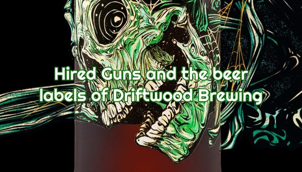
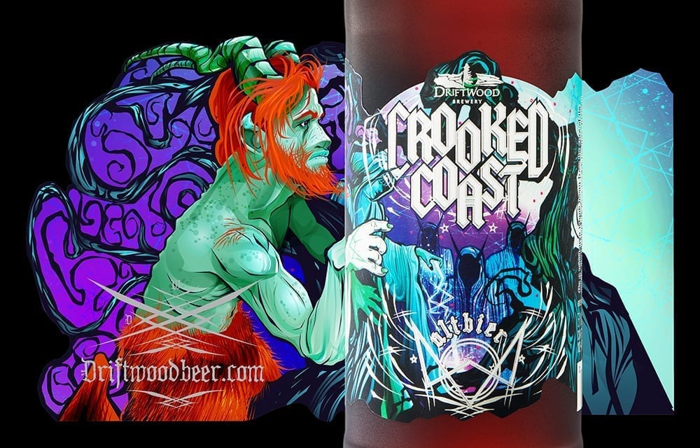
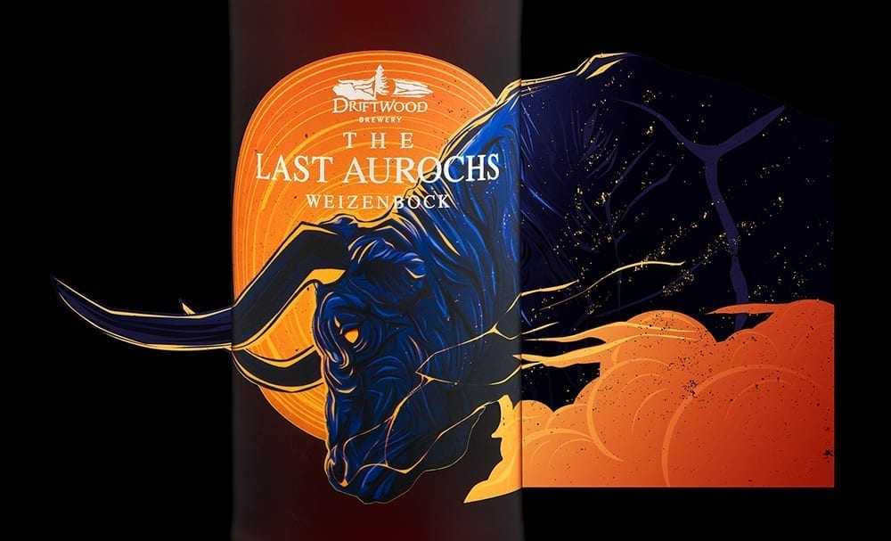
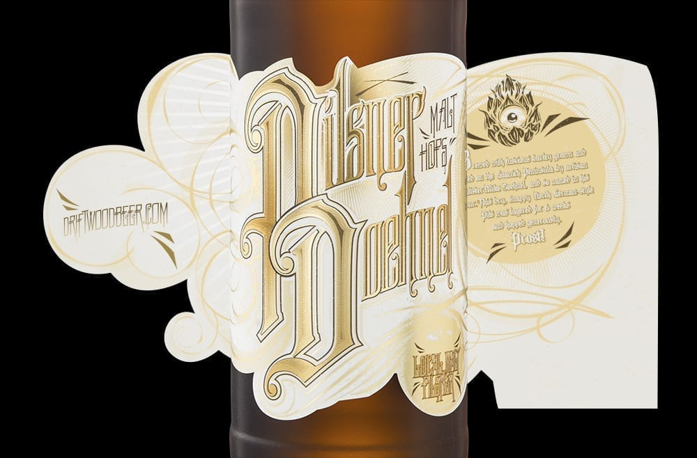
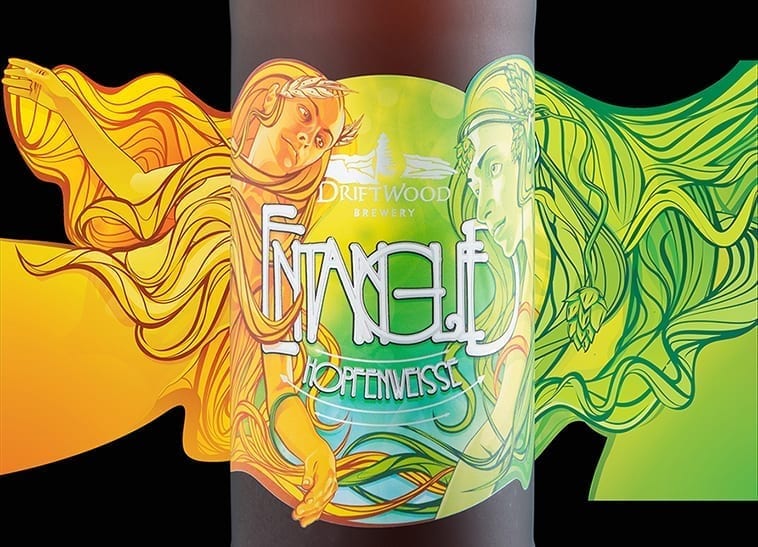
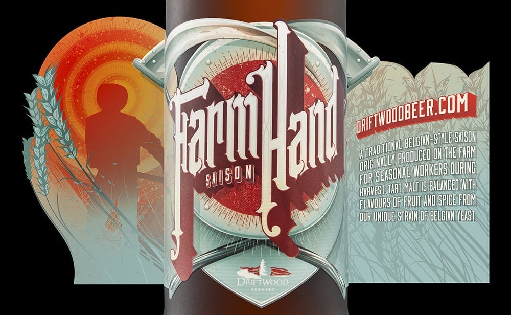
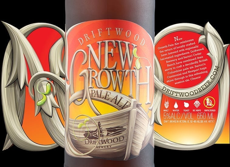
I first became aware of the work of Hired Guns Creative back in 2015 when I featured their pumpkin beer label from Longwood Brewing in our “Best Of…” post. Since then, we’ve played Twitter tag with Hired Guns on a few occasions, especially when a new label masterpiece hits the shelves. Leif Miltenberger was kind enough to answer some questions about being one of the few design agencies dedicated solely to the alcohol industry as well as their extensive work with Victoria, BC’s Driftwood Brewing.
All label photography by Sean Fenzl.
Thirsty Bastards: Tell me a bit about Hired Guns Creative: How did you get to where you are now?
Hired Guns Creative: We started our business in 2008 as a generalist web design company with no particular focus other than getting enough work to keep the lights on. It didn’t take long before we started thinking about specialization. We started off targeting the wine industry here on Vancouver Island. After a while, one winery gave in and gave us the opportunity to redesign their branding, bottle labels, and website. From there we were able to land two more winery branding/packaging/web projects. From there we got two more, and so on.
After a few years of building up our wine portfolio we able to spin that out into projects craft breweries and distilleries. Eventually, we took the plunge and went “all in” by focusing exclusively on alcohol clients and we haven’t looked back.
During those years of specialization we also gradually moved away from web design/development to focus more on branding and packaging design because we found that we were able to bring more value to our clients with a kick-ass label design than with a shiny new website.
TB: What challenges do you encounter specializing in designing only for the alcohol industry?
HGC: The cost of making mistakes can be quite high. If you design a label that doesn’t perform well on a packaging line it can cost your client a lot of wasted time and, occasionally, money for a reprint. Trying to push the limits of can printing techniques a bit too far can result in a brewery having to sell their way through 50,000 cans where the artwork turned out too dark. (Don’t even get me started on typos!)
And as with any area of specialization, staying current with emerging technologies & trends is an ongoing task. (In craft beer just keeping up with all the new releases is difficult enough these days!)
TB: How did you connect with Driftwood?
HGC: We actually designed their original website back when they opened in 2008 and made some minor upgrades to it over the years. In 2014 they asked us if we would redesign the beer bottle labels for their entire lineup of core products and seasonal releases.
TB: Can you speak to the creative process between you and Driftwood? How much guidance do they provide you?
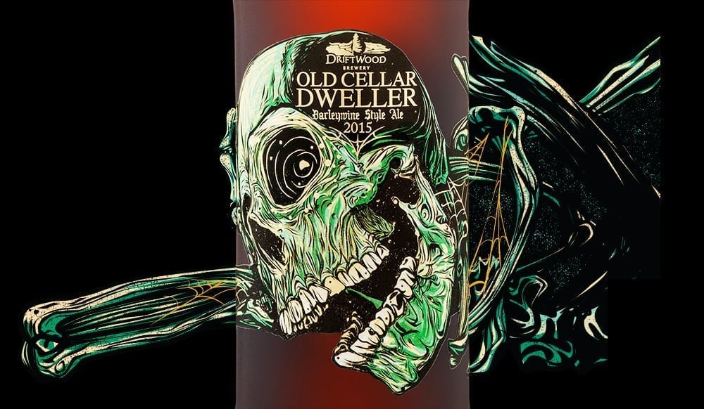
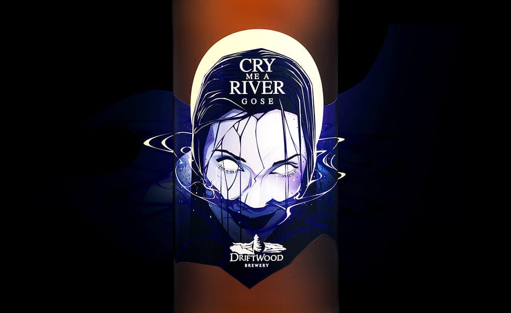
HGC: We start the design process for each label by talking with their head brewer (Jason Meyer) about that specific beer: the history of the style, their spin on the style If it’s an existing beer in their portfolio then we talk through the history of the beer (the name, the old label, etc.) We look for any interesting hooks about each beer: unique or interesting ingredients, anything from the brewing/aging process that we might be able to sink our teeth into. If it’s a new beer, we start with product naming and that approved first. Sometimes we knock around ideas for the label design with Jason, but often he just leaves that up to us. Richard (our Creative Director) then takes that all away and comes back with a mock-up of the label design. We revise the design (if needed), write the “love story” text that goes on each label, and then make sure all of the text details are correct (ingredients, bar code, legal stuff, etc.)
TB: Which of the beer bottle labels you’ve done for Driftwood are you most proud and why?
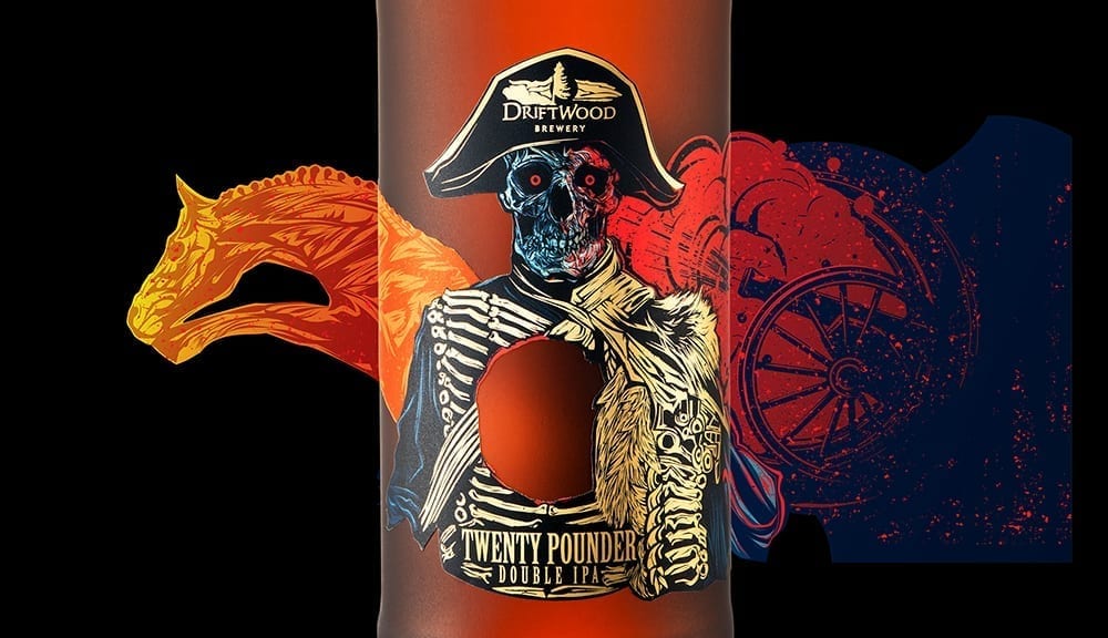
HGC: We’ve always been pretty fond of the Twenty Pounder label. See more details in my answer to your question about that label below.
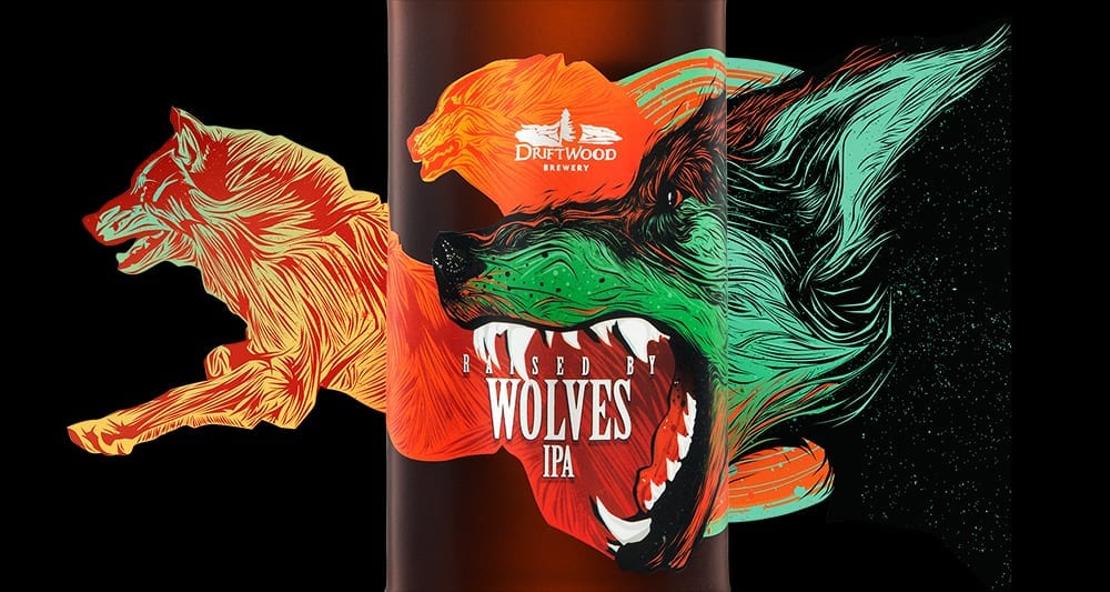
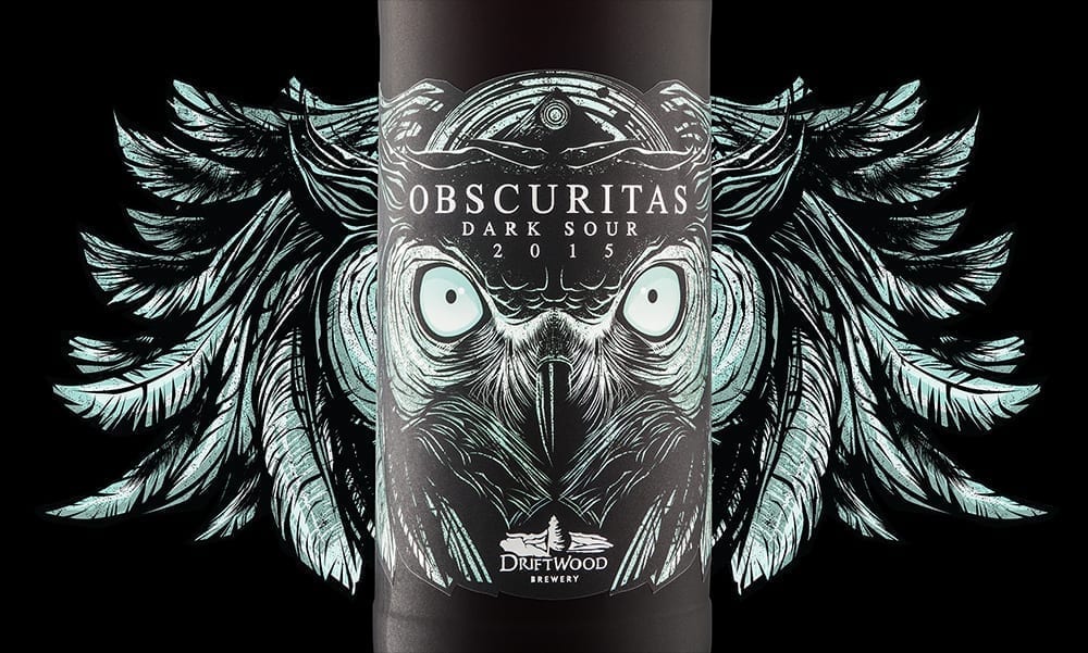
Other personal favourites would be Raised By Wolves and Obscuritas. Both are examples of striking designs that pair just perfectly with the beer inside the bottles. The designs enhance the beer and vice versa. It’s a continuous positive feedback loop that results in beer geek nirvana.
TB: I don’t see much about the Birds of Prey series on the Driftwood website. What’s that series all about?
HGC: They don’t separate it into a series on their website, but they do have all the beers from the series on there: Driftwood special beers
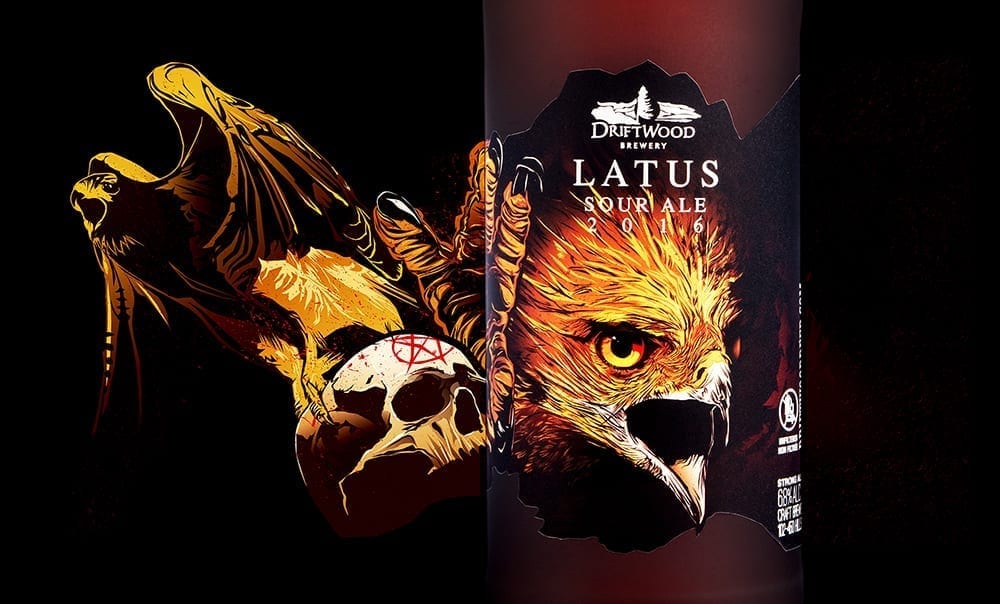
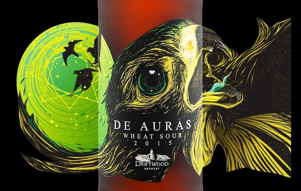
The Bird of Prey series is Driftwood’s series of sour beers. They were one of the first breweries in BC to start a sour program. The name of the series pays homage to a Cooper’s Hawk that took residence in the brewery for an evening. Ever since then, all of Driftwood’s sours have featured a different bird of prey on the labels.
TB: I’m very illustration focused. Is your artist in-house? Do you use the same illustrator for all of your bottle labels?
HGC: All of the Driftwood Brewing beer labels were illustrated by Richard Hatter, our Creative Director. We have other illustrators on our team, but Richard was responsible for all of the Driftwood labels. We don’t contract out illustration because we believe it’s one of the primary reasons breweries come to us.
TB: Custom die-cutting seems to straddle the line between “infinitely aesthetically pleasing” and “financially difficult to justify”. What kind of challenges does that style of label present to you?
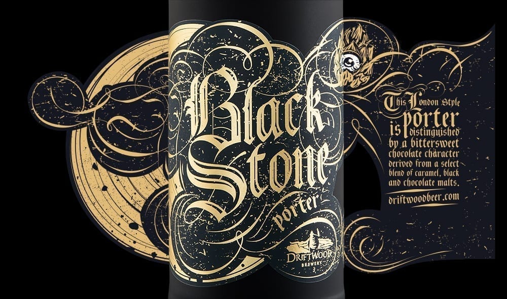
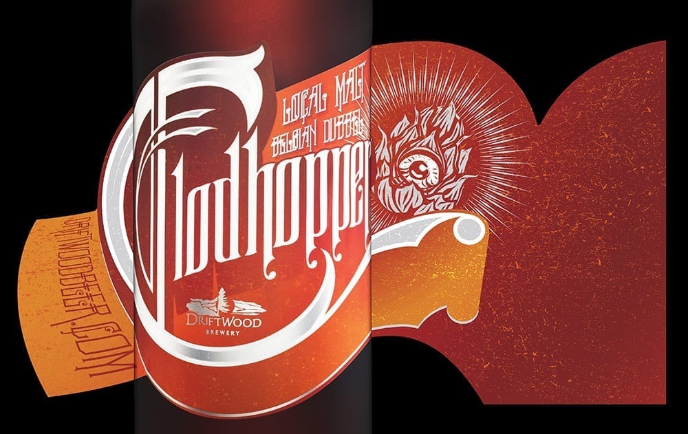
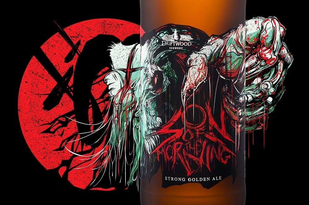
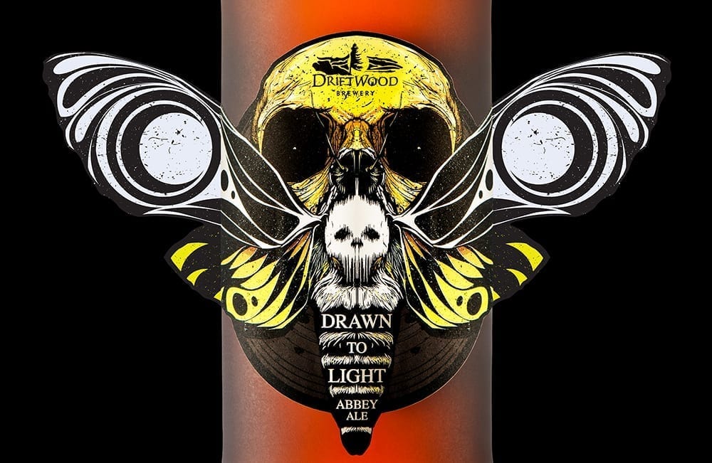
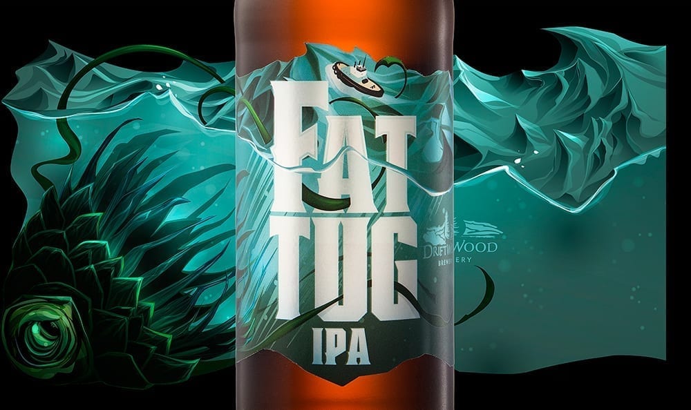
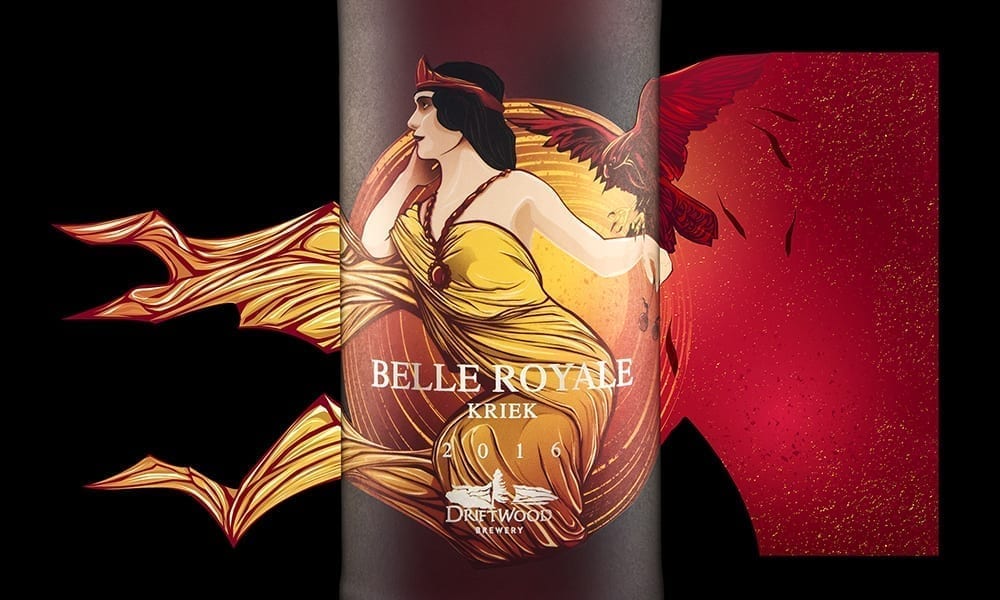
HGC: Custom die-cutting has come down a lot in price over the past few years. The printer who prints the Driftwood Brewing bottle labels (shout out to Paul Fong & his team at Westkey Graphics!) uses a new process called magnetic dies, which are quite a bit cheaper than the custom dies of the past. But yes… there’s a cost to custom die cuts that definitely needs to be justified. With Driftwood Brewing we’ve made custom dies into an essential part of their packaging look. Unique dies for every one of their beers is one of a very small number of elements that ties all of their labels together.
On the logistical side of things, we need to make sure that each custom die that we design will apply smoothly on Driftwood’s bottling line. And that needs to be done before the labels have been sent to print instead of after. We work pretty closely with Westkey to make sure that our designs won’t be creating problems when it comes time to bottle the beer.
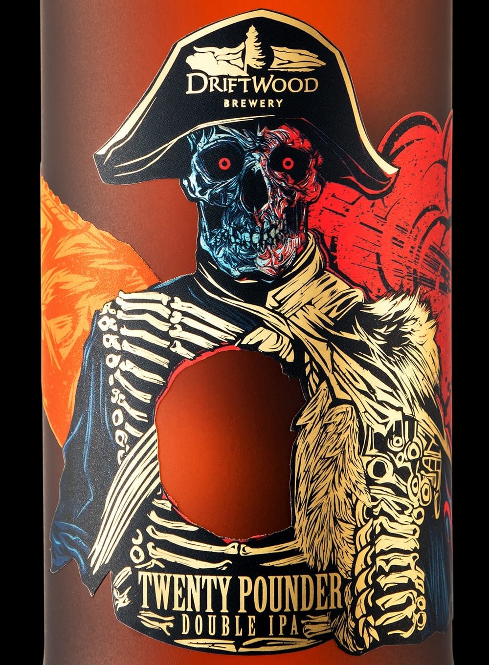
HGC: You sure can 🙂 That’s called a “knock-out” in print geek speak and it’s something that you don’t see very often on beer labels. It ties in so well with the name/concept for that their double IPA (a big cannon-blast of hops) that the brewery felt it was worth the extra expense on the label printing.
TB: What do you guys like to do, art-wise, outside of work?
HGC: Richard’s recently started learning to blow glass. Me? I’m just struggling to keep up with my three young kids when I’m outside of work 🙂
TB: True or false: The best beer label art looks like it could also be Magic: The Gathering card art.
HGC: Ummm… I guess? I’m not really familiar with the game. I had to Google it to see what the cards looked like. While some of the labels we’ve designed certainly look like they could fit into that world, the way we design for beer labels is much more iconic than the approach that Magic uses for their card art. We focus on a key element, draw it out, and make it very visible, prominent… very easy to grasp what you’re looking at from a bit of a distance. This is key to getting someone to pick a new beer up off a liquor store shelf for the first time.
