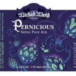
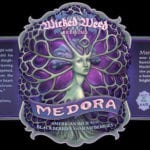
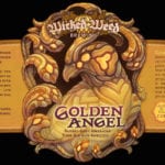
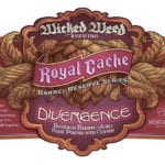
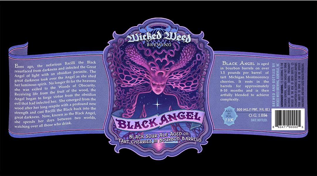
It takes a daring and adventurous brewery to use lacy funghi, juicy organic plant forms, otherworldly spiders, and fantastic forest creatures to sell beer. Wicked Weed of Asheville, NC is that brewery and Howell Golson is the artist behind it all.
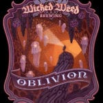
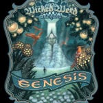
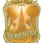
 Howell Golson: The ideas behind all of the Wicked Weed sour beer labels began with a European Art Nouveau label design aesthetic that we married with an utter refusal to depict anything in a way that anyone would expect. This is also the approach of the brewery in general I believe – using traditional brewing methods to explore and discover new ways of developing the craft. All the Wicked Weed labels utilize mysterious, fungi-and-weed-like forms to echo the explorative, organic brewing approach of the brewery.
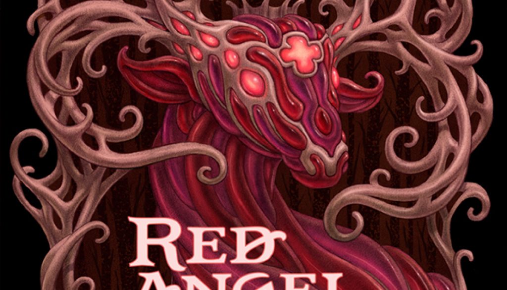
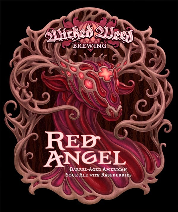
Beer Labels Art: My favorite label you’ve done for Wicked Weed is Red Angel. Can you tell me the story behind its conception?
HG: With the Angel series, I was adamant that I would never draw a wings-on-a-person angel. In fact, I didn’t even want it to be a person. It had to be something no one would’ve expected. I’d never used animal forms before, and the elk has some very interesting physical features to exploit in an organically geometric way, so it seemed like a great place to start. And so the trans-dimensional spirit of the elk prince was born. The Wicked Weed guys liked it so much; they wanted to see the whole series based in the animal world, so expect more celestial animal wizard-gods in the future.
BLA: What is your favorite label you’ve done so far for any brewery and why?
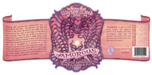 HG: I’d have to say that Wicked Weed’s Amorous is my favorite label thus far because I think I accomplished what I’d set out to do in such a complete way. The color palette screams “sour” to me, apart from it just being so pleasantly vibrant to the eyes. The composition works for me in an interesting way even down to the abstract level. Finally, I think it sells the beer well. The label is so triumphant, it gives me great respect for the beer, even apart from how delicious the actual beer is. It the biggest win so far for me.
BLA: Where are you from and where did you learn to be an artist?
HG: I grew up in an insipid suburban tomb. It matters not which one. Since outward exploration was impossible, I instead explored within. I played obscene amounts of Dungeons and Dragons. I listened to stoner metal. I read Heavy Metal magazine and gained most of my passion for drawing from it. I learned to draw from studying issues of Silver Surfer and The Savage Sword of Conan.
BLA: What other art do you make?
HG: I typically don’t do a lot of personal work, because I married a Vietnamese woman, and that has doomed me to a life a servitude, but I do have a Behance page that showcases some sketchbook pages and some personal work. It’s worth looking at I think. Professionally, I do a lot of scratchboard style illustrations, packaging work, and identity work.
BLA: True or False: The best beer label art looks like it could also be Magic: The Gathering card art.
HG: I have friends who have done MTG cards, and they are great artists. But so much of MTG art is pretty explicit and prosaic. Which is fine. I try to create situations that defy understanding, yet beg to be understood. I strive to evoke some elusive, primal knowledge within all of us. I think that’s what’s compelling about my work when it works, ultimately. That’s certainly why I do it.
UPDATE: Wicked Weed posted this awesome video of Golson at work on their YouTube channel:
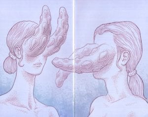
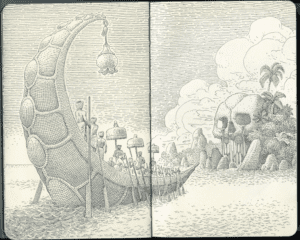
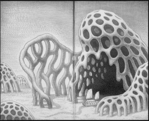
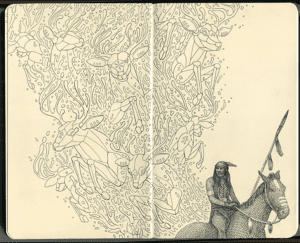
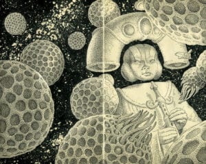
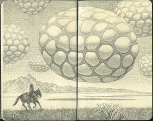
Here are some sketchbook images from Golson’s Behance page:
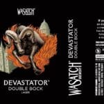
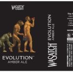
Golson also created the illustrations for Wasatch Brewery’s label rebranding the Summer of 2014.

