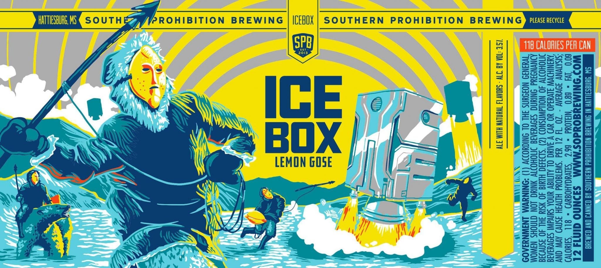
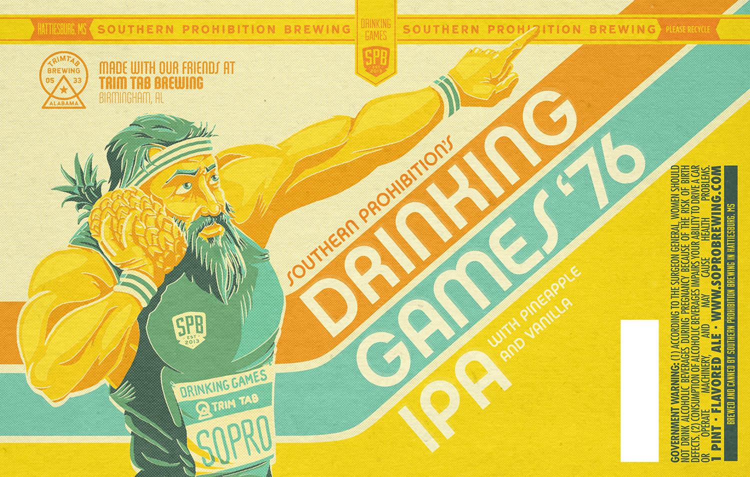
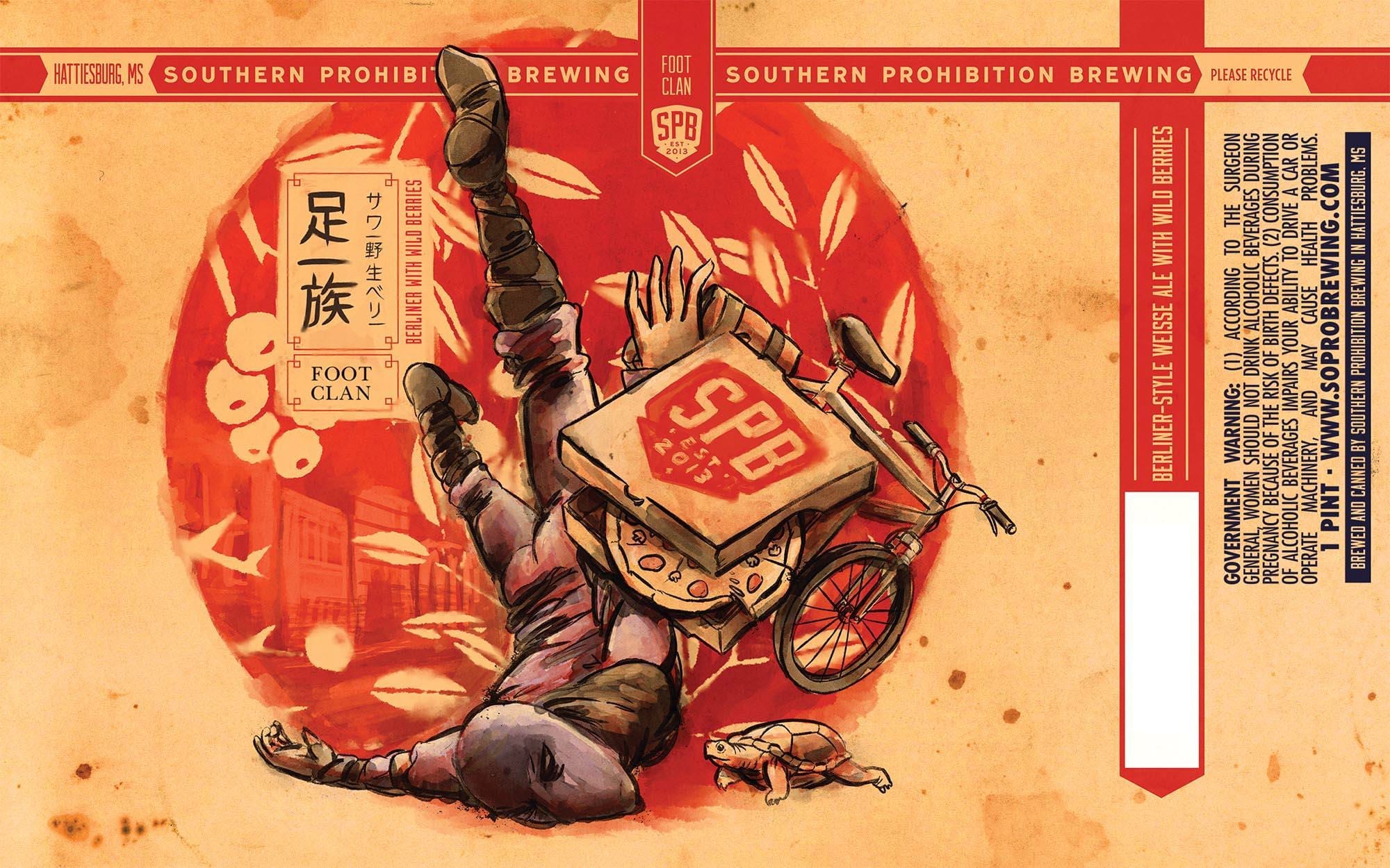
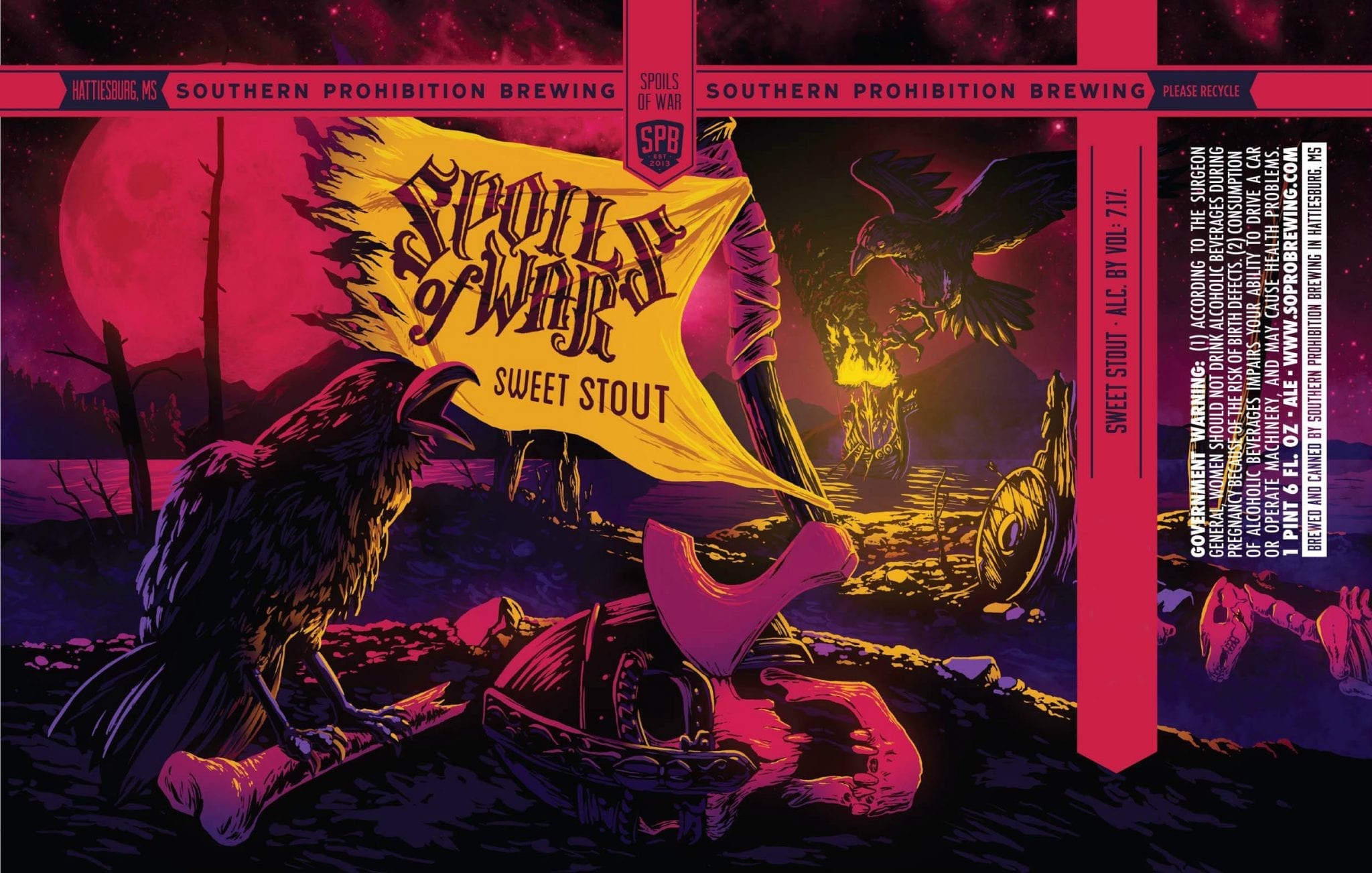
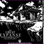
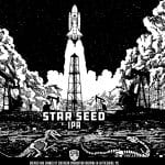
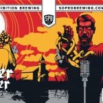
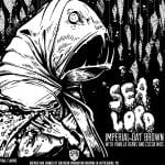
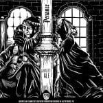
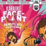
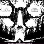
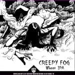
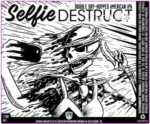
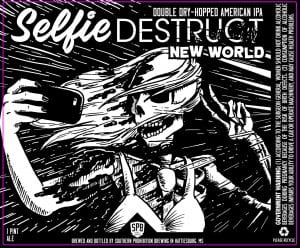
When I first spotted the label art of Matt Phelan, I was struck by how many labels he’d done for Southern Prohibition Brewing. I try to stay current on what’s new in the beer label world, and it seemed strange that the volume of work that he’d done for the Hattiesburg, MS brewery would have flown under my radar.
“Basically, if it’s Southern Prohibition and it’s from the last 2 years, then it’s one of mine.” Suffice it to say, Matt has done A LOT of labels in the past two years.
I reached out to Southern Prohibition VP Emily Curry to find out how they work together. “Matt has been incredible to work with. He will take a mush mouth idea you throw at him and take it beyond your expectations. He can knock a project out of the park the first time you sit down with him, but working with him on the long-term vision of your brand he really starts to take it on as a part of his personality.”
“His art and design skills are extremely versatile, and it sort of blows my mind when shows me something completely different than the ‘SoPro style’ art he does for us weekly.”
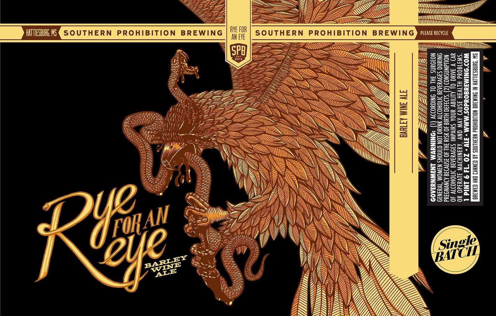
Thirsty Bastards: My favorite label you’ve done is for Southern Prohibition is Rye For An Eye. Can you tell me the story behind its conception? (Or Spoils of War. Or Luddite… they’re all so damn good it’s tough to choose!)
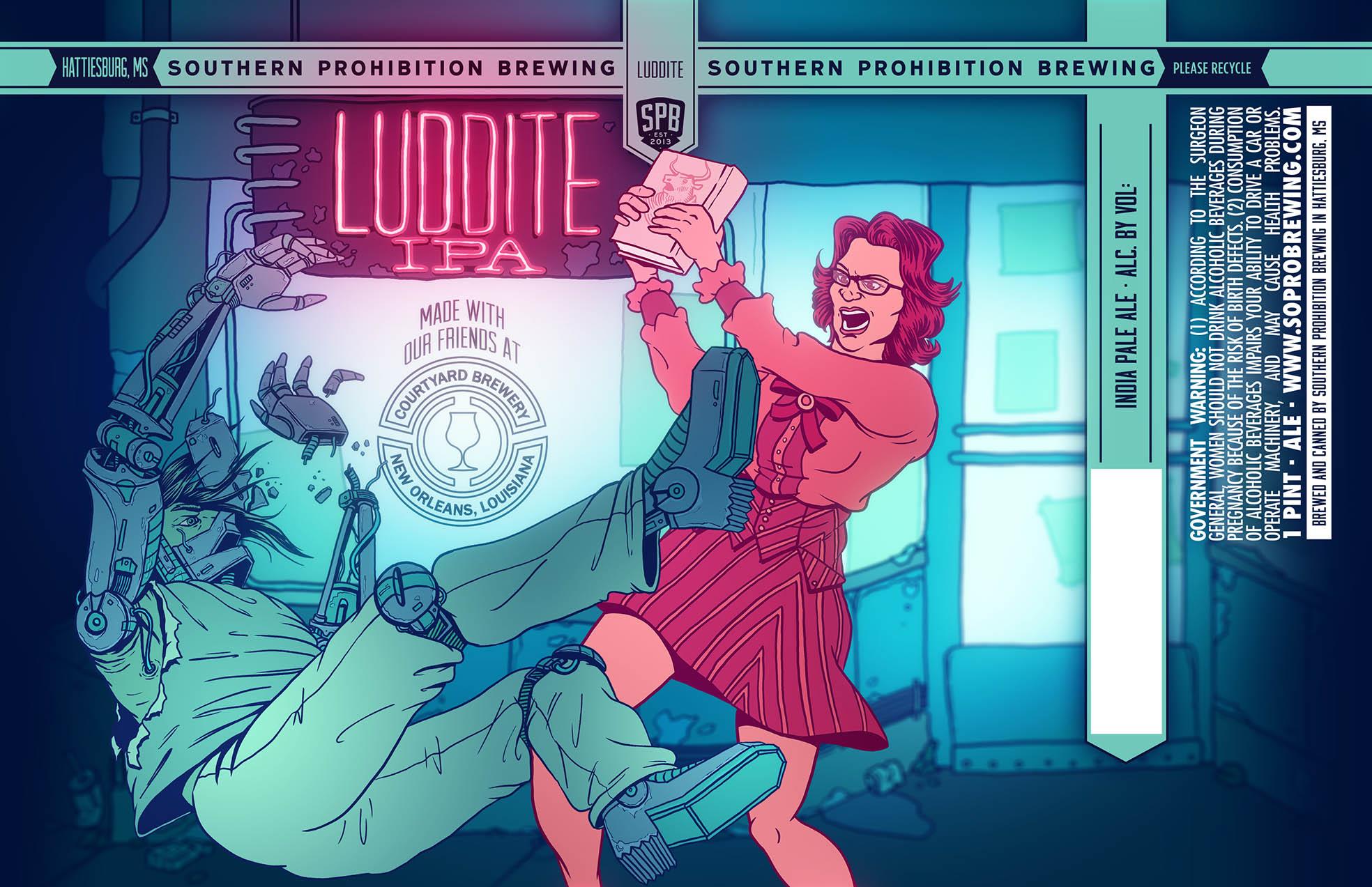
Matt Phelan: Luddite was a collaboration with Courtyard Brewery out of New Orleans. Courtyard was visiting Southern Prohibition on a day I happened to also be at the brewery (I’m based in New Orleans, but go up to the brewery in Hattiesburg occasionally). Anyway, we all sat down and talked ideas. I had an initial sketch, this woman reading a book in a coffee shop, but the table is floating on jets, and there are robots and cyborgs in the background.
Basically, the idea was that you first see her doing this very analog thing, and then you notice she’s in a very futuristic setting. Anyway, it would have been an okay label I think. But this was a good example of how valuable it is bringing in other voices and talking through the process and getting everyone’s input. It really ended up creating a more interesting label in the long run.
Also, that label was my very poor attempt at a Josan Gonzalez drawing. That dude is a master though, he’s on a whole different level than I am.
TB: What is your favorite label you’ve done so far for Southern Prohibition and why?
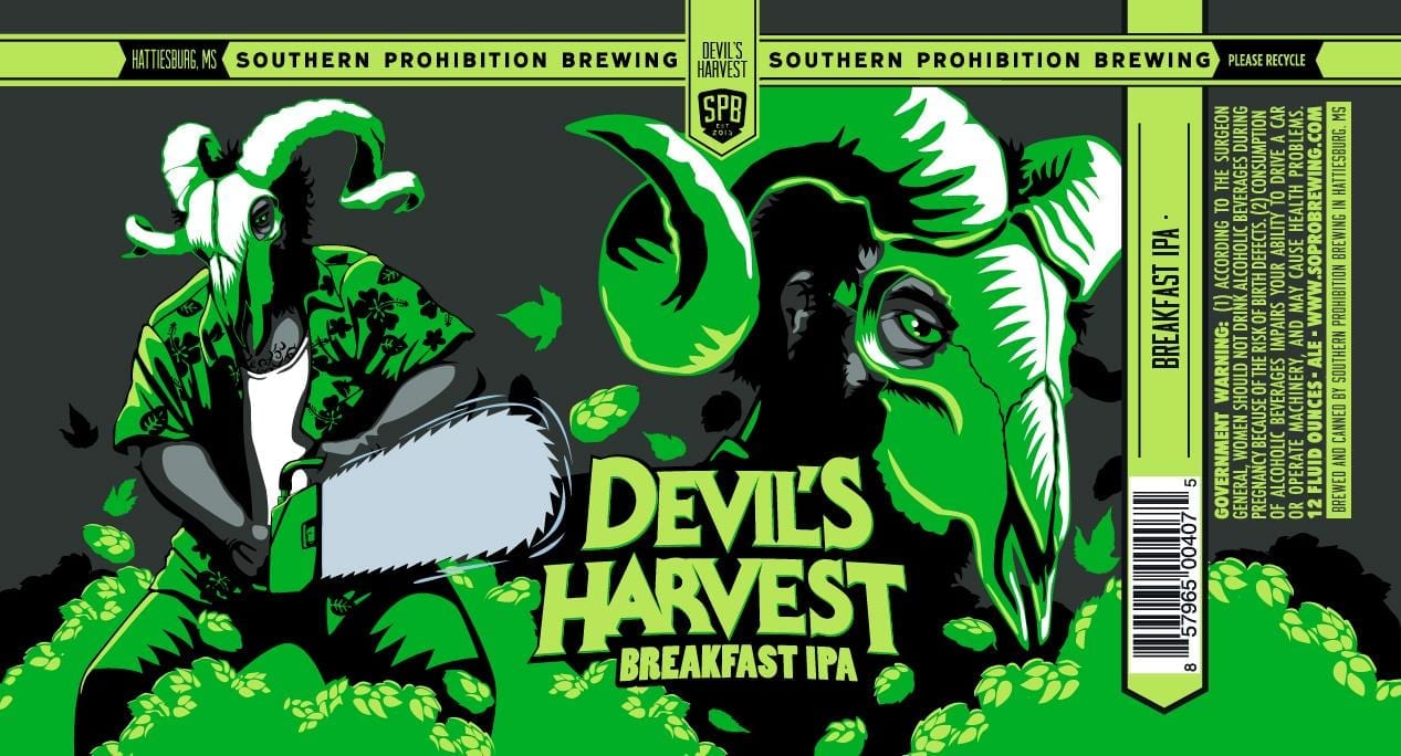
MP: I think it’s got to be Devil’s Harvest. It was still early on in my relationship with Southern Prohibition, and they wanted a completely new look for one of their flagships cans. I gave them maybe a dozen rough concept pencil sketches.
The day I was going to send them off though I decided to do one last sketch on my lunch break. This crazy guy with a Hawaiian shirt and a ram skull for a mask with a chainsaw. I put it last in the pdf and wasn’t surprised when they picked one of my other ideas. One with a literal devil in it that just made more sense with the name, and overall felt like a safer pick. But that guy stuck in their heads and ended up winning out.
So it’s not my favorite label because I think it’s the best I’ve done or anything. It was just when I realized that Southern Prohibition was on my wavelength and not afraid to get weird and take a risk with their art. That and it was insane to me that this drawing I threw together in my one hour of freedom from my old office job, it turned into beer that’s sitting in the cooler at the convenience store down the road. That’s never not weird to me, every time I see any of my cans in the wild.
TB: How did you get started making labels for Southern Prohibition?
MP: A former coworker at that former office job, she knew Southern Prohibition was looking for an illustrator/designer to do a label. Their deadline was coming up quick and they needed the work ASAP. Anyway, she put us in touch and it ended up being a great match.
TB: Where are you from and where did you learn to be an artist?
MP: I was born in New Orleans, but grew up mostly in upstate New York. Got my BFA in Communications Design from the art school at Syracuse University. My major was pretty grueling, so aside from a ton of graphic design, my more traditional art kind of fell off. Became a graphic designer right out of school.
I still did a lot of weird digital art all through my 20s. Photo manipulations and 3D renderings, that sort of thing. But I didn’t start to take drawing seriously again until almost 3 years ago, and it’s been so rewarding. I kick myself for not getting back into it sooner.
TB: Can you tell me a bit about your process? Are you all digital? Traditional? Mix of both?
MP: Southern Prohibition will give me a name, and sometimes an idea they had in mind, but typically it’s pretty wide open. So after a few days with the name kicking around inside of my head, I create a pencil sketch of the label concept. If they’re cool with it at that stage, I’ll take it into Photoshop and ink/color it on my Wacom tablet. For bigger releases that see a wider distribution, I’ll usually spend more time on the conceptual stage and give them a lot of initial options.
TB: What other art do you make?
MP: I paint, though not enough. I do a lot of poster design for different groups here in New Orleans. Design the occasional t-shirt.
TB: How can your fans find you and your work? Can they buy your art?
MP: Instagram is honestly the best way to see my stuff. I’m still working on a website for my design company, Deep Field Design. So eventually deepfielddesign.com will be a good way to get in touch and check out some of the work. I don’t have any prints for sale yet, but it’s also something I want to get set up in the future.
TB: True or false: The best beer label art looks like it could also be Magic: The Gathering card art.
MP: I like that, but I’m going to say “False”. Only because a lot of my favorite labels are very graphic design-y or a little more abstract. One thing I try to do with Southern Prohibition’s labels though is tell a story. Or at least, set one up and let the person staring at their can fill in the rest. So I guess in that way they’re similar, both are kind of like one-panel graphic novels. Make a character, imply a story and do it all in a single image.
Label images research made possible using the highly recommended LabelVision search tool at ShipCompliant.
