There’s plenty of really shitty beer labels on the shelves. I’ve avoided writing about that in the past year since I started this site. It’s easy to call something shit when you see it and at the end of the day, I’d much rather celebrate the “Shinola”.
That said, this is my third week doing a “best of” and I’m still feeling it out. This week had some gorgeous labels and there’s lots to show off. I can’t promise I’ll do it every time, but I’ve decided to add an “Eyesore of the Week” as the very last beer label I highlight. Trust me, when it happens, it will be deserving of the title.
The following labels were registered with the Alcohol and Tobacco Tax and Trade Bureau during the 51st week of 2014. They have been selected for their aesthetic appeal or simply because I thought they were really cool.
Contents
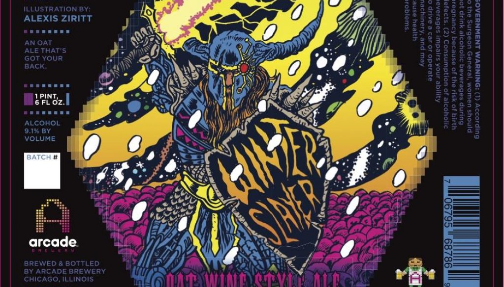
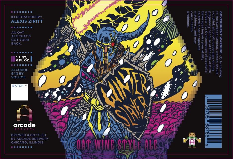
Arcade Brewery Winter Slayer
This latest release from Arcade Brewery features the artwork of yet another comics talent – Alexis Ziritt.
Well known for his over-the-top, cosmic, death metal-style illustrations, Ziritt’s Winter Slayer is mind blowing. Flanked by a field of skulls, the slayer appears to be a black knight cyborg wielding a Thundarr The Barbarian-inspired laser sword.
You can tell it’s cosmic by the wavy lines in the background. It’s so Kirby!
Arcade simply does labels differently!
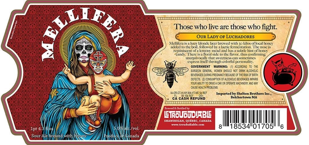
Le Trou Du Diable Mellifera
Mellifera is a species of honey bee. There is honey in this beer and elsewhere on this label, but bees are not front and center. Instead we have a gorgeous image of a “Day of the Dead” Virgin Mary holding up a Luchadore-masked child. So this beer is Catho-Mexi-honey- I don’t know… there’s a lot going on here.
The pose is inspired by French academic painter William-Adolphe Bouguereau virgin masterpieces of the late 1800s. The brewery gave the artist credit on the label, which you know I love. For the life of me, I can’t make out the name.
UPDATE: This label art was created by Pale Horse Design and more specifically, Chris Parks of St. Petersburg, FL.
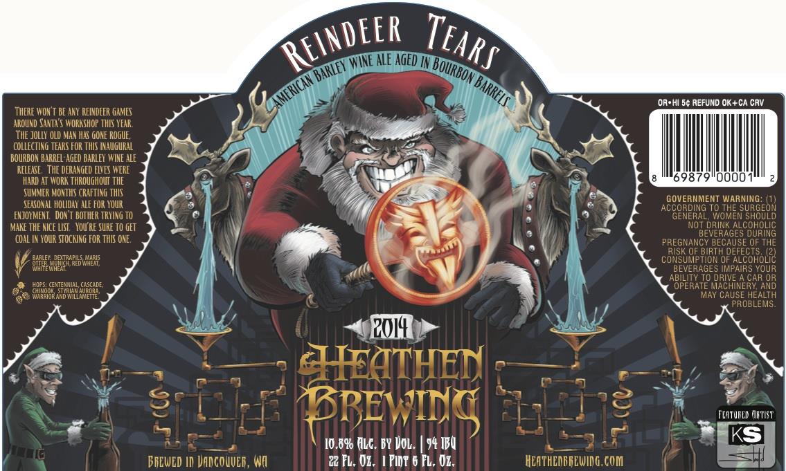
Heathen Brewing Reindeer Tears
I did not do a Winter beer label post this year (yet), but this would certainly make the list. Heck, I could do a post just about mean Santa beer labels.
These poor reindeer are providing the missing ingredient for Heathen’s barleywine. After Santa brands each one with their logo, that is. There must be tabasco in the deer pellets to turn on the water works like that.
The beer labels for Reindeer Tears and Sinderalea, a pumpkin ale, were created by for Heathen Brewing by illustrator Kyle Shold.
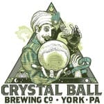
Crystal Ball Coconut Porter & All-Seeing IPA
I’m a big fan of Crystal Ball Brewing’s woodcut-style logo and label illustration. The way they’ve incorporated the fortune teller and his ball into each label is very clever.
What’s in your future? Coconut! Or, THIS EYEBALL! I really like the concept of “gazing into the ball” and seeing an image that relates to the beer, but I could see the motif get a bit old after they get several beers under their belt. Hoppin’ Frog and Rogue Ales are two examples of breweries whose labels suffer from lack of variety. I’d hate to see that happen here.
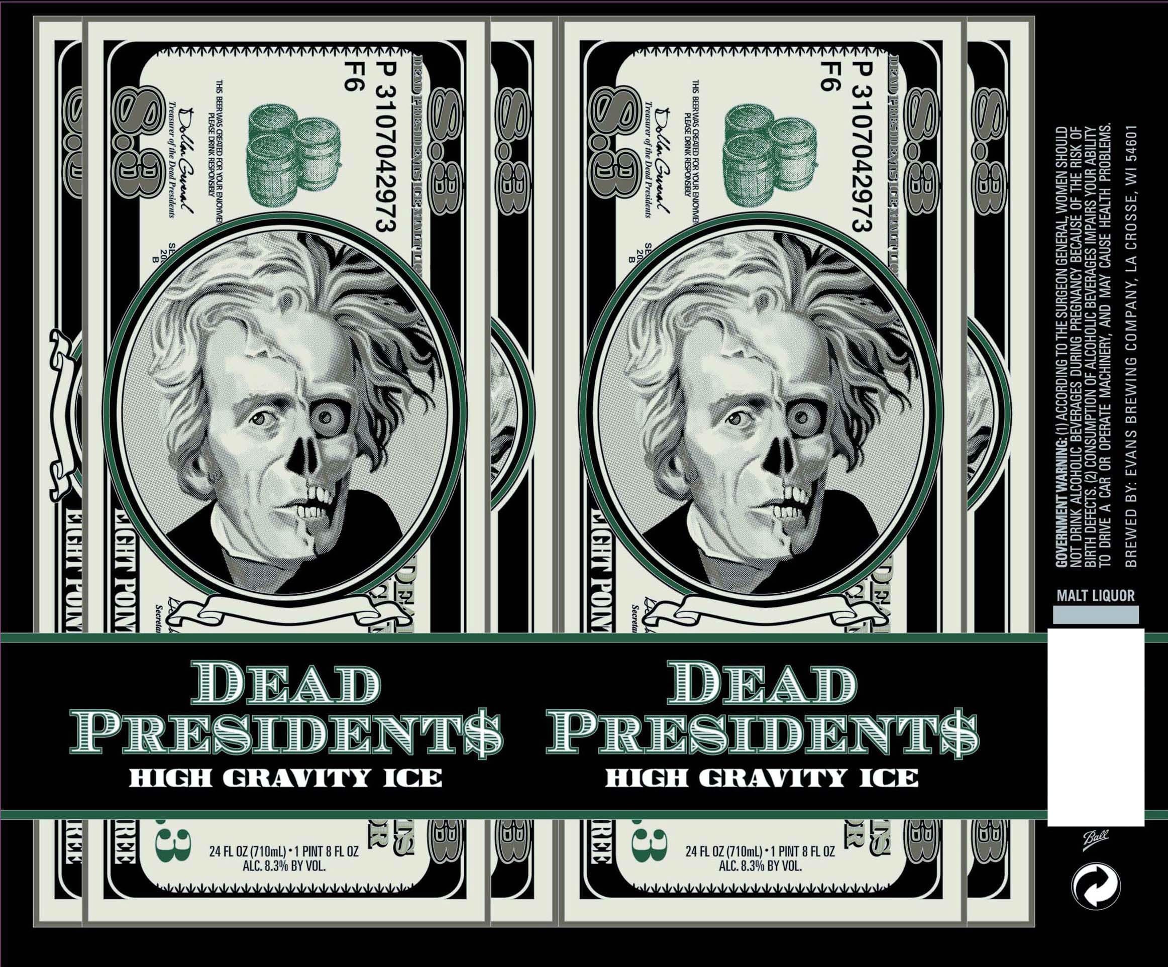
Evans Brewing Dead Presidents
Who’s that on the $8.3 dollar bill, you ask? Well, Zombie Andrew Jackson, of course. Not sure why there isn’t a funny attempt at giving him a zombie name. You know, something like “Undead Jackson”.
I don’t even want to know what something called “High Gravity Ice Malt Liquor” with an 8.3% ABV tastes like. It might vey well melt my nose and half my face off just like poor Andy here.
By the way, it appears that Dollar General is the elected Treasurer of the Dead Presidents. I’d also have tried to make a zombie joke name from Rosa Gumataotao Rios, but I guess that’s kind of tough. The best one I can get out of a Zombie Name Generator is “Fetid Jumbleguts”, but that’s still better than Dollar General.
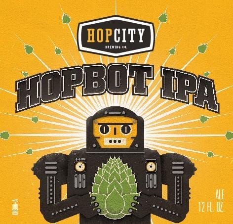
Hop City Hopbot IPA
Finally this week, we have Hopbot. He’s the raddest hop-squeezing robot with fingernails to ever open your beer for you. According to the label, he’s “programmed with 5 West Coast American hops”!
I love the style of this robot. It’s got a gritty, antiqued feel. He’s cartoony looking, but the drop shadows on the dials and buttons also give him depth and substance. He’s got a Metropolis movie poster feel to him.
It took me a long time before I noticed the little hop cones blasting out from behind him. Well done, all around!
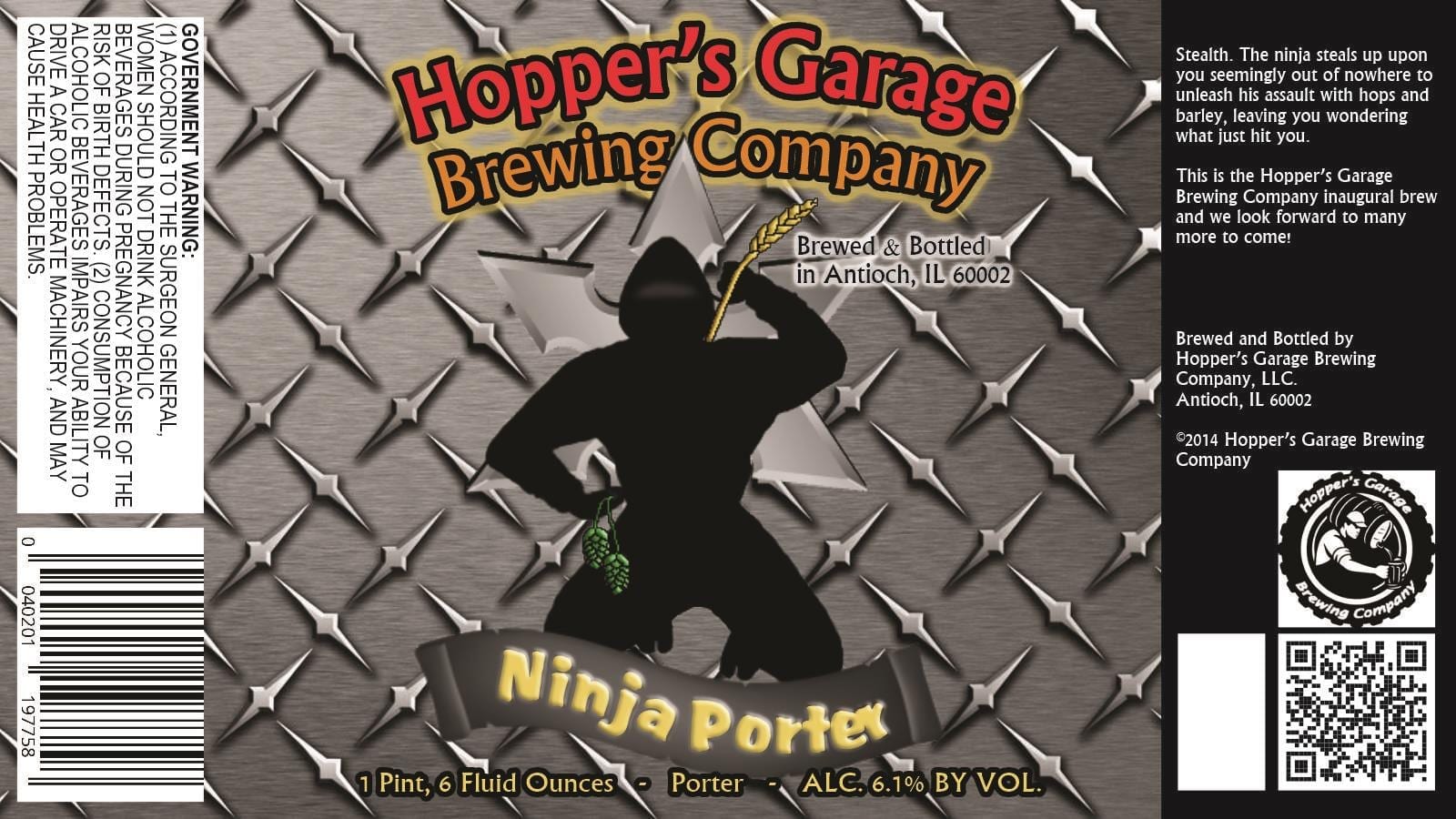
Eyesore of the Week: Hopper’s Garage Brewing Company Ninja Porter
Again, I can’t guarantee that I’ll do this every week…
It shames me to do this to a local brewery, but Hopper’s Garage I have to tell you, it’s time to go back to the drawing board. Your barley-wielding kneeling ninja (who also seems to prefer hop cones to nunchaku) is not going to entice me to buy your porter. And I love porters. I know throwing stars are made of metal, but that diamond plate metal background makes me think of big rigs and tow trucks instead of stealthy Japanese assassins. Perhaps that’s where the “garage” comes in?
I dug a little deeper on this label and found this on the Hopper’s Garage Facebook page:
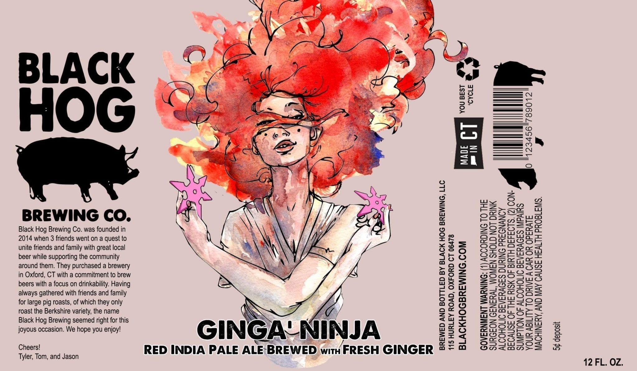
So perhaps this won’t make it to the shelves after all. BUT in case you don’t believe me, here’s three ninja beer labels that got it right (including another Ninja Porter):
Label images research made possible using the highly recommended LabelVision search tool at ShipCompliant.

![William-Adolphe Bouguereau, The Virgin With Angels [Public domain], via Wikimedia Commons](https://thirstybastards.com/wp-content/uploads/2014/12/512px-Bouguereau_The_Virgin_With_Angels-190x300.jpg)
![William-Adolphe Bouguereau La Vierge au lys [Public domain], via Wikimedia Commons](https://thirstybastards.com/wp-content/uploads/2014/12/512px-La_Vierge_au_lys-205x300.jpg)
January 10, 2015 @ 6:20 am
Thanks for the eyesore award, Craig. A major award indeed. https://www.facebook.com/HoppersGarage/posts/816076828456522