A bit of a slow week for eye-popping labels. These four I’ve selected as the Best Beer Labels Of The Week are worth checking out.
The following labels were registered with the Alcohol and Tobacco Tax and Trade Bureau during the 10th week of 2015. They have been selected for their aesthetic appeal or simply because I thought they were cool.
Contents
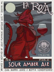
La Roja Du Kriek Jolly Pumpkin Artisan Ales Sour Amber Ale
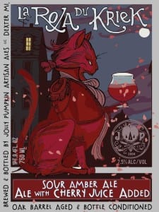 The poster-style direction that Adam Forman has taken the labels of Jolly Pumpkin is so compelling. The more labels Jolly Pumpkin releases, the more I feel the influence of Théophile Steinlen and Eugène Grasset. There’s nothing else like them on the shelves. They are easily the best beer labels out there, IMO.
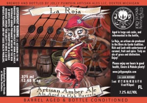
La Roja du Kriek seems to be a variant of their La Roja. I thought it would be fun to see them side-by-side with the original and the old school version. Obviously the background has been enhanced. I suspect the flower petals that have been added must be cherry blossom?
I love seeing how this stuff evolves:
For more about the work of Adam Forman, please check out my interview with him from late last year.
Ecliptic Brewing Orange Giant Barleywine Ale
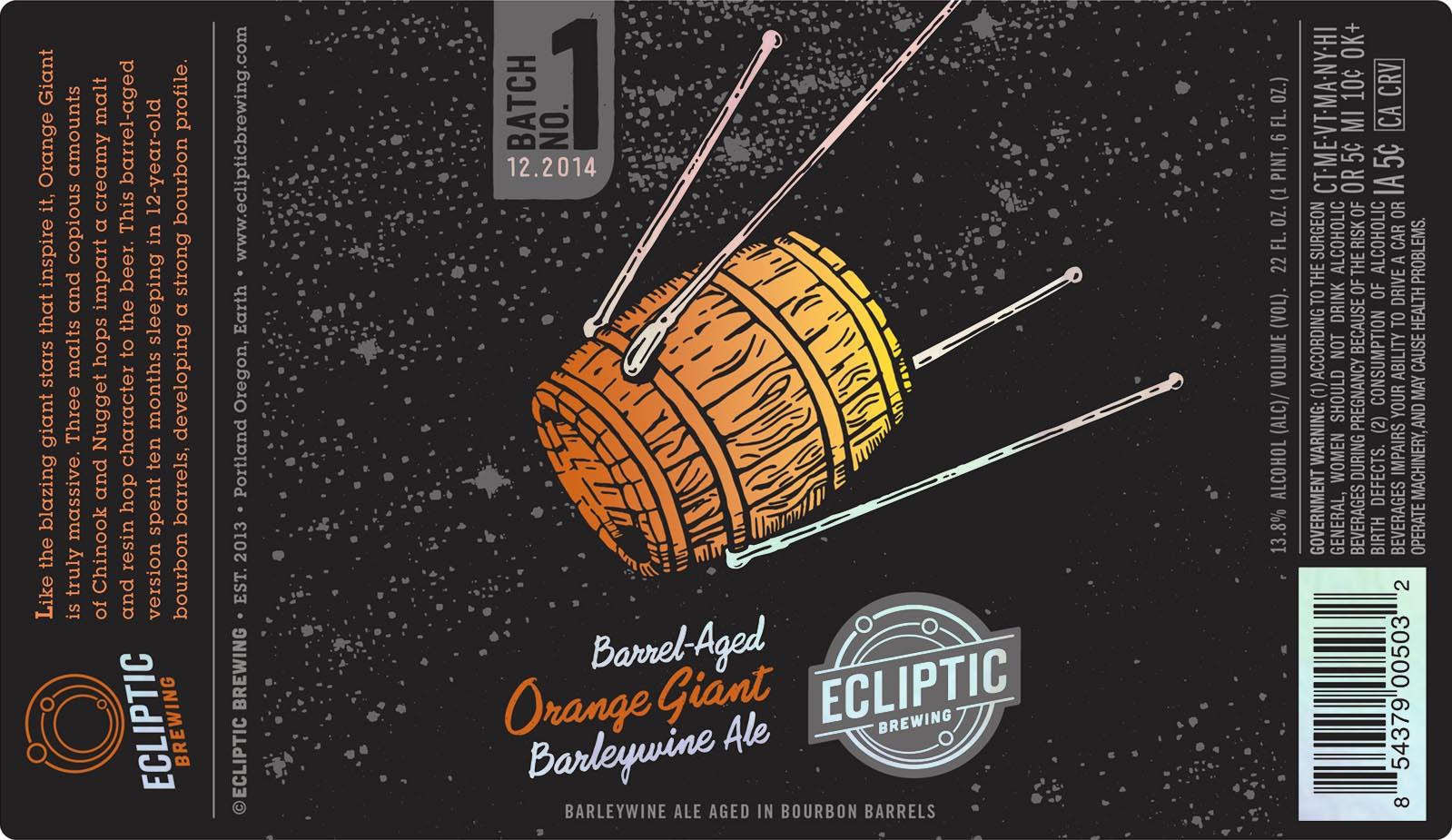 Aged beer is like a time capsule – you need to lock it up and forget about it until it’s ready. Time is the only element that makes it sealing it up. You need to resist the temptation to open it too soon. What better way to force your patience than to launch it into orbit for ten months?
This Sputnik-inspired line drawing is simple but very clever. The line art has a woodcut style to it, and the limited palette suggests printmaking techniques as well.
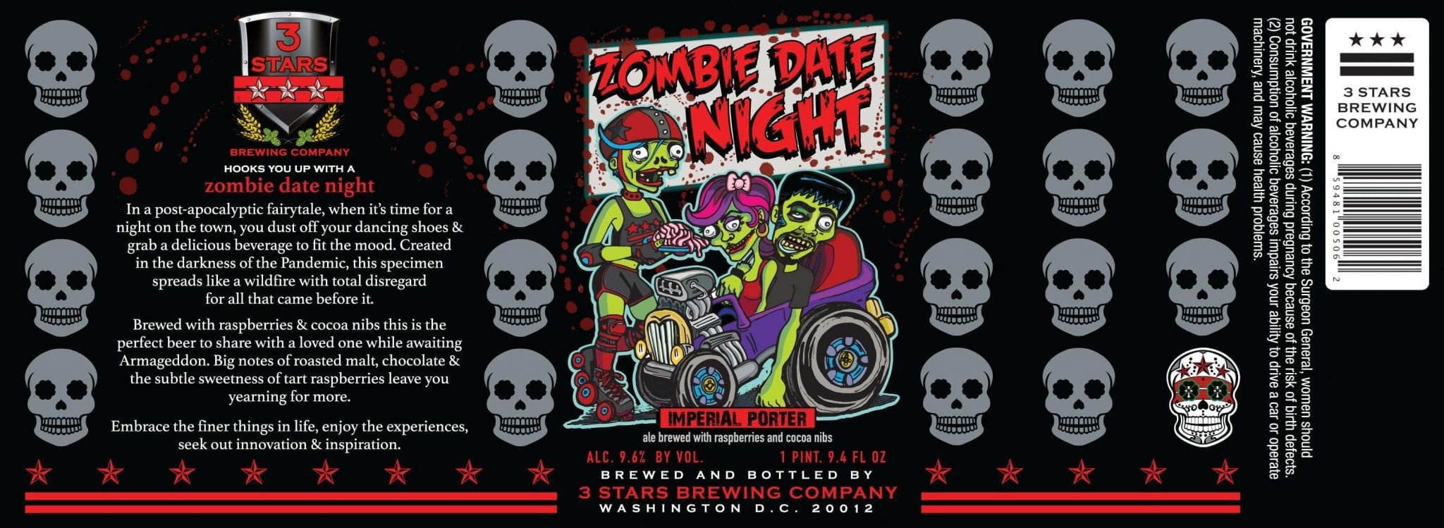
3 Stars Brewing Company Zombie Date Night
I’ve played just enough Plants Vs. Zombies to appreciate this cartoony undead vignette. I like that the drive-in server also has a bit of roller derby in her get-up, complete with three stars across her chest. And what’s she serving up? Brains, of course.
There’s also a little bit of Rat Fink influence here, mostly in the shape of the hot rod. It seems to be missing the signature gear shift jutting out from the floor.
@beerlabelsart it’s Kendra from @cieloprodc
— threestarsbrewingco (@3starsbrewing) March 12, 2015
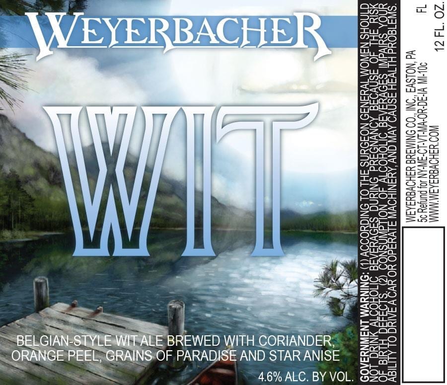
Weyerbacher Wit
Not much to say about this other than that it’s a very fine example of landscape. If Weyerbacher is trying to say that drinking their Wit is like lounging lakeside on a summer afternoon, they’ve captured that.
You did notice the contented smile on the face of the sun, didn’t you?
Label images research made possible using the highly recommended LabelVision search tool at ShipCompliant.


