Since I started this site, I’ve had lots of talented artists reach out to me and share their work. It’s probably the most rewarding thing about writing here for me. Aaron Scamihorn knew in his guts that his recent pumpkin beer label should have been counted among the finest of 2015, and he’s not wrong. It’s pretty spectacular…
Beer Labels Art: My favorite label you’ve done is Murder By Pumpkin? Can you tell me the story behind its conception?
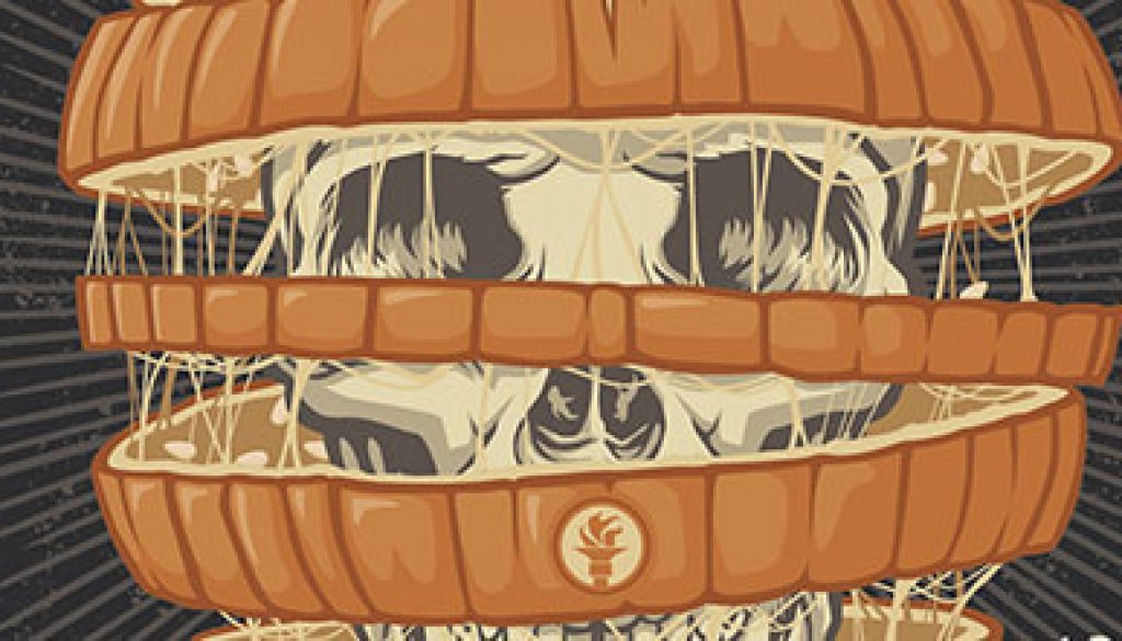
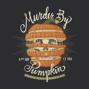 Aaron Scamihorn: The first pumpkin beer Indiana City did was called Death By Pumpkin. As punk and metal music fans, the owner, Ray Kamstra and I love that kind of dark side/hardcore branding for big and unique beers. For the brew, they mashed in a ton of real pumpkin but didn’t over-load it or mask that flavor with too much cinnamon and nutmeg that can often be too much. The resulting beer has a monstrous pumpkin flavor, thus “Death By Pumpkin”. So when we stepped it up to be a bourbon barrel aged version of that, I knew we had to go darker and more epic with the art. The concept of the cut up pumpkin layers floating was a little bit of a leftover idea for a gig poster design I did for Bayside that they didn’t like. For their 15 year birthday tour, I did floating layers of a cake connected by dripping wax from candles and frosting. I wanted to revisit that approach and bring in the “murder / death” imagery by showing the pumpkin having a skeleton hidden inside. The response has been great and the bottles sold out in 2 hours. The beer is amazing, too! Really solid balance of bourbon blended with the huge pumpkin flavor.
BLA: What is your favorite label you’ve done so far for Indiana City Brewing and why?
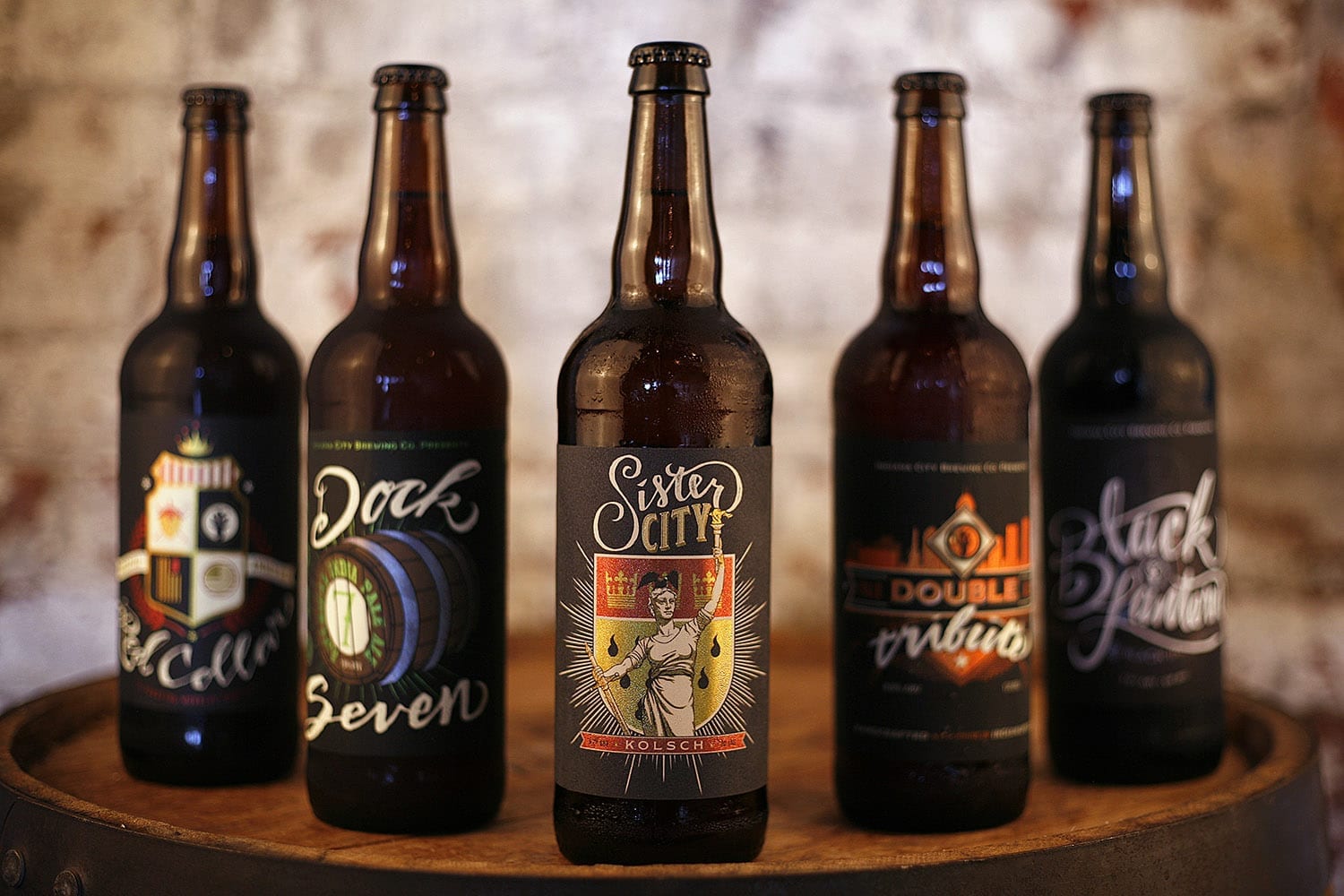
AS: I feel like every new label we do is my new favorite. I know that’s a cop-out, but It’s been really cool to start from the onset with a company like this and then over the course of a couple years develop the look and voice of the branding and label art. While they still all look like a family sitting on the shelf side-by-side, you can definitely see how in the more recent ones how the hand-brush-lettering is more refined and consistent and the illustrations have more depth and detail.
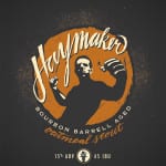
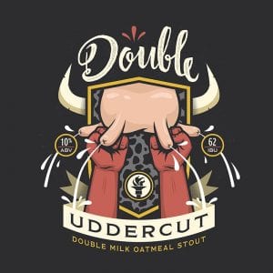 All that being said, I’m insanely proud of Indiana City Double Uddercut! One of the most popular beers and the first year-round stout produced in the area is Shadow Boxer. The history of the building they’re in is wild in that it was the bottling building for the old Home Brewing Company which went out of business due to prohibition. Since then it’s been many things, but one of those was a boxing gym. Paying homage to that, as well as the fact that Ray’s father-in-law was a champion boxer, this stout has a boxing theme in all of its varieties. The bourbon barrel aged version of it is called Haymaker and the double milk oatmeal stout version is called Double Uddercut to stay true to the boxing theme and add in the lactose reference. Due to the slightly humorous nature of the name, I knew we had to show a little of that while still maintaining brand consistency. After a few rounds of tweaks to try to make the udder less phallic, I’m super pumped with the final result. I pushed for them to do a milk stout version of shadow boxer for a little over a year, I helped come up with the name, and I got to help bring it to life visually. It’s definitely my pride and joy. We’re still working on what it will be called when we bourbon barrel age it… gonna have to be big and surreal!
BLA: How did you get started making labels for Indiana City Brewing?
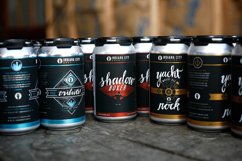
AS: Ray and I had many mutual friends and he was familiar with my work when he first started up a kickstarter to help get the brewery off the ground. He reached out to me to help establish a look and feel for the individual beer brands. We started off with three: Beyond the Pale, Shadow Boxer & Yacht Rock. We really clicked well together as a team and the fact that he appreciated my aesthetic and trusted me to just run with it really pushed me to explore some new ideas and techniques.
BLA: Do you have a list of labels you’ve done?
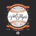
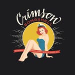
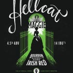
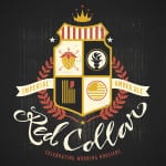
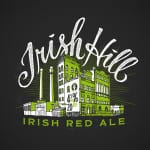
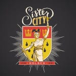
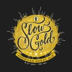
AS: Shadow Boxer, Yacht Rock, Tribute, Double Tribute, Red Collar, Dock 7, Black Lantern, Forefathers Rye, Sister City, Mimi’s Breakfast Stout, Mimi’s Tabernacle, Beyond the Pale, Irish Hill, Death By Pumpkin, Murder By Pumpkin, Slow Gold, Haymaker, Beast of Laureys, Crimson Bombshell, Cratchit’s Ale, Shine, Roulette, Hellcat Maggie, Von Tilzer, Bye Bye Blondie
BLA: Where are you from and where did you learn to be an artist?
AS: I live in Indianapolis and grew up in rural Wabash, Indiana. My parents were both ceramic artists and mom was an art teacher. I’ve been around creativity my whole life. When I went to school I initially followed mom’s footsteps and got my degree to teach art. That wasn’t as fulfilling as I’d hoped, so I immediately went back and got a graphics degree. After school I had a handful of different agency and in-house marketing gigs. During all that I was doing a lot of my own design work for a variety of different clients. Those experience all helped shape the artist I am today and the business I run as Ronlewhorn Industries.
BLA: What other art do you make?
AS: I’m a screen printer and gig poster artist. I love working with bands and creating art for the music industry. Growing up I played in a lot of garage punk bands and doing gig poster work is my connection to all of that now.
BLA: How can your fans find you and your work? Can they buy your art?
AS: You can find all of my work and my store to purchase prints on RONLEWHORN.com
BLA: True or false: The best beer label art looks like it could also be Magic: The Gathering card art.
AS: False. It might be an unpopular opinion, but I prefer a little more refinement and graphic aesthetic in label art. My favorite labels out there are stuff like Josh Emrich’s art for Bottle Logic and Christian Helm’s work on Modern Times and Austin Beerworks.
