As a new feature here on Beer Labels Art, I’d like to introduce a weekly look at new labels coming to stores near you.
The following labels were registered with the Alcohol and Tobacco Tax and Trade Bureau during the 49th week of 2014. They have been selected for their aesthetic appeal or simply because I thought they were really cool.
Contents
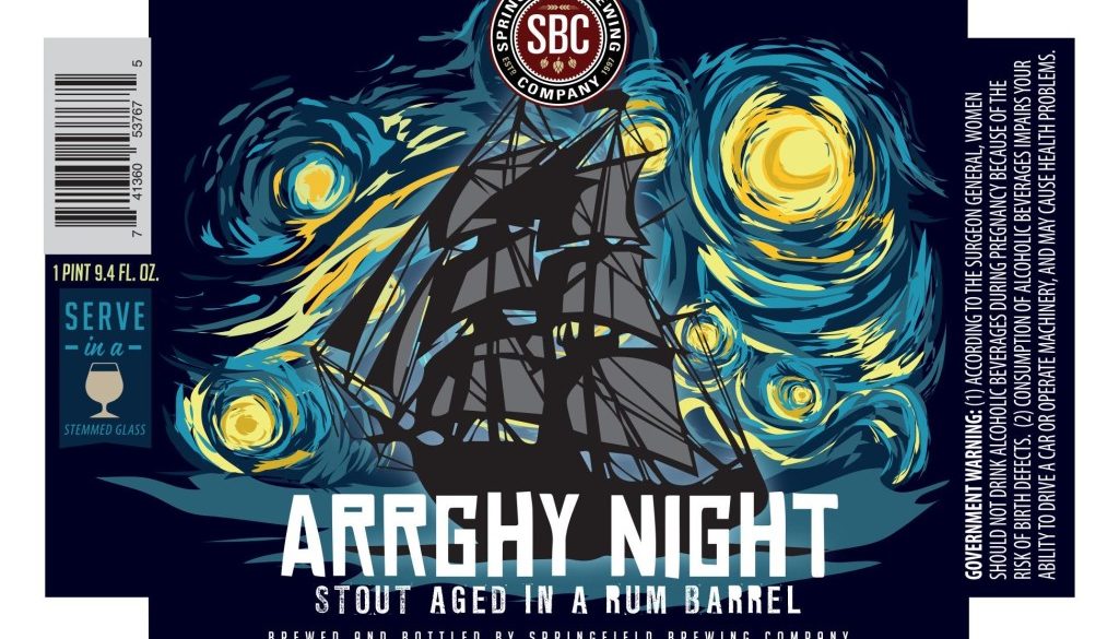
Springfield Brewing Company Arrghy Night
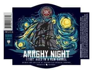 What do you get when you combine Vincent Van Gogh’s Starry Night with Talk Like a Pirate Day? “Arrghy Night”, of course.
On top of being conceptually clever, the design and illustration on this beer label are just gorgeous. I think the easy route would be to create a replica of the original masterpiece and incorporate the ship into it in the same style. Instead, the artist adapted the work to fit a more graphic style which I think, not accidentally, hints at the Pirate Bay logo and makes for a stunning image.
I love how the swirling shapes incorporate the SBC logo as one of the starry objects. It’s also really nice to see the shape of the image defined by the label boundary without being confined by it.
I’d really like to see this label done as a silkscreen. The colors are pretty limited in number, so it would certainly work pretty well as one.
Am I the only one who finds the language “stout aged in a rum barrel” a little odd? Do they only have one?
Prairie Artisan Ales Prairie-Vous Francais
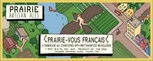 This is an aerial view of a naked woman flying over the countryside on top of a giant eagle.
Or, possibly, an aerial view of a tiny naked woman flying over the countryside on top of a normal size eagle.
Either way, if I’m checking boxes on a Visual-Freaking-Awesomeness List, this one hits all points.
I like the simplicity applied to the linework and use of color. It’s got the playful quality of a kid’s drawing with all the seriousness of naked eagle riding.
I do wish they had done hand-drawn lettering for all of the text. I’m sure that’s not cost effective, but it would make for a consistent charm.
UPDATE: I was able to confirm that Prairie’s Art Director, Colin Healey, created this illustration. In fact, he does most of them.
@beerlabelsart sure did.
— Prairie Artisan Ales (@prairieales) February 11, 2015
Stillwater Artisanal Hors D’Age
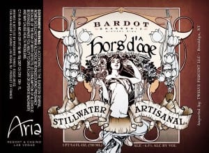 While this is definitely a departure from the kind of beer labels we’re used to seeing from Stillwater, it caught my eye this week. It seems to have been brewed for the opening of Micheal Mina’s Las Vegas restaurant, Bardot Brasserie, at the Aria Resort and Casino.
Stillwater has a signature look to its brand – darker, monochromatic imagery, engraving-style line art, sometimes collage-y, with lots of brown tones. This beer label still features those browns and “classical” line art look with a Mucha-esque illustration of a woman flanked by rose branches. The familiar Stillwater scrolling banner is front and center.
So not the greatest label I’ve seen from this brewery, but it’s a beautiful illustration. There’s a lot going on here, but I suspect it’s thanks to the intended destination of the beer. It’s kind of funny to think that a comparatively disappointing Stillwater label is still leaps and bounds better than a lot of labels on the store shelves.
Crazy Mountain Brewing Company Centennial Brown
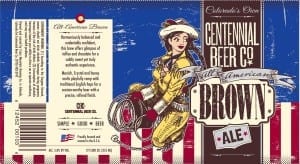 Pin-up style beer labels are a dime-a-dozen. This label is pretty refreshing take.
The linework, halftone screen, type, and color use all work nicely to achieve the flavor of an Old West rodeo poster. It’s all sorts of “old-timey” and ‘Merican.
I will take a couple of points off for visual consistency here – I’d like to see the distressing effect applied to all of the design. I get why you wouldn’t apply it to the script font at the top and in the banner, but maybe that’s the first sign that you’ve made some iffy type decisions. I mean, come on. I count at least six.
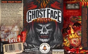
Twisted Pine Brewing Company Ghost Face Killah
I’m not quite sure how Twisted Pine expects to release this beer without a lawsuit, but here’s Ghost Face Killah. Perhaps the fact that it’s not called “Ghostface”? That space could keep you out of court, I suppose. Good luck, guys.
I suspect the skull face at the center is an original illustration, but this beer label relies very heavily on collage. The result is sheer chaos which the color use on the images really ties together nicely. The theme here, obviously, is heat, and if the description doesn’t warn you, you’ve got all the visual cues: a dragon, a broken thermometer, red chilies, and even a fire-spewing hydrant.
There’s also no end of slogans and catch-phrases. I guess “This beer will melt your face off” didn’t make the cut.
Long Trail Brewing Company Double Bag
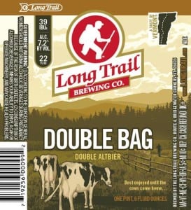 Let’s wrap up with a nice pastoral scene: cows grazing in a meadow. Granted one of those cows is sticking its tongue out at us in a sassy way, but still, pastoral.
I’ve written about Long Trail’s labels before. Twice, in fact. They go for high-quality, no-nonsense illustration that just works. There’s a visual pun here that I’m not sure I get, and the art may not blow your socks off with a visual right hook, but you can’t argue with how well crafted this scene is.
Maybe that’s how they roll in VT. I Googled “double bag” and all I got was an Urban Dictionary entry I will let you discover for yourself. “Pastoral, but sassy” may be all you need to know.
Long Trail’s branding, identity, logo, packaging, ads, and promotional materials are created by Lisaius Marketing of Burlington, VT.
Label images research made possible using the highly recommended LabelVision search tool at ShipCompliant.

