September is my favorite month, second only to October. The oppressive Chicago heat fades away and being outside doesn’t require mapping out the shady spots. I do what I can to put off drinking my first pumpkin ale until September first, even though they are on the shelves before then. And of course, Oktoberfest beers start hitting the shelves too. Stout season can’t be far! It’s a wonderful time to have a mouth!
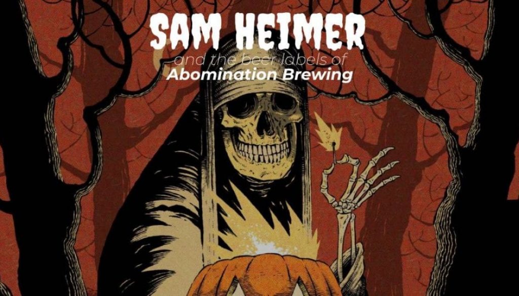
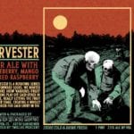
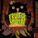
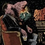
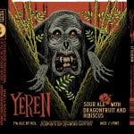
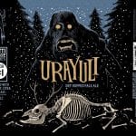
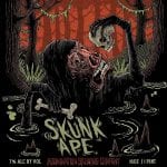
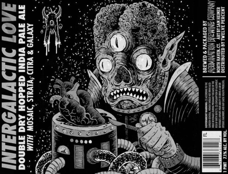
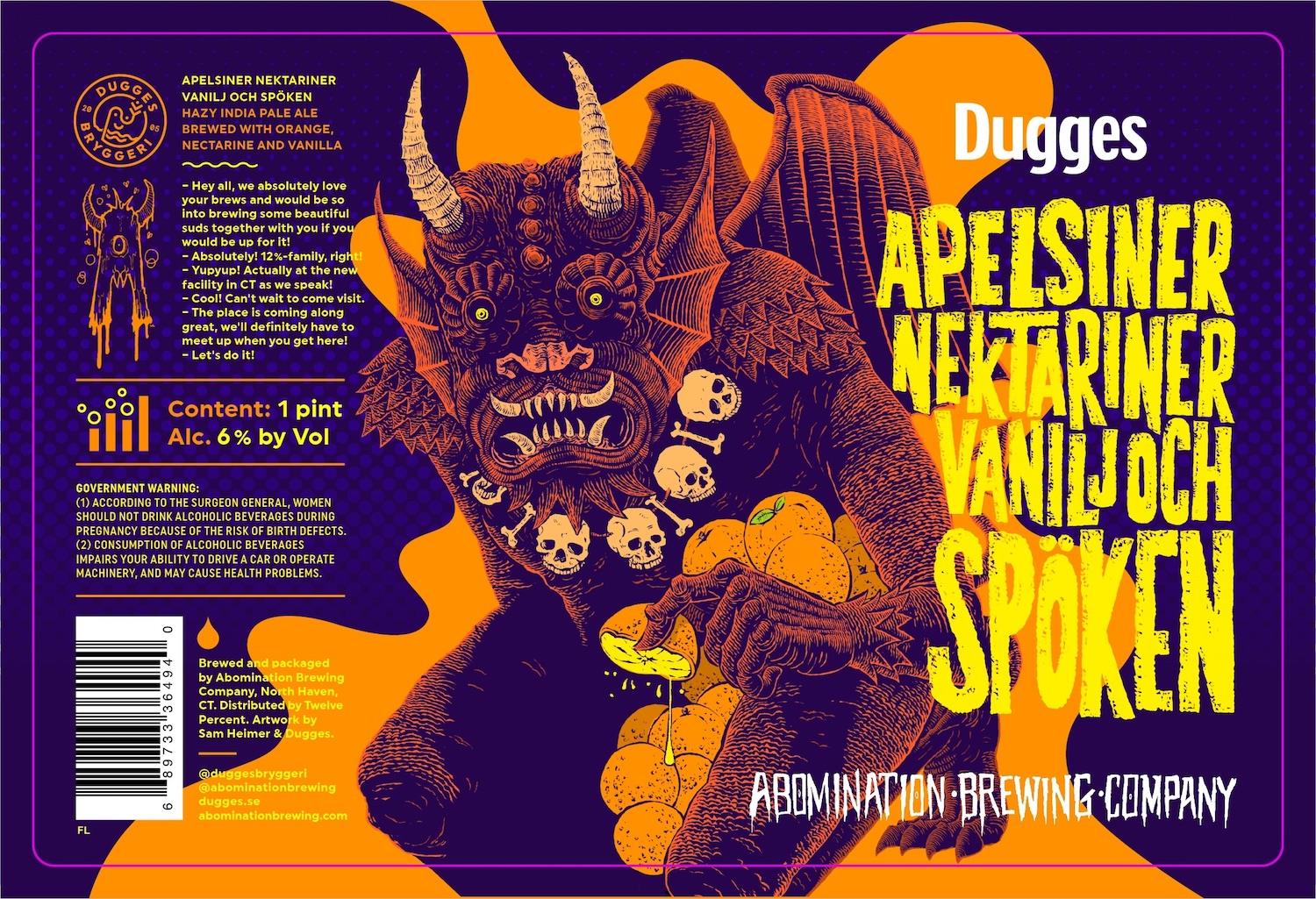
You can tell that artist Sam Heimer absolutely revels in the spirit of the Fall season, not simply via subject matter, but with his work’s style and flavor. Heimer leverages the fine pen work of Edward Gorey combined with the aesthetic and soul of Tim Burton. I see Gustav Dore and Mike Mignola in his work and that’s good company to keep when the last of your only candle just went out. With beers with such names as “Lantern Lighter”, “Rotting Earth”, and “Only Hell Can Save Us Now”, I can think of few more appropriate breweries for his work than Abomination Brewing.
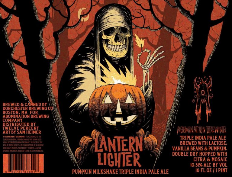
Thirsty Bastards: My favorite label you’ve done is Lantern Lighter? In fact, I’m super bummed I missed it for our annual Pumpkin Beer Labels post. Can you tell me the story behind its conception? What is your favorite label you’ve done so far for Abomination and why?
Sam Heimer: We can kill two birds with one stone here, and thanks bud! Lantern Lighter is my favorite as well.
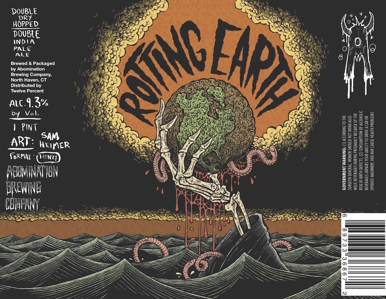
As soon as I realized I’d be illustrating more than that first label, Rotting Earth, I started bugging Josh [Arno] to do a Pumpkin Ale. Not just because Halloween is a big part of my art and life in general but doing a Pumpkin Ale label was an item on a bucket list within another bucket list for me.
My first target marketing campaign (looking for work) as a professional illustrator was to several hundred Craft Breweries. The card was a pumpkin-headed scarecrow toasting the moon, leaning on a firkin nestled in pumpkin vines. The mailer yielded no work, so a dozen or so years later when I did Rotting Earth for Abomination, it was a personal victory for me, and Lantern Lighter was a second.
As far as conception, I wanted classic, vintage Halloween and a simple composition. I shouldn’t badmouth other art/artists here, but a lot of Pumpkin Beer labels miss the mark for me either in concept or execution. I just wanted it to read as Halloween, pure and simple.
TB: How did you get started making labels for Abomination?
SH: Josh reached out to me via Instagram about doing the label for Rotting Earth around a year ago. Can’t remember if I asked how they found me, but if not through Instagram, it was probably from doing the poster design for the Kennett Square Brewfest, a great local Beer event that Abomination has been at a few times.
TB: Where are you from and where did you learn to be an artist?
SH: Lansdale, PA, right outside of Philly. Every Saturday growing up my parents had me try a myriad of sports, art and nature classes and other activities. The art is the only thing that stuck. Throughout middle and high-school I was talking every art class my parents could find for me, as well as pre-college classes at Moore and UArts. My brother, 3 years my senior and also a freelance illustrator, went to University of the Arts for Illustration, and seeing no other path for myself, I did the same.
TB: Can you tell me a bit about your process? Are you all digital? Traditional? Mix of both?
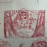
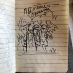
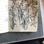
SH: Almost completely traditional. I’m not good with technology but I found a sort of compromise. I build images like a screen print, where every element is a separate layer. The main ink on Bristol, and then color, shadow, and highlights on separate pieces of semi-transparent layout comp, also in black ink. At the very end it’s all scanned in and juxtaposed digitally. Most of the color I use is paper swatches I made from cutting up and scanning old comics to make a palate I liked.
TB: What other art do you make?
SH: A whole lot of Horror and Halloween inspired art, both for client work and personal work.
Jason McKittrick, a sculptor and resin artist, and I run a sort of Halloween art club called Order Of The Thinned Veil, that I create a lot of work for. It’s our way to celebrate the Holiday all year and continue making Halloween inspired art in the Spring and Summer when Halloween seems so far away. I also run a micro toy company that helps me scratch other odd artistic itches I get.
TB: How can your fans find you and your work? Can they buy your art?
SH: The best way is Instagram, and I also have an outdated portfolio site, and an Etsy with prints and other various items throughout the year.
Also worth mentioning, I have started an Instagram account @pumpkin_ale_reviews to further explore my favorite seasonal novelty.
TB: Optional: True or false – The best beer label art looks like it could also be Magic: The Gathering card art.
SB: That’s a trick question. Maybe the card art from the late 90’s when Magic started. The art was nice and varied and had a grungy quality about it that mirrored fantasy and comic art of the time. Now magic cards all have the same digitally-painted sterile look with a peppering of cringe-worthy steam-punk elements.
TB: It IS a trick question! Bwahahahah!
