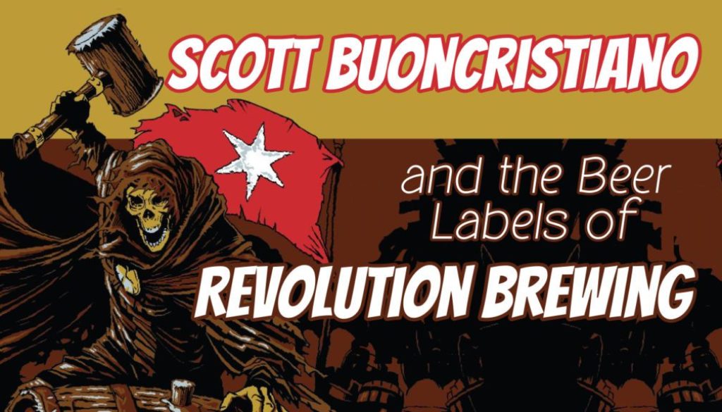
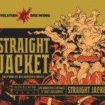
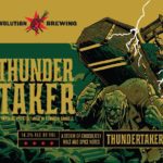
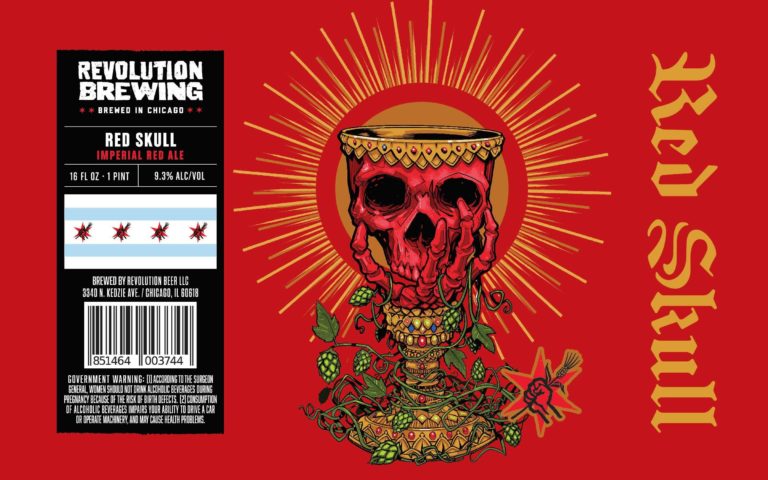
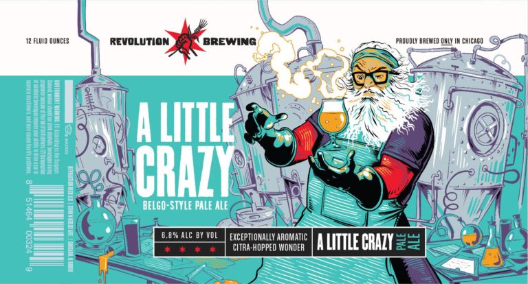
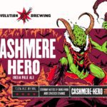
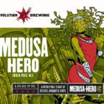
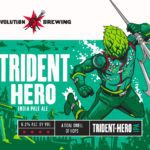
I’m not going to lie… A significant amount of space in my beer cellar is dedicated to Revolution Brewing’s Deep Woods beers. When I caught word that this series of barrel-aged whales was going through a rebranding, I jumped at the chance to find out who the artist is with the honor of having their work emblazoned upon the vessels of one of my favorite Chicago barrel houses.
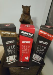
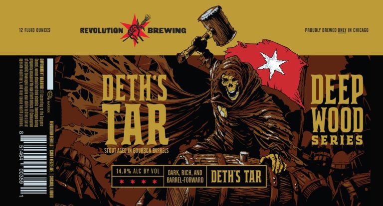
I’m sitting on a 2016 RevBrew Deth’s Tar that I can’t honestly come to terms with what occasion will inspire me to open it. The format is a boxed bottle and RevBrew has since abandoned that in lieu of cans. To quote RevBrew’s latest blog post on the subject, “Everything is in balance, or nothing is.”
“So you work on everything. All the time. You continually pin and re-pin your focus another year, or two, or three, down the road. And eventually, you feel a chill, look up, and see that a dark and beautiful Deep Wood has grown up to envelop you. And that’s not the endpoint. Nothing is.”
Artist Scott Buoncristiano is this year’s “focus” and he agrees: “…there’s still so much to learn, but that’s the fun part.”
Let’s take a “walk through the woods” with Scott!
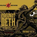
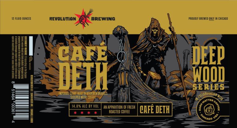
Thirsty Bastards: My favorite label you’ve done is Revolution Brewing’s Cafe Deth? Can you tell me the story behind its conception?
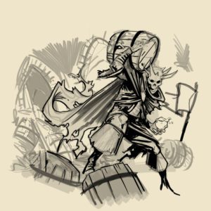
Scott Buoncristiano: Cafe Deth was actually an unused concept for a different Rev label! I think the people at Revolution Brewing liked it enough that they wanted to use it elsewhere. Ian [Law] at Mighty Few will usually give me a few completely different bits of direction for each label. One of them was using the Deep Woods series skeleton guy as Charon crossing the river Styx. After it was decided to be used for Cafe Deth, since the composition was pretty much locked down in the concept art stage, it was just a matter of adding some coffee bags to the boat to fit the theme. I think originally, I had a huge stack of barrels back there.
Josh Deth (Owner of Revolution Brewing): We decided to refresh all of our can art a few years ago, continuing our longstanding relationship with Mighty Few who have designed our cans since day one.
Overall our goals were to clean up the background design and Mighty Few proposed a new layout that brought the characters to the foreground, so they really jump out of the can more so than [in] the past when they have branding in front of them. The Deep Wood Series labels are actually the last component of our portfolio to get the refresh, so these new cans bring that multi-year project to completion with a big exclamation point.
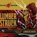
For our barrel-aged beers, the new art adds an entire new dimension to the brands and brings them alive more than ever before. In the past, most of the beers just featured a wood barrel as the centerpiece and now they all have their own character and story to tell. These beers are the pinnacle of our brewers’ art inside, and Scott’s killer new designs are just a great match for them.
TB: What is your favorite label you’ve done so far for Revolution Brewing and why?
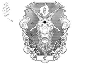
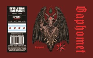
SC: This is a tough one! I’ve done somewhere between 60 and 70 labels for them so far. Lucia and Baphomet are definite standouts, but I think my #1 would have to be Deth’s Tar. It was the one that kind of kicked off the vibe for the new look Deep Woods series. Ian really deferred to me on that one…he said something like “this is your specialty, so do what you do”. I did some pretty thorough and varying character design of this guy until he was just right. He’s the style of character I draw for fun and for myself, so that label is very “me”.
TB: According to Ian from Mighty Few, your work for Armada brewing really demonstrated your strengths in character-driven work. How did you get started making labels for RevBrew?
SC: Years ago I got a random email one day from Adam and Ian of the design team The Mighty Few. I think they had seen my work pop up on Pinterest or Instagram or something and asked me to do some labels for Armada Brewing. We worked really well together as a team and they were happy with my work, and that was around the same time as the RevBrew revamp was happening, so they brought me on for that. About two and a half years later and still going strong!
Ian Law: All along [Scott’s] been strong with character creation. That’s something he thrives in.
We’re in a sweet spot right now in terms of the process and it really shows in the Deep Woods stuff… We’re at a point where Scott is a pretty busy person.
TB: Where are you from and where did you learn to be an artist?
SC: I am from Cape Cod, Massachusetts and I took a pretty unconventional path with my career. I took some art classes in high school, then went into the restaurant industry for about 16 years and pretty much never touched a pencil or thought about art much. Then I burned out on being a bartender and decided to learn to draw at around thirty-four. For me, it was really about putting in the hours at the drawing table, and I put in a LOT. Lots of trial and error and repetition and a lot of terrible drawings early on. 10 years later and there’s still so much to learn, but that’s the fun part.
TB: Can you tell me a bit about your process? Are you all digital? Traditional? Mix of both?
SC: Aside from the occasional penciled thumbnail sketches, I’m pretty much all digital now. It’s just so much more of a streamlined process for me…sharing files, revisions etc. It helps me be more efficient with my time.
I use a Clip Studio Paint. It’s a manga/comic book drawing program, so it is fairly specifically made for penciling and inking. It was a pretty seamless transition from when I went from traditional drawing to digital. I really only use a few digital brushes, and I made them out of scans of actual physical pen tips I used to use. I’ve tweaked them so they behave pretty much exactly as if I were using a micron pen. I’m a bit of a luddite, so I probably don’t use the software to it’s full extent, and I just use it like I would pen and paper….but with zoom and an undo button. I also do all my coloring and color separations for print in Clip Studio.
I draw on a Wacom Cintiq 22” HD and run it through a 2020 Mac mini with the M1 chip… that thing is unbelievable. I also have a 12.9” iPad Pro, again with the M1 chip, that I’ll sometimes use to sketch and can just airdrop a sketch over into my main setup to bring to final. More often though, everything is done from start to finish on the Cintiq. I also use the iPad as my second monitor (with the Cintiq being the first) and have reference material or notes I need to refer to on there.
TB: What other art do you make?
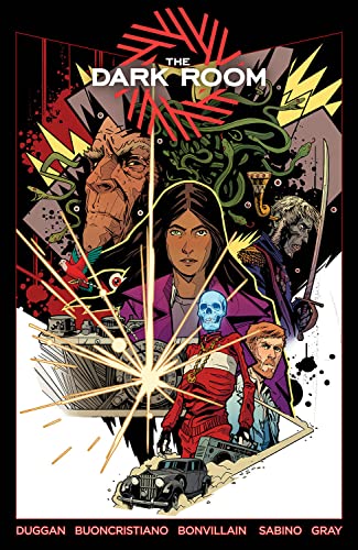
SC: In addition to beer labels, I also do book illustrations and concert posters, though my main focus nowadays is comic book work. My first creator owned graphic novel (co-created with Gerry Duggan) is out now. It’s called The Dark Room and is published by Image Comics. I am very proud of it!
TB: True or False – The best beer label art looks like it could also be Magic: The Gathering card art.
SC: Hmmmm……good question! I’d have to say False. I’ve done both Magic: The Gathering card art as well as beer labels, and they’re totally different things with different approaches. That’s not to say that MtG style art doesn’t work for a beer label, but I think the best beer labels represent the vibe of the particular brewery, the type of beer, and an important thing is how it “reads” from up close to twenty feet away on a shelf in a store. You want them to stand out amongst the rest, and ultimately help make the sale. I think beer label designs work best when there’s a little room to breathe. Negative space and all that. MtG cards are masterfully done, but maybe a little too busy to work for the purpose of a label. Well, my philosophy on a label’s purpose anyway…
TB: How can your fans find you and your work? Can they buy your art?
SB: On Instagram and Twitter, and my website is ScottBuon.com. I have a shop on my site for posters and apparel and whatnot. The Dark Room can be found at your local comic shop or bookstore and can also be ordered off amazon or an online book seller.
- The hunt for a camera containing an undeveloped photo of the face of true evil threatens to wipe out New York City one chilly autumn evening. Doune Mahoney is the curator of a private collection of extremely dangerous cursed objects, and her night’s about to go to hell. Your new favorite artist SCOTT BUONCRISTIANO!
Prices pulled from the Amazon Product Advertising API on:
Product prices and availability are accurate as of the date/time indicated and are subject to change. Any price and availability information displayed on [relevant Amazon Site(s), as applicable] at the time of purchase will apply to the purchase of this product.
Oh hey! FYI… any links on this page that lead to products on Amazon or other online retailers are affiliate links and we earn a commission if you make a purchase. Thanks in advance for your support!

