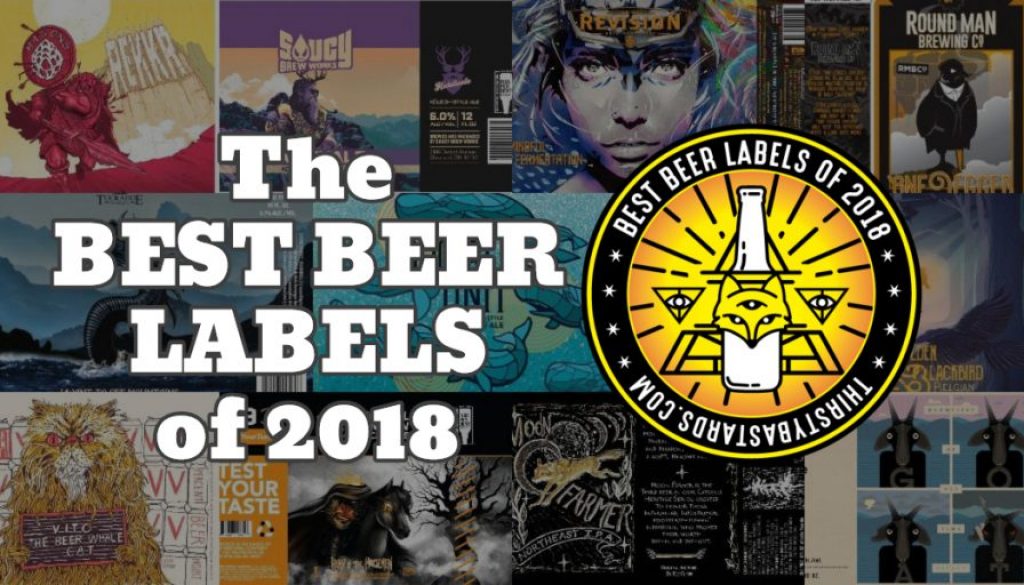
 This is it, Little Leaguers! This is the fruit of all our labors! You voted and here they are! THE Top Ten Best Beer Labels of 2018!
ICYMI we put together a list of 80+ labels from last year for your consideration. With a $300 gift card going to one lucky voter, the turnout blew our expectations out of the water. We had almost 800 votes! That’s crazypants!
Much thanks to everyone who participated in voting for their favorite labels. We’ll definitely be doing this again. SUPER special thanks to Andrew at Beermiscuous for donating their delightful Field Guide for the prize closet!
[amazon template=iframe image&asin=0998995819]
You can jump right to the Top Ten, but those of you who like stats and branding-color-specific pie charts might enjoy this thing we made just for you:
That’s right, the #1 label took nearly a quarter of the votes! Also, astute readers will notice there are actually ELEVEN labels listed here thanks to the tie for #5
So, without further ado, Josh and I break down the Top Ten Best Beer Labels of 2018, voted by you lovely Thirsty Bastards readers, in reverse order of popularity. Cuz, you know, suspense…
The following labels were registered with the Alcohol and Tobacco Tax and Trade Bureau during the calendar year of 2018. They have been selected by the voting of hundreds of readers like YOU in our Best Beer Labels of 2018 Giveaway Contest.
Contents
- #10 – Connecticut Valley Brewing “Social Unit NE IPA”
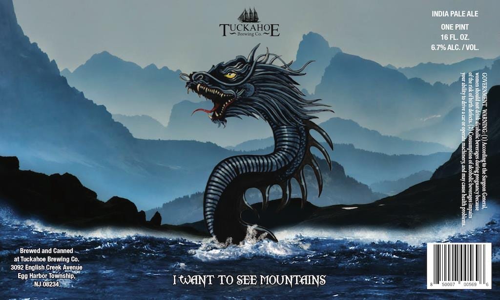
- #9 – Tuckahoe Brewing “I Want To See Mountains India Pale Ale”
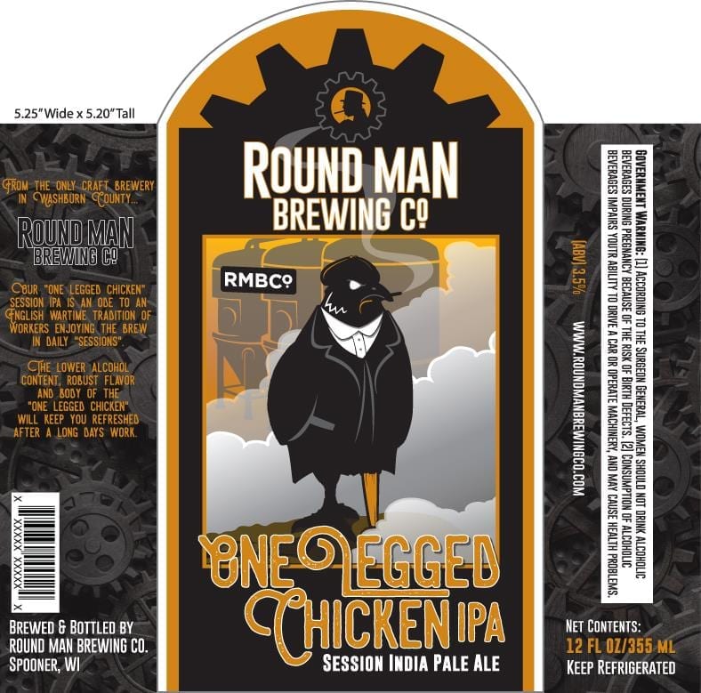
- #8 – Round Man Brewing “One-Legged Chicken Session India Pale Ale”
- #7 – Mason’s Brewing “Rekkr IPA”
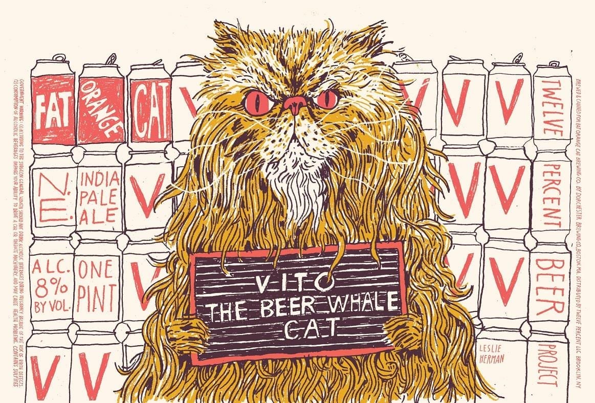
- #6 – Fat Orange Cat Brewing “Vito The Beer Whale Cat NE IPA”
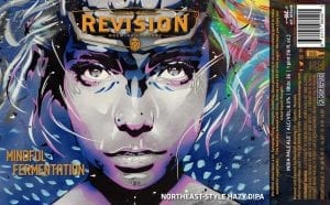
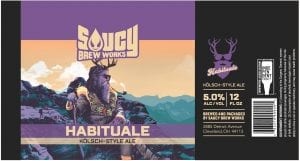
- #5 – TIED! Revision Brewing “Mindful Fermentation DIPA” Saucy Brew Works “Habituale Kolsch”
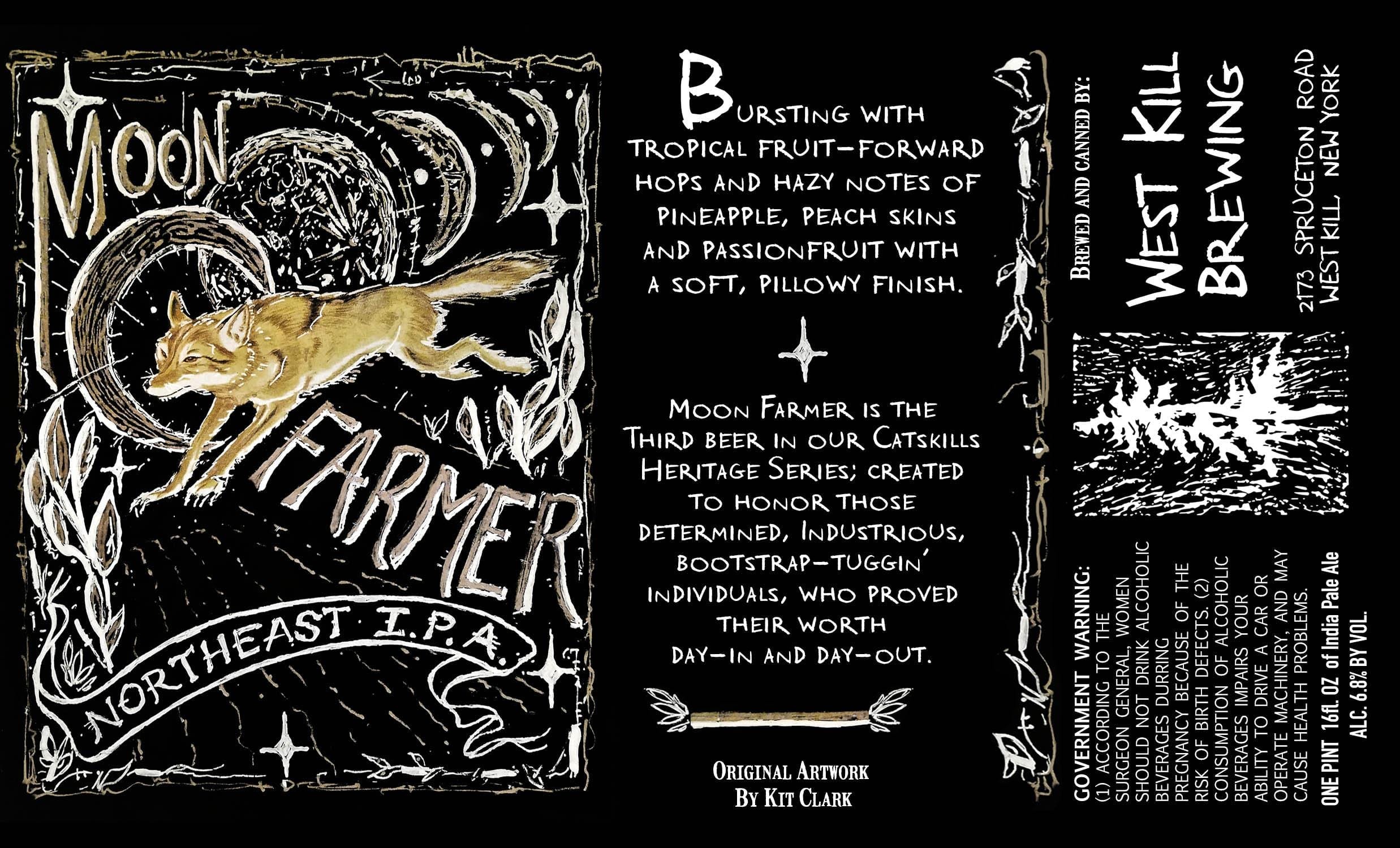
- #4 – West Kill Brewing “Moon Farmer IPA”
- #3 – Beau’s All Natural Brewing “Grumpiest Of All Time Urbock”
- #2 – D9 Brewing “Head Of The Horsemen Imperial Pumpkin Ale”
- #1 – Oddstory Brewing “Golden Blackbird Belgian Blonde”
#10 – Connecticut Valley Brewing “Social Unit NE IPA”
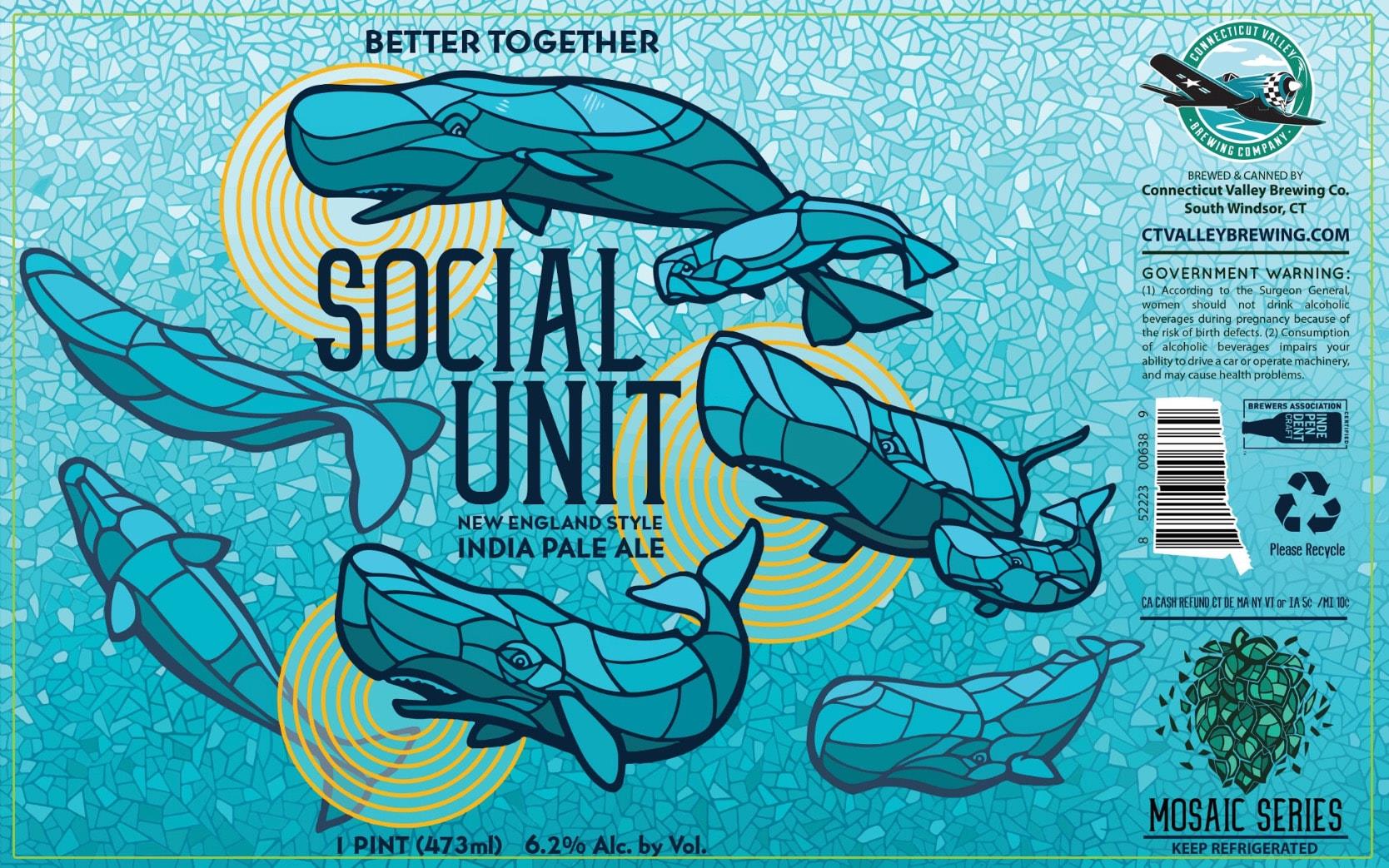
Craig: This one jumped out at us because of the cool composition and unique stained-glass illustration style. Also, because it visually confirms that whales talk to each other just like Aquaman did in the Justice League cartoons.
Connecticut Valley Brewing owner and founder, Lori Palauskas, is on a mission with Social Unit. “I am very excited that you chose this can for this is one of our messages that I hoped would be shared with many people.
“Social Unit is inspired by the Connecticut’s state animal, the sperm whale. The art is done is mosaics because of the hops that are in the beer.
“The can art is to make people aware of all whales that are out of sight and so out of mind, but are still in danger every day. One of our core charities at the brewery is Save The Sound, which is an organization that works to keep the waterways, rivers, streams and Long Island sound safe for wildlife and humans. To learn more about how you can help save the sound, check out ctenvironment.org.
“We also put a link on our website to adopt a whale and help support the critical research Ocean Alliance which is doing its part to conserve whales and their ocean habitat.
“When you read what a social unit is, you will see how similar whales and people are in our desire to connect with others.
“‘A social unit is a group of sperm whales who live and travel together over a period of years. Individuals rarely, if ever, join or leave a social unit. There is a huge variance in the size of social units. They are most commonly between six and nine individuals in size but can have more than twenty. Females and calves spend about three quarters of their time foraging and a quarter of their time socializing.’*
“As craft beer lovers, we know that craft beer is not only delicious, but also better shared with family and friends in a ‘social unit.'”
#9 – Tuckahoe Brewing “I Want To See Mountains India Pale Ale”
This label was created by Mike Bell who has done quite a few labels for Tuckahoe Brewing. You can read our interview with him here!
Josh: Aside from that one thing with the Jersey Devil, the closest I’ve ever come to an encounter with a cryptid on South Jersey Shore is a brief childhood infatuation with the Sea Serpent roller-coaster on the Wildwood boardwalk (summer of ‘87 rulz!), so I can totally get behind this super-sweet sea snake piece from Tuckahoe from Egg Harbor (just west of Atlantic City).
It’s impressive how much depth and atmosphere is accomplished with such a limited color palette. It establishes a bold, yet ethereal composition that really makes the art “pop”.
Hopefully, this leviathan turns right around, gets a good gander at the mountains, and can then find somewhere quiet where he can finish his book.
#8 – Round Man Brewing “One-Legged Chicken Session India Pale Ale”
Craig: The posture of the bird man on this label makes me think he’s surveying his accomplishments, while the steam and gears suggest that the work continues in earnest. This guy’s seen a lot – he lost a leg! But no time for slacking. That beer’s gotta get made!
“ALL of the Round Man Brewing labels are so unique and each have a fun, story telling explanation!”
-Kaitlyn Holt
Round Man founder, Spencer Churchill, connected me with Chris Comstock from Big Woods Creative. Chris had this to say:
“From the beginning, the vision for Round Man Brewing Company has been vintage industrial and it beautifully permeates everything from the building and bar to the branding, marketing, food and of course culminating in the beer.
“When I was given the beer names and descriptions, the One Legged Chicken stood out for sure and I knew I wanted to do a bad ass, confident, not-to-be-messed-with-type of character with a 1920-30’s industrial look.
“I’m proud of the work and very thankful to the Churchill’s for the confidence they have shown in turning me loose creatively.”
#7 – Mason’s Brewing “Rekkr IPA”
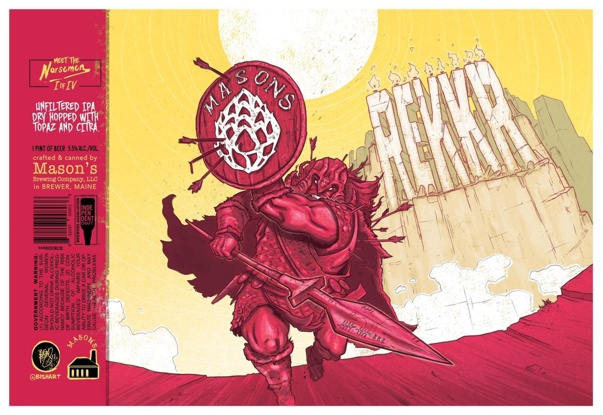 Josh: Mason’s Rekker barrels in with a sick sword & sandals comic style and a killer color palette.
Chris from Mason’s had this to say on the origin of the concept: “Rekkr is the Norse word for Warrior Man. This can was developed as a series of 4 beers called the VI Norsemen. We were doing a series on fantasy type warriors and knew we wanted an over-the-top brick-house of a viking character, the muscle. So of course, with a name like REKKR, it was a perfect fit.”
Ben Bishop, the artist, had this to add about the process: “Artistically, I knew I wanted to keep the color palette as minimal as possible, so after a few different variations, landing on the vibrant, strong red over yellow made the most sense, giving the scene a really warm, brutal atmosphere. I also like to incorporate the beer names and Mason’s logo into the art whenever possible, so making the logo actually hammered steel on his wooden shield was an obvious win. Coming at these beer cans from a comic artist and toy collector perspective has proved to be a winning combo. The idea is the same, tell as much story in a single image as you can… and of course, make each can epic enough that people will want to ‘collect them all’.”
#6 – Fat Orange Cat Brewing “Vito The Beer Whale Cat NE IPA”
Craig: Sheila Mullen from Fat Orange Cat, of East Hampton, CT, had this to say about Vito:
“We love our VITO label so much and are honored by being in the top ten of your contest.
“Our artist, Leslie Herman and I were introduced last year by Alex Blank from Twelve Percent Beer Project ( the collective we are in). We love his work so much and he loves our vibe, so we exclusively use his artwork. Les worked from images on Instagram and came up with the Vito mugshot concept. We all LOVED it and went with it.
“Vito The Beer Whale Cat is an Instagram celebrity. We had been following each other and commenting for a while. I reached out to his people, Scott and Amber Peluso, about doing this beer in his honor. They loved the idea. We all became friends during the process and did a label for their other cat Lorenzo the Beer Cat as well.”
Scott Peluso, Vito’s human, had this to say:
“When Shelia from FOC approached us about using Vito’s name and likeness on a can we were thrilled. We had been such big supporters of their small CT brewery. Being able to have some input in Leslie Herman’s wonderful design made it that much more personal and special. Vito is our oldest Persian Himalayan cat and got his name originally because he was so elusive and only would come out for Whale status rare beers. Over the years he became a fan favorite and got so used to posing for beer pictures. In his old age he has become more exclusive again but he will always be our first cat and the one of the three who infamously got his beautiful face and name on a beer can. #SorryLorenzo.
“Cheers and thanks for picking Vito as one of the Top Ten.”
#5 – TIED!
Revision Brewing “Mindful Fermentation DIPA”
Saucy Brew Works “Habituale Kolsch”
Craig: This Revision label is one of MY favorites. It takes me back to my airbrush days with lots of masking and some creative overspray. Revision touts this beer as their “latest liquid thought”. This must be Saint Brigid, Nokhubulwane, or Ninkasi lending her fermentation gifts and blessing their brew – her gift inspiring their recipe.
“This label takes me back to The Neverending Story and reminds me of a gentler time before I was old enough to drink. :-)”
-Helen Nunn
According to Darla Roberts, Revision VP ad Co-Founder, the creator of the art for Mindful Fermentation is Reno artist, Bryce Chisholm.
“Revision actually asked Bryce to create a piece with a different beer name in mind. We were looking for something that showed the creative side of the mind vs the analytical side – right brained vs left brained. When the art was completed, the original name didn’t fit the art and the full sized painting showed a lot of exposed brain. The art was beautiful and we wanted to make it work, but how would consumers react to the visual of an exposed brain while drinking a beer?
“CEO/Brewmaster Jeremy Warren sat on the proposed art for a bit trying to figure out what the solution was. Then it came to him, ‘Mindful Fermentation’. We cropped down the amount of exposed brain just a bit and the art went together perfectly with the new beer name resulting in one of Revision Brewing Company’s favorite labels.”
Josh: Saucy’s Habituale is a really cool fantasy-meets-poster art piece. I appreciate that it has a nice easy-going feel to go with the style of beer, as it’s always a bit weird when a label for a mild beer is festooned with flaming demons, exploding skulls, and the like. I’d like to think that the figure on the label is the patron saint of brewers, or at least a composite of pretty much every brewer/beer guy ever.
True story: a couple of years ago Craig and I were in Denver for the Great American Beer Fest; we went into a shop and the sales girl warmly welcomed me back. I had never been there before. I had to explain that as much as I appreciated her enthusiasm, that pretty much everyone who came into the dispensary over the next 3 days was gonna be a big dude with a long beard dressed like a transient. I’m sure I wasn’t wrong.
Jumps off the shelves. Great beer, amazing artwork!
-Austin Stritmatter
#4 – West Kill Brewing “Moon Farmer IPA”
Josh: Here’s the story on this sweet lithograph design straight from Mike Barcone of West Kill Brewing:
“Kit Clark the artist was hitchhiking here in the Catskills when we picked him up because we thought he was someone else. Turns out he wasn’t who we thought he was haha. On our way to drop him off at the bus station he informed us of his journeys and that his final destination was the west coast. He was. basically tramping it around the country. He also informed us that he was an artist and did a lot of collage work. He told us his Instagram tag and away he went. We started following him immediately and fell in love with his art.
“Fast forward 3 years , we ran into Kit in Portland, OR and told him down the line we would love to have him design some of our can art. We came up with the name Moonfarmer but had no idea what should go on the can. It hit me all of a sudden, coyotes hunt for food at night. Coyotes are moonfarmers. Kit drew up the design and we fell in love.”
“Special landing pad in the middle Of heaven….Mike and Patrick and the crew are up to some choice brew and unique ideas….easy winner”
-Pat Cash
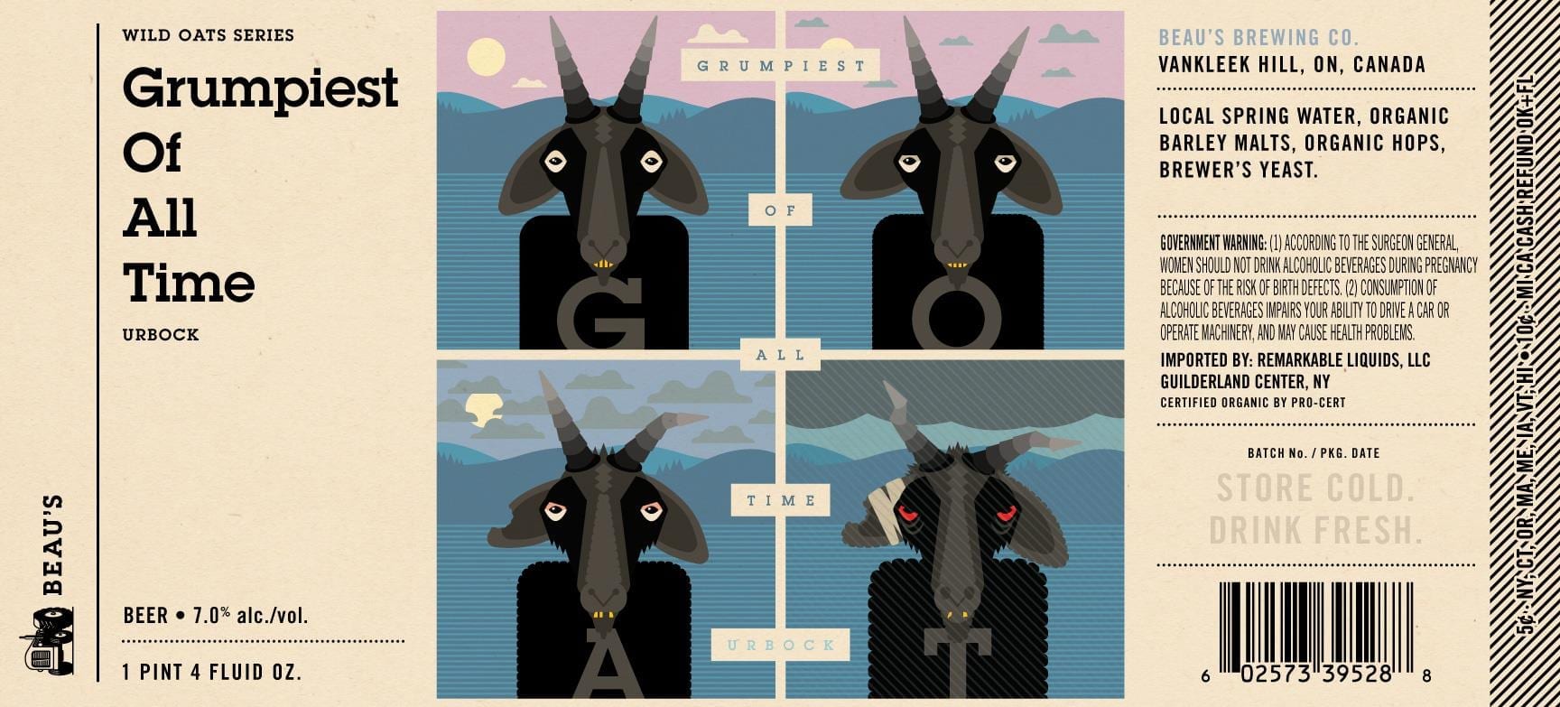
#3 – Beau’s All Natural Brewing “Grumpiest Of All Time Urbock”
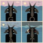
“The name G.O.A.T. is a play on the acronym ‘Greatest Of All Time’ found everywhere in pop culture. Since the German word ‘bock’ means ‘goat’ in English—and goats are often depicted on bock beer labels—we decided to merge the animal and the acronym. Since goats are generally seen as grumpy, we gave ours the title of Grumpiest Of All Time.
“The label is composed of four panels, with our goat illustration getting increasingly grumpier in each frame.”
So there you have it… G.O.A.T. is a comic! A comic about a down-on-his luck… um, goat.
As with all comics, the story is what happens in between the panels. I love that we have to guess what happened to this grumpy guy when we weren’t looking.
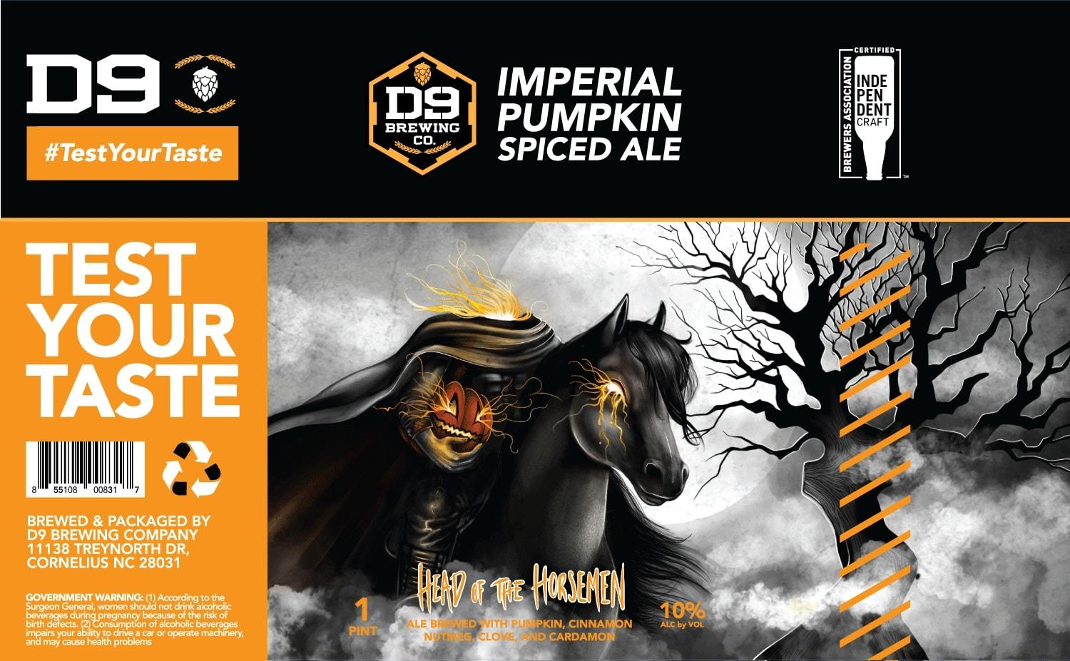
#2 – D9 Brewing “Head Of The Horsemen Imperial Pumpkin Ale”
Josh: Here’s the time in the count-down where we provide ancillary historical information in our endless struggle to qualify ThirstyBastards.com as an established educational resource and rake in that sweet government funding. Washington Irving created the Headless Horseman as a Hessian soldier beheaded by a cannonball in the Revolutionary War, which really doesn’t explain why he’s chasing after cowardly yankees across colonial Tarrytown. I guess he could just be a pissed-off kraut, but pick a side, for fuck’s sake. Germans gonna germ. Okay, now that we have that out of the way, onto the artwork.
Once again, we have another super limited color palette, but here the color works to accent the art rather than overtake the composition. It works here, and that’s why this raked in the votes to be the runner up for best of 2018. Enough said.
“Super cool creepy label. Definitely makes me want to know what’s in it.”
-Sandy Michel
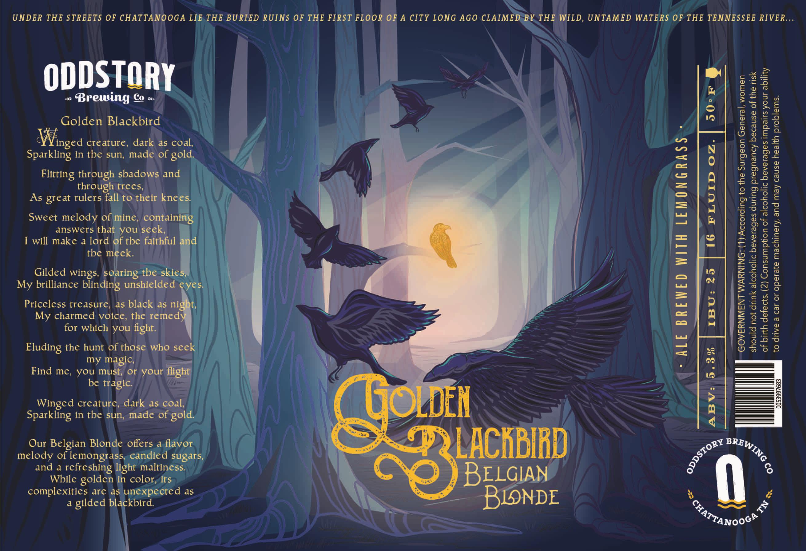
#1 – Oddstory Brewing “Golden Blackbird Belgian Blonde”
Craig: Golden Blackbird is THE Number One Beer Label of 2018! And well deserved!
We have an interview lined up with Emily Boyd, the lead artist for Oddstory Brewing. Here’s what Oddstory’s graphic design, Jenna Tomaszewski, had to say:
“Golden Blackbird was the very first beer can label Emily Boyd and I created together, so this one holds a special place in our hearts. We strive to create a detailed designed environment for each of our labels to inhabit. Each label is accompanied by a story often inspired by folklore, which draws inspiration for the overall illustration, color palate, and typeface choices. It is important to us that each label can stand alone as its own branded beer identity, while also remaining cohesive with the creative process of our other canned flagship beers. We have been so humbled to see these cans out in the world doing just that.”
“Beautiful doesn’t begin to describe this label. Often I have heard beer and art don’t go together but this label defies all of those ‘beer’ norms. It’s creativity and beauty surpass anything I have seen. It is a story within visual mastery.”
-Kiersten Williams
You can read more about the art of Emily Boyd in our interview with her!
Congratulations Oddstory, Jenna, and Emily! And congrats to Ian F. and Ryan W. – our giveaway contest winners.
Label images research made possible using the highly recommended LabelVision search tool at ShipCompliant.
*Wikipedia contributors, “Sperm whale,” Wikipedia, The Free Encyclopedia, https://en.wikipedia.org/w/index.php?title=Sperm_whale&oldid=881269680 (accessed February 7, 2019).
