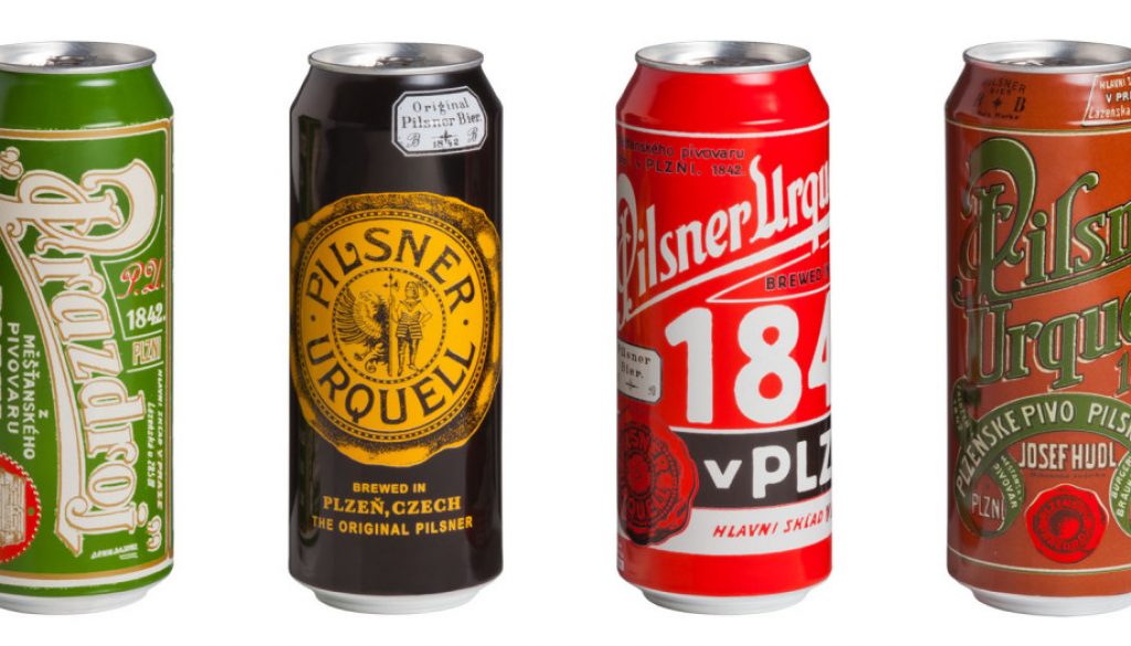
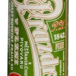
I don’t usually blog about label designs, but I’m very excited by the look of these new Pilsner Urquell cans. This summer Pilsner Urquell will be turning the “retro can” trend on its ear by releasing historically-inspired, limited edition cans.
According to their press, “These are not vintage cans, they are newly crafted designs that draw from our rich and storied history, nearly 200 years of packaging, tavern signs, and cask marks.” The results are gorgeous!
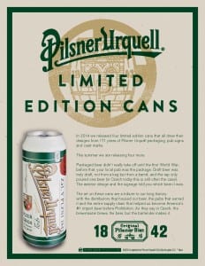
“In 2014 we released four limited edition cans that all drew their designs from 171 years of Pilsner Urquell packaging, pub signs and cask marks.
“This summer we are releasing four more.
“Packaged beer didn’t really take off until the first World War; before that, your local pub was the package. Draft beer was truly draft, not from a keg but from a barrel, and the tap only poured one beer (in Czech today this is still often the case). The exterior design and the signage told you which beer it was.”
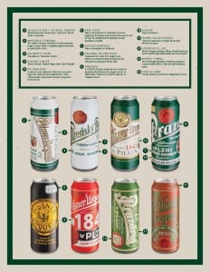
“By looking back into our archives of the last 170 years of designs, we’ve found a diverse range of different labels. Some of these contained the name of a distributor, some had links to warehouses where the beer was stored; there were different brandings burnt into the wooden barrels, different uses of the town’s coat of arms, different uses of the brewery’s wax seal; different colours and different phrases, all linking back to the brewery in Plzen.”
Each of these Pilsner Urquell cans is like a marketing design history lesson. I love the diagrams they put together describing where each part comes from. The whole campaign says, “We’ve been at this a long time and we’ve got the medals to prove it.” Well done, Pilsner Urquell!

