In case you missed it, we selected 175 of the best labels registered for sale in 2019. Then we invited our fine readers to vote on which labels they believe deserved to be called THE BEST.
A whopping 873 of you did!
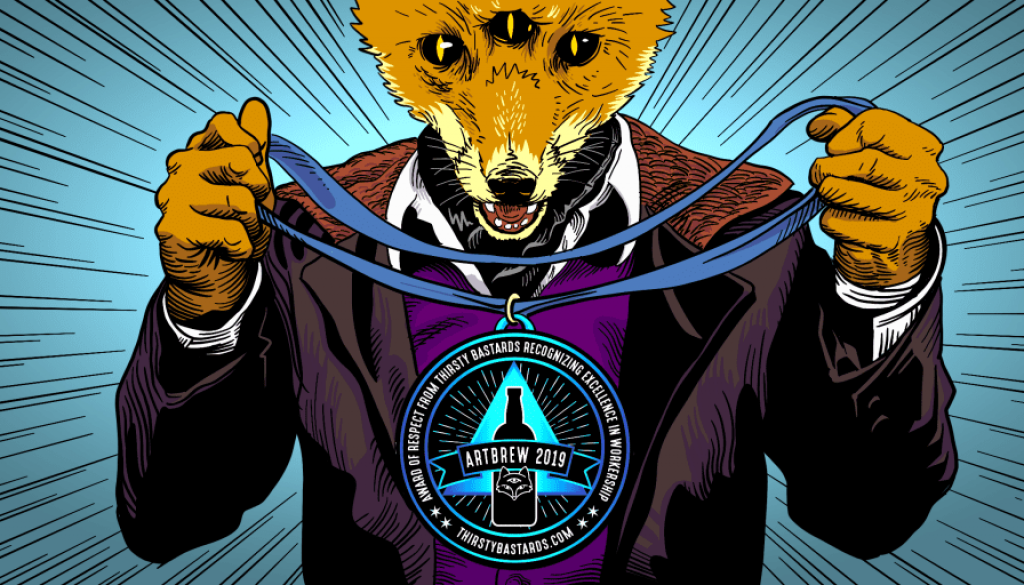
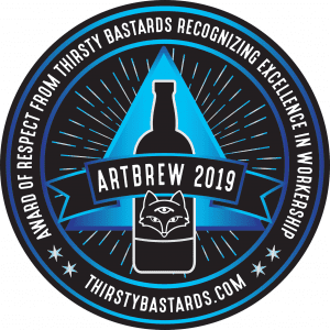
As our second year crowning the Top Ten Best Beer Labels of the Year, we decided to give our marginally-coveted award a name: ARTBREW – Award of Respect from Thirsty Bastards Recognizing Excellence in Workership!
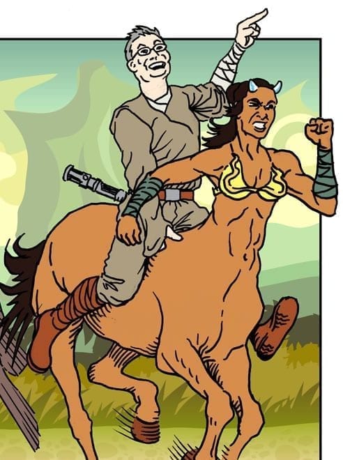 Josh and I will naturally provide our brand of colorful commentary on the winning labels. We are honored to be joined this year by friend-of-the-blog and host of The Nerdy Legion podcast, the Master of Sunshine and Sparkles himself, Mr. Nick Wetmore. Nerdy Legion episodes are available weekly. If you love pop culture, comics, fast food, recipes, and home tech experiments, there’s plenty of room for you in the Banana Hammock!
We’re super stoked to reveal the Top Ten, and I’ma let you see them, but first…
Contents
- The Winning Voters!
- The Best Beer Labels of 2019
- First Place! – Abomination “Pilgrimage Into The Dank” DIPA
- Second Place – Three Heads “Ol’ Salty” Salted Caramel Chocolate Stout
- Third Place – 2 Toms “Major” IPA
- Fourth Place – Big Sexy “Call of Lupulhu” DIPA
- Fifth Place – Tattered Flag/Pilger Ruh “You Should Have Put Him In Custardy” Sour
- Sixth Place – Roy Pitz “Nice Dreams” Sour
- Seventh Place – O’Connor “Angler’s End” DIPA
- Eighth Place – Middlecoast “Touch of Sunshine” Pale Ale
- Ninth Place – Collusion “Soft & Cuddly” Sour Ale
- Tenth Place – Bluejacket “They Both Melt” Dunkel Lager
- Best Voter Comments
The Winning Voters!
Winners of this year’s giveaway are being awarded prizes from Tavour.com and Craftshack.com. Sign up with Tavour today and start building your custom box of the beers you love (flat-fee shipping), or enroll in a monthly, bi-monthly, or tri-monthly subscription (ships for free). We LOVE Tavour!
Grand Prize
Winner of $300 Craftshack.com Gift Card to spend on new and hard-to-find, independent craft beers available across the U.S.
Katherine M.
Dorchester, MA
Second Prize
Winner of A Gift Box Set from Tavour valued at $99.00.
Mike P.
Dover, PA
Thanks to everyone who voted! Your participation is greatly appreciated! Without further ado…
The following labels were registered with the Alcohol and Tobacco Tax and Trade Bureau during 2019. They have been selected for their aesthetic appeal and as a result of 873 votes from our readers.
The Best Beer Labels of 2019
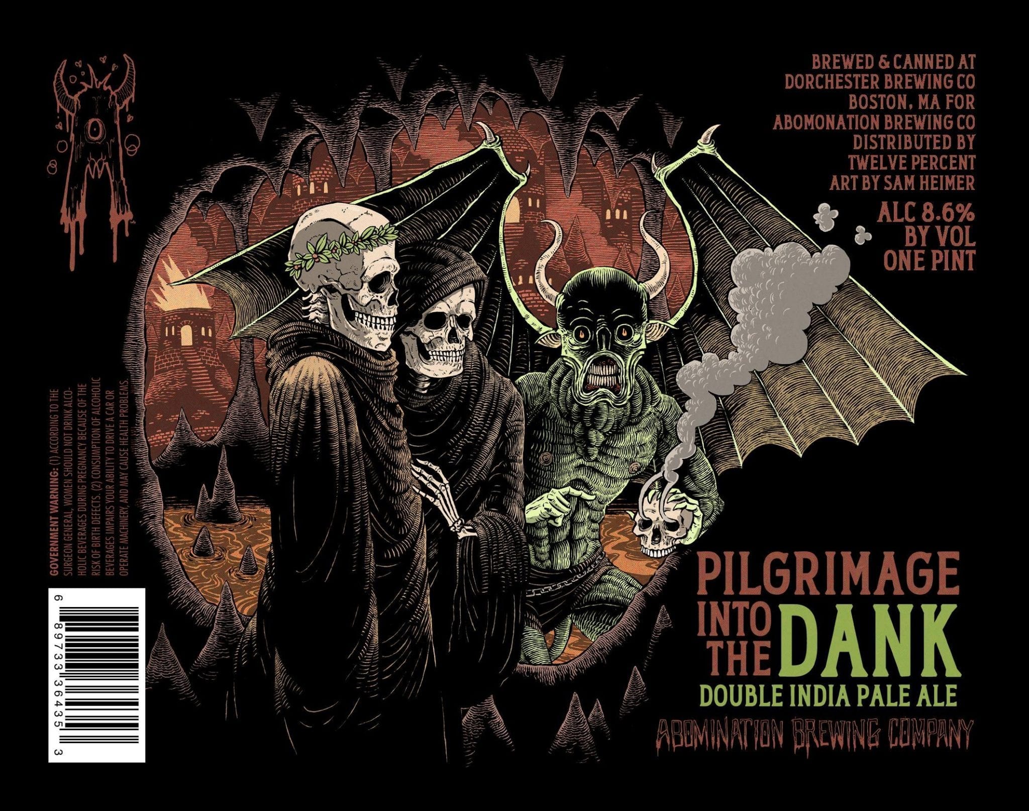
First Place! – Abomination “Pilgrimage Into The Dank” DIPA
“Abomination is always on point with their artwork, and their beer matches it. They really set a standard with all of their artwork. But this one exceeds that standard.”
– Alex M.
Nick: You want some heavy metal in your DIPA, Abomination has you covered. One part H. P. Lovecraft one part Iron Maiden, this label jumps off the shelf at you and makes you want to throw up the devil horns.
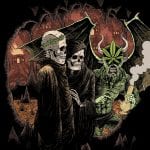 Craig: I love the intricate hatching and subtle colors on this label. The two robed skeletons seem as if they are being introduced to the skull of a comrade they’ve been searching Hell for. The look from the demon pulls us in as (un)willing spectators – he knows we’re watching!
The artist, Sam Heimer, was kind enough to supply us with the original concept for this label. A different story altogether!
Sam says, “The concept was just a play on Dante’s Inferno. The changes we had to make to the label kinda neutered the concept, but I still love it.”
Congrats to Abomination Brewing and Sam!
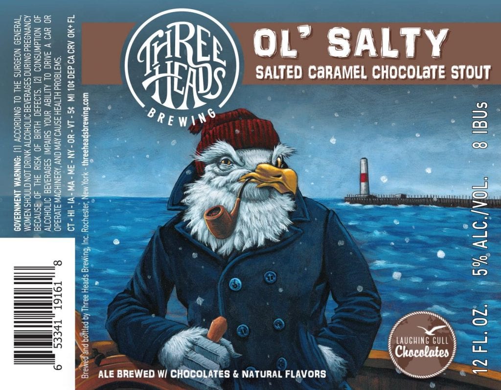
Second Place – Three Heads “Ol’ Salty” Salted Caramel Chocolate Stout
“Brilliant label and incorporates the Rochester NY vibe perfectly!”
– Cathy L.
Nick: With an image of a weather-worn seagull dressed to take on the rough seas. Three Heads Ol’ Salty label jumps off the bottle at you and made me want to investigate what is going on with that sea fairing seagull captain. Was Ol’ Salty the inspiration of old sea shanties, who’s to say.
We’re no strangers to the work of Allen Firlit – we’ve featured him in the past. Geoff Dale from Three Heads refers to him as their “secret weapon”!
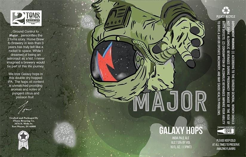
Third Place – 2 Toms “Major” IPA
“So many talented artists, but this one really caught my eye!”
-Heathee J.
Josh: The text on this label mentions “Home brew to brewery in less than 3 years has truly felt like a rocket to space. While I dreamed of being an astronaut as a kid, I never imagined a brewery would be part of this life journey.” Echoing that, the protagonist of the song Space Oddity, Major Tom (for which this beer is named), is meant to represent the helplessness of mankind against the expanse of the universe and individual man as a pawn of circumstance.
“Here am I floating ’round my tin can
Far above the Moon
Planet Earth is blue
And there’s nothing I can do”
– Space Oddity
The single for Space Oddity was released on July 11, 1969. Five days later, Apollo 11 launched from Kennedy Space Center, and on the 20th landed a man on the moon for the first time. By timing the release when he did, the song went from a cheeky jab at a current event to become the de facto soundtrack for this monumental accomplishment of humankind, launched David Bowie’s career, and has become an integral part of the zeitgeist of the era. I think the lesson here is that while talent and determination will give you a solid foundation to build from, what’s more important is timing and the ability to be clever when it matters most.
Nick: I love the astronaut imagery, but what makes this label as unique as the IPA within is it is a little off-center and the spaceman is floating upside down. I was born in Ft Wayne, IN so I’m a little biased, but this label inspires me to go visit my hometown and grab a beer.
According to 2Toms‘ Owner and Head Brewer, Tom Carpenter, “Major IPA is part of a series of what we call The Other Tom series. While the brewery name is 2Toms, there is only one. Back story here.
“Major is a nod to David Bowie’s character in Space Oddity. We first released this beer in July 2019 which happen to be both the 50th anniversary of both the Apollo Lunar Landing and Space Oddity. (Dumb luck, because we certainly didn’t plan it that way.
“Major was designed by Kaylie Snodgrass who has become our primary label artist. The label was the fourth project with us and the most important to date. There was a specific look and feel to the previous four Other Tom labels. It was very important to me that the design reflects a similar look and feel but also be a Rockstar in its own right.”
Artist Kaylie Snodgrass was also kind enough to lend a few words:
“Discussing the actual label itself, I was extremely inspired and eager to work on it. I was very nervous as well since it was one of the first few labels I did for [2Toms].
“When you started talking about David Bowie I wanted to start it right away. I grew up listening to him and watching him in the Labyrinth. I decided to try a new technique and sketch the astronaut instead of making him clean and precise. I made the background a whole mess of layered textures and gradients to try and emulate space. It’s one of those things you finish and feel like you did a really good job and you’re proud.
“I just feel very lucky and blessed that I get to do something like this every day, similar to how you feel With brewing beer people love and talk about. Having someone trust you and give you creative freedom is one of the most rewarding feelings. It puts true meaning to not wasting your time doing something you hate. Many don’t take art seriously but this shows the impact it has, it’s what people see, it’s one of the 5 senses how could it not matter. It makes someone pick up the beer because people to in fact judge books by their covers.”
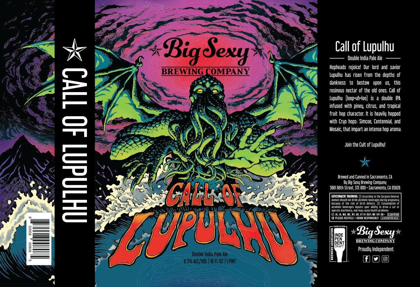
Fourth Place – Big Sexy “Call of Lupulhu” DIPA
“Looks hella goooood! ???????? Gnarly to da bonez brah!”
– Austin C.
Josh: I awake abruptly in a cold oily sweat but cannot move, firmly pressed downward against the fetid sheets by an unyielding invisible hand. My mind races trying to decipher what can be remembered and what is imagined. I vaguely recall ducking into a seaside tavern for a needed respite and a wanted repast. It was an odd establishment to be certain. The barkeep’s face could never be viewed, even when he was facing me directly and everything around seemed to possess an extra angle than should be necessary or possible. There was a barely decipherable tune squeakily repeating in the background like a rat being ground out under a boot, layered over with whispers by patrons unseen, and a persistent scratching coming from inside the walls, ceiling, and floor. Then there was suddenly a libation in front of me, and then another. As I lustily quaffed stein after stein, I lost want of food and any sensation of time or space. At some point, I was standing at the edge of the water with the tide lapping at my feet as I screamed curses of despair and regret into the abyss of the nothingness that spread out in front of me. I cannot be sure if the following is truth or a trick of the mind, but as I wept and gnashed toward the sea I could see a figure slowly rise from the depths. It grew taller than the clouds and wider than the horizon. The beast’s unblinking gaze bore past flesh to burn apart my soul. I turned and fled back to the sanctuary of my bedchamber and here now I lie. A bitter taste lingers at the back of my throat and I can taste cryogenic memories of Simcoe, Centennial, Mosaic hops. A once sweet sensation turned rancid through overindulgence and uneasy dream, for I drank way too many of those dangerously delightful beers last night, and today I must pay the inevitable toll.
Nick: Call of Lupulhu label has imagery even Tenacious D would be envious of. A demon from Fantasia’s “Night on Bald Mountain”, reaching out begging the customer to give it a taste…..if you dare. Not sure I can welcome sleep tonight very easily, thanks Big Sexy.
Dan Rafferty, Big Sexy’s head brewer, added this:
“Lupulhu (loop-uh-loo) was a character I had been thinking about for a while and I always dreamed of working with the Legendary comics illustrator, Emily Martin. Once I was able to convince her to work with me on this project, we set out to create a character whose magnitude reflected the hop character of the beer.
“The perspective of Lupulhu played a key role in conveying the enormity of the character. Emily drew on inspiration from classic San Francisco rock posters and gothic illustration, to set a dark scene with a psychedelia color pallet. Emily did an incredible job taking my vision and turning it into an epic label.”
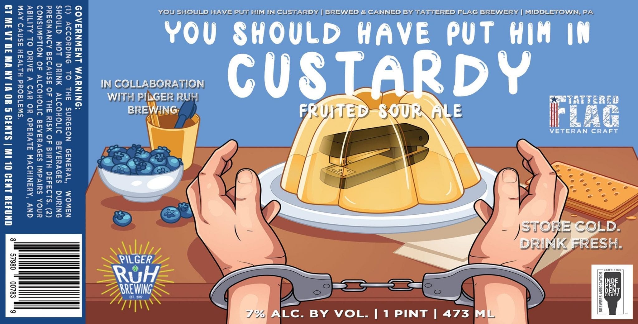
Fifth Place – Tattered Flag/Pilger Ruh “You Should Have Put Him In Custardy” Sour
“If we come across a person that doesn’t have any arms or legs do we bother saving him?”
– Heather R.
Josh: I really need to talk to you about this jerk that I work with. He’s constantly harassing me and has gaslit me to the extent that I don’t know what’s real anymore.
No, I’m serious. Within recent memory, he has changed my information on vital forms, destroyed my personal property, locked my personal property in a vending machine, given me intentionally wrong information in vital circumstances, convinced me I had ingested illegal narcotics, paid all my coworkers to call me by another name, rigged my computer to replace my name with “diapers” whenever it was written, held possessions of mine for ransom, convinced me I had a hearing issue, stalked me both in real life and in Second Life, told everyone I got a hooker at the convention we attended together (which is FALSE), ordered multiple pizzas in my name, convinced me I was being scouted by the CIA, raised the pitch on my voicemail message to make me sound like a chipmunk, slammed on the brakes while I was riding with him so my face would hit the back of the driver’s seat, tried to convince me that I had committed a murder, conditioned me to trigger a Pavlovian response, dressed up like me and imitated my speech and mannerisms, replicated my entire work area with wrapping paper, and has encased several of my possessions in Jello molds.
JELLO MOLDS! He goes home with my things, makes Jello, and then suspends them perfectly to float halfway in the molds. What fucking psychopath does shit like that? And then he has the gall to convince everyone that I’m the weird one. God, I hate that guy. I just wanna smack that smug look right off his face.
“Stapler”
– Timothy M.
Sixth Place – Roy Pitz “Nice Dreams” Sour
“I have been collecting beer labels for our future billiards room. His artwork is awesome on all the Roy Pitz labels.”
– Jane C.
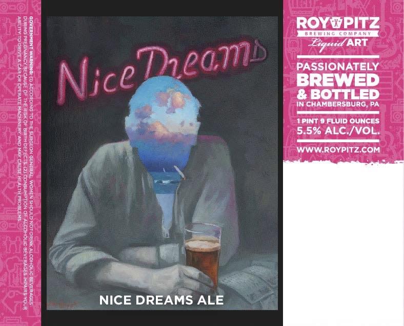
Nick: Nice Dreams recalls the paintings you would see in old European pubs with a dash of Rene Magritte and a touch of early eighties Eurythmics. Very muted color play with splashes of bright spots that bounce your attention from one to another. I feel if I try Nice Dreams, my head might just open up as well (and who doesn’t need that?).
Craig: …It’s bad enough you can count the number of bars where you can still smoke on one hand, but what are the chances this one serves Nice Dreams? Oh man, this beer takes me back. Back to a time when things were better. Back when I wore colors. Luckier times. Back when life was simpler…
“Bartender, do you do package?”
“Yes, we do!”
“It’s my lucky day. Can I get a six of Nice Dreams to go?”
“Sure, pal.”
“Here you go.”
“Thanks, see you around.”
“Hey! You left your smokes on the bar.”
“I don’t need ’em anymore.”
Roy Pitz’s label artist, William Hemsley, provided some “colorful” commentary on Nice Dreams:
“With all of the labels I make for Roy Pitz Brewing Company, I first like to develop a loose concept based on the names of the beer. I start with thinking about what would be the most obvious imagery related to the name, and then I deviate as far from that as possible in order to ensure that the concept is fresh and unique.
“In keeping with the other label designs, it was important for me that Nice Dreams was a touch ironic while still being whimsical, as we try not to take ourselves too serious in anything we do. When conceptualizing Nice Dreams, I kept visualizing the text as a neon bar sign, flickering with a letter burned out. The rest of the image was kind of effortless beyond that. The thought of a bar-fly having a drink and a smoke at the bar, with some crumpled Keno tickets next to him was a must. By employing the double-exposure techniques popular in modern photography I painted his personal dreamscape within the lines of his face and neck. The contrast between the colors of paradise and his beer up against the dull greyscale of his reality gets the message across. This is one of my personal favorites within the larger body of work I have painted for Roy Pitz.”
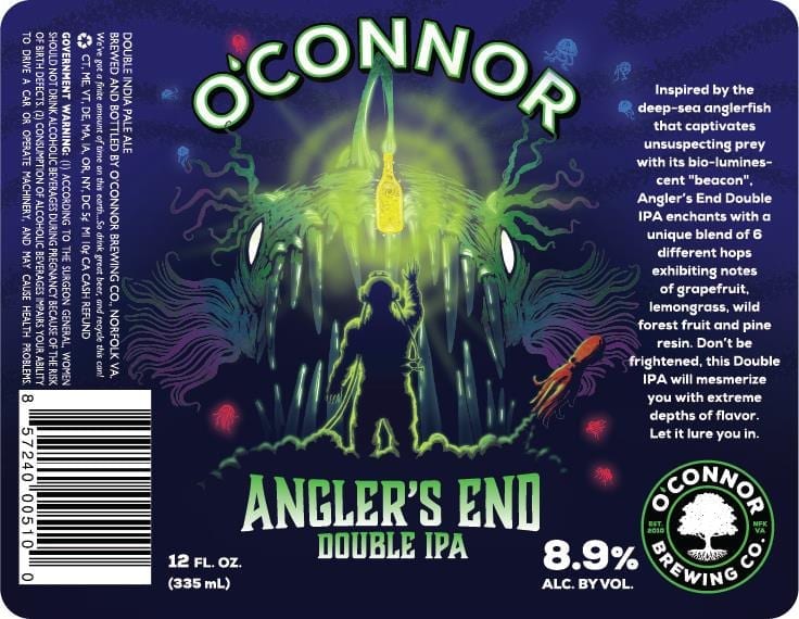
Seventh Place – O’Connor “Angler’s End” DIPA
“Beautiful artwork. Really enjoy how the angler fish is luring in an angler to his end. Nice double meaning.”
– Kevin D.
Nick: When I first saw Angler’s End, it hypnotized me with the glowing color play. But just like the angler fish, I was mesmerized until it was too late. Stepping back and looking at the label as a whole, the scene depicted would be a memorable nightmare. I love it.
Penny O’Connor, VP of Marketing for O’Connor Brewing, tells us, “The concept was a collaborative effort from some of our OBC team, and the final artwork was done by our in-house designer, Anthony Brown.”
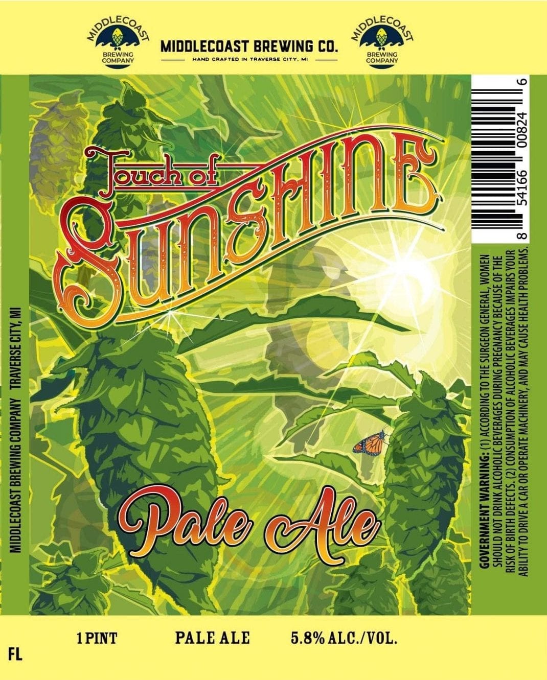
Eighth Place – Middlecoast “Touch of Sunshine” Pale Ale
“I love the way the sun shines through. Not only indicative of the name but also the location of the brewery”
– Tracey B.
Craig: Let’s face it. That beer of yours, while VERY sensitive to the effects of UV rays would simply not exist without a healthy dose of the Sun’s rays. That said, if you’ve ever had too much to drink and passed out in the sun on a hot summer day, you’re probably in the White Claw Set anyway. Brown glass and sunscreen FTW!
Deven Larrance, co-owner of Middlecoast, tells a rather idyllic story of how this label came to be.
“Before we were professional brewers Joel (the other brewer) and I were working in his hop fields. It was a miserable day, overcast and a bit stormy. We went back to his barn and grabbed a couple of beers. We had our pilot brewing system in his barn which we used to experiment with new recipes, and this one was a test batch that later became Touch of Sunshine.
“Walking back into the hop fields as we raised the beer to our lips, the sun came out for the first time in days. A ray peeked through the clouds and lit up a Monarch Butterfly resting on a hop cone. That beautiful moment inspired both the name and the label of the beer.”
Ninth Place – Collusion “Soft & Cuddly” Sour Ale
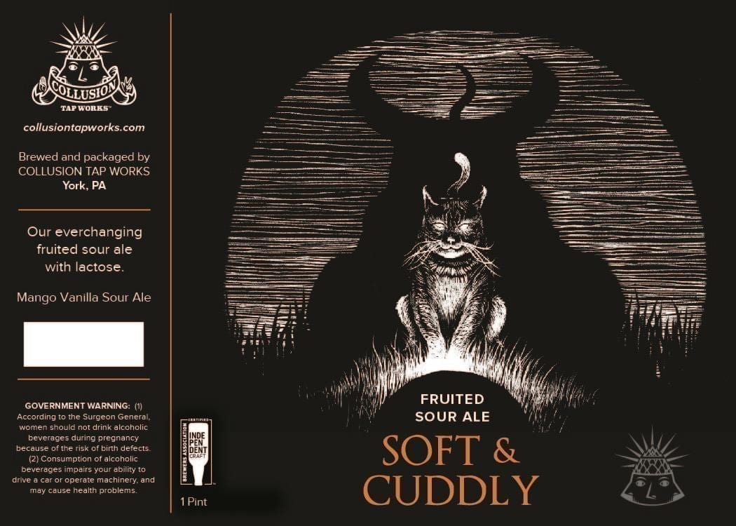
Craig: I agree with Nick – cats ARE evil. That said, “Don’t fuck with cats”. I wouldn’t with this one.
According to Collusion’s Brewmaster, Jared Barnes, “The idea came about when we decided to add a twist to the phrase ‘soft and cuddly’. We didn’t want to brand the beer with a boring or light-hearted label but add more of our artist’s touch to fit with our branding.
“Local tattoo artist Oliver Scott had great designs and [we] loved his work and asked him to do all of our labels.”
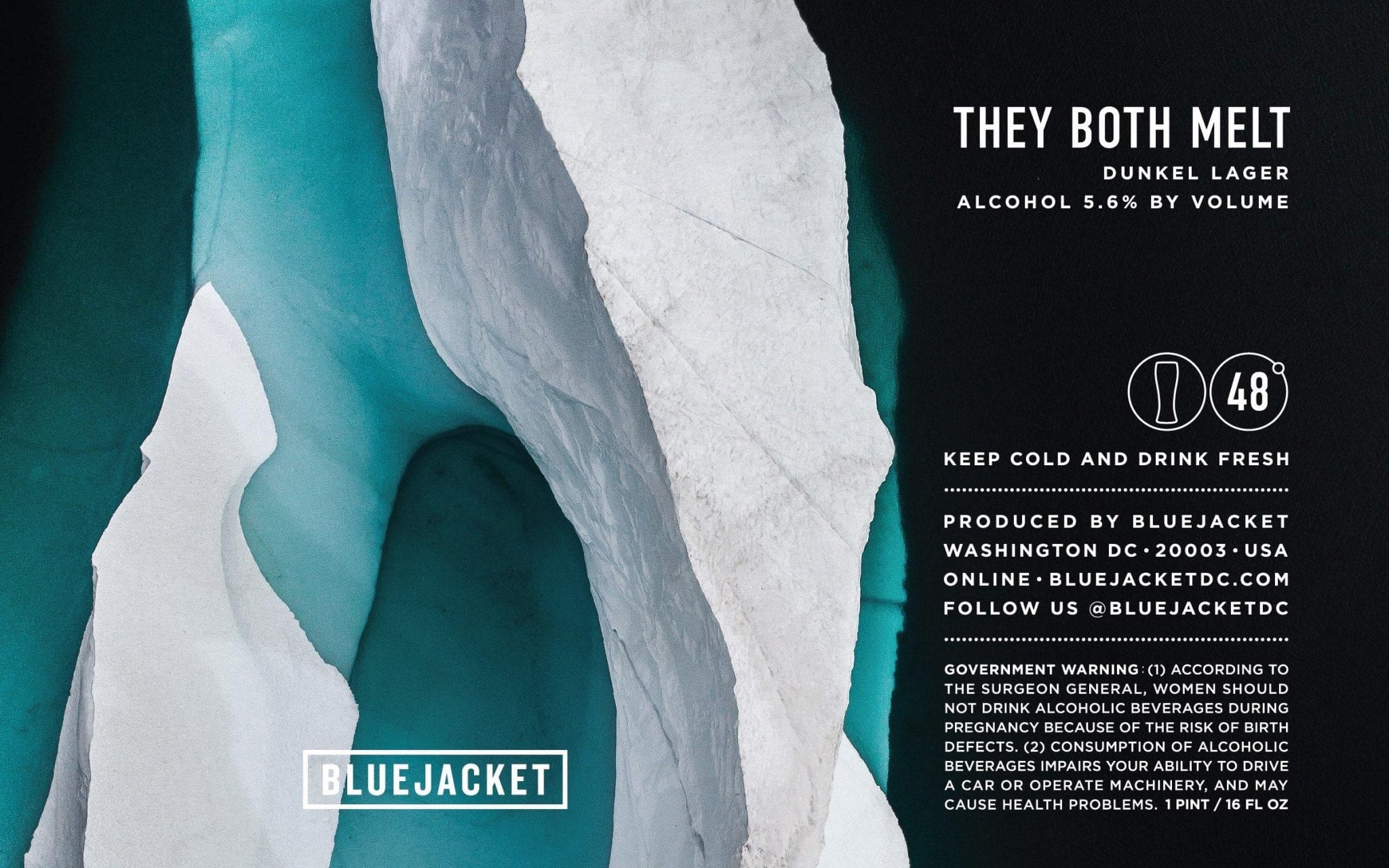
Tenth Place – Bluejacket “They Both Melt” Dunkel Lager
“great, classic, minimalist design.”
– Robert C.
Nick: Bluejacket hails from Washington DC, but this label looks like the cover art to the next Radiohead album, with striking images and color play. Will this Dunkel Lager have music playing on your palette? I can’t wait to taste and find out.
Molly Hippolitus, Communications Director for Neighborhood Restaurant Group, had this to say about their marketing team’s work:
“Kris has served as Director of Marketing and Creative Director for the Neighborhood Restaurant Group since 2007 – and is responsible for designing, implementing and maintaining the complete visual brand identity for each business, product or event, including logotypes, signage, menu design, print collateral, websites, labels, environmental graphics, merchandise, etc. Additionally, he is involved in all aspects of direct to consumer marketing and promotion, including copywriting, email initiatives, event, and program development.”
The “Kris” Molly refers to would be Kris Mullins, NRG’s Creative Director, who told us…
“Having designed nearly 75 labels for Bluejacket thus far, I look to each beer for inspiration and then craft a simple vignette that in some way evokes the story behind the style, flavors, and personality of that brew. Often this translates into something quite literal, though I generally find that we tend to land on something with a slightly more oblique reference. In the case of They Both Melt I felt that there was an opportunity to put on display and celebrate the beauty that is quite literally melting before our eyes, and to do so without proselytizing. After all, the job of the label is to serve simply as a supporting actor to the beer itself – because, in the end, it’s only the beer that matters.”
Best Voter Comments
Here’s a selection of voter comments that were too good not to share.
“175 is a lot to choose from!”
– Joseph R.
We’re not f-ing around here, Joseph.
“This label stopped me dead in my tracks. Its absolutely gorgeous. This is the kind of label I would save and display on a wall in my home. Simple, bright, tranquil, but also exciting.”
– Kelley C.
“Beer is delicious”
– Shirley H.
So true, Shirley. So true.
“While most of these look like they were drawn by high school boys in between sessions of video games and going to cosplay festivals, with their themes of death, zombies, war and sorcery, this label is at least humorous and probably memorable. If I saw it on the shelf, I would want to check it out.”
– Mark S.
To hell with Nick Wetmore. Next year, we’re enlisting Mark S. as guest commentator.
“Hail Satan!”
– Sam S.
“not a single tired hands label?”
– Ty M.
Eat a d-, Ty M. You try pouring over a year’s worth of labels!
“There are a few top labels. Some are just plain, others are not ???? original. There were about 13 that were tops! The details & colors on this label is something I’d want to display as well as drink”
– Michael M.
While we do not condone “drinking colors”, somehow we get where you are coming from, Michael.
“Send me prizes”
– Earl P. (Did not win prizes.)
Label images research made possible using the highly recommended LabelVision search tool at ShipCompliant.
ARTBREW Illustration by Craig Gunderson, drawn under the influence of Beermiscuous in Chicago.

