 Here we are again, label lovers. There’s beer labels and there’s PUMPKIN BEER LABELS! As we do every year for our beloved readers, we perused hundreds of the most recent labels registered and assembled a gallery of 12 of THE BEST on offer. You’ll be stunned, delighted, and perhaps a little spooked when you see what we’ve put together.
So, without further ado, check out the Best Pumpkin Beer Labels of 2019!
The following labels were registered with the Alcohol and Tobacco Tax and Trade Bureau between October 2018 and September 2019. Thirsty Bastards has also solicited submissions from breweries whose labels may not have required registration. Labels have been selected for their aesthetic appeal or simply because we thought they were really cool.
Contents
- Clown Shoes Brewing Gordo Imperial Pumpkin Stout
- Scorched Earth Crypt Keeper Pumpkin Porter
- Roosters Brewing Cosmic Autumn Rebellion Pumpkin Chocolate Chip Cookie Ale
- Wooden Robot Brewery/Infinite Ale Works/Green Bench Jarrahdale Pumpkin Saison Ale
- Alewerks Brewing Company Pumpkin Latte
- Catawba Brewing Emperor Don’s Imperial Pumpkin Ale
- Blue Point Brewing Company Mother Pumpkin
- Great South Bay Brewery Splashing Pumpkin Pumpkin Ale
- Sloop Brewing No Pumpkin
- Most Improved: Rivertowne Brewing Headless Wylie
- Flying Dog Brewery The Fear Imperial Pumpkin Ale
- Dogfish Head Punkin Ale
Clown Shoes Brewing Gordo Imperial Pumpkin Stout
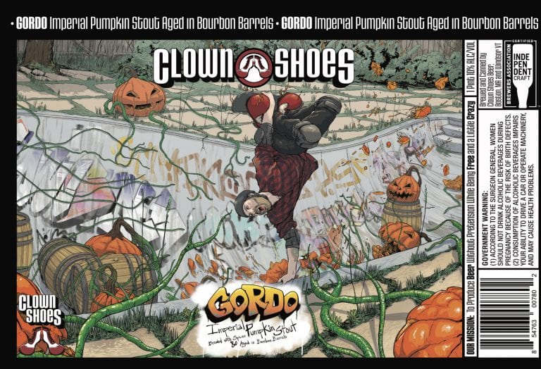 I don’t know who we would be if we couldn’t feature a Michael Axt label from Clown Shoes Brewing in a roundup of best labels in ANY category. There’s a lot going on here, so we had to get the story befhind it from Sam Routhier of Clown Shoes’ Sales and Marketing: “‘Gordo’ is one of our local Boston sales reps (actual name Jordan Kellem), he’s a big skateboarder so we figured it only made sense for him to be shredding on the label.”
Michael Axt had this to add: “It’s kinda become a thing to put coworkers or even distributor reps on labels. Just so happens Jordan is a skater. Gregg (founder) gave me a basic idea of demonic pumpkins surrounding Jordan skating. I knew I didn’t want the pumpkins to be too gnarly since it needs to be appealing so instead went with possessed carved pumpkins in an abandoned pool turned half pipe. I liked the idea of him cresting the top in a dynamic pose.”
Scorched Earth Crypt Keeper Pumpkin Porter
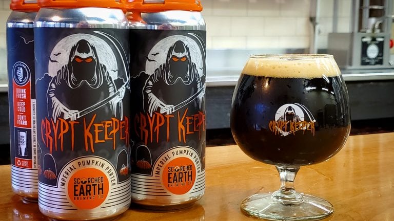
And now for something completely local, we bring you a label from one of my favorite annual offerings, right here in the Chicago area – Scorched Earth Brewing! Crypt Keeper is an AMAZING pumpkin porter, so I’m super stocked that co-founder Mike Dallas was able to tell us about its label’s origin.
“The brand really goes all the way back to my childhood. I was and remain a huge horror film lover. I got a VCR when I was in 7th grade, my parents signed a letter that said, ‘Mike has my permission to rent rated R movies’, and starting investing some occasional free time walking down to the local convenient store in our small town of Marengo, IL and renting horror movies of the 80s and 90s (and some older classics too). Just love that scary movies and look forward to this time of year when I can spend some time watching some of my favorites and watching a few new ones.
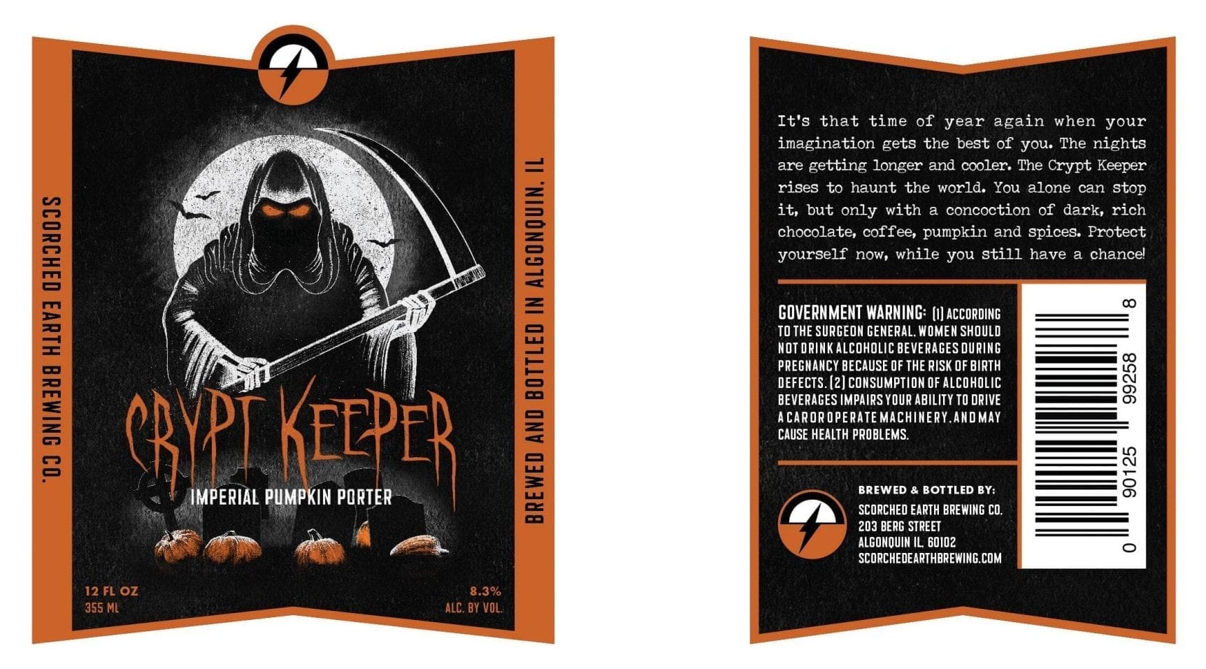
“The current label today is inspired by that love of movies. When working with our original branding team – Knoed Creative (a small graphic design firm run by Kim Knoll and Kyle Eertmoed) – I described the vision for the brand, imagining a dark evil night with a Crypt Keeper wraith in a graveyard holding a sickle, with a full moon, misty night, bats etc. Kim and Kyle nailed the illustration right from the first draft. It was amazing!
“The label has been slightly refreshed by our new graphic designer Nate Azark and Mark Luessow from 12 Line Studio slightly for the 16 oz can label, but is still very true to their creation.
“Those who love horror movies would probably guess correctly that the name of the beer was inspired by the Tales from the Crypt horror series from the 90’s.
“One interesting note about this brand: There was a first iteration of this label that was on 750 label, a kind of fun/campy illustration done by a local artist out here in the suburbs. We asked for her help due to some timing issues working on labels. Ultimately, the label did not have the scary edge the brand needed, so Kim and Kyle created what you see today for our 4 packs. The label itself does a terrific job representing the dark imperial pumpkin porter inside the can!”
Kim from Knoed had this to add:
“The label art for Crypt Keeper was inspired by the name. We know the name is based on the popular show Tales from the Crypt, and the Crypt Keeper had a specific look, but for this Crypt Keeper we wanted to use the grim reaper because of the season and to give it a twist—Scorched Earth tends to put a twist on things. The label is dark to give a creepy factor and also because the beer is dark in color. Since it’s a pumpkin porter, we wanted to show pumpkins in the graveyard and use the color orange.
“Each element was hand drawn separately using a pencil to get the texture you see. They were scanned in, assembled and colored in Photoshop to create the scene. The words Crypt Keeper were based on a font, but they were also hand drawn and altered to fit in the shape between the ghoul and headstones.
“The original label was created by us (Knoed) for the 12 oz glass bottles with updates made by Nate Azark (copied here) for the cans. You can see how he greatly improved the art with adding clouds, more bats and made the headstones more visible.”
Roosters Brewing Cosmic Autumn Rebellion Pumpkin Chocolate Chip Cookie Ale
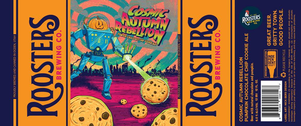 Do you remember that classic sci-fi film where the giant pumpkin-headed robot saves a troubled metropolis from an impending apocalypse by infusing chocolate chip cookies of various sizes with an alien energy? Neither do we.
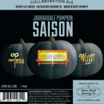
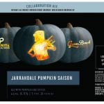
Wooden Robot Brewery/Infinite Ale Works/Green Bench Jarrahdale Pumpkin Saison Ale
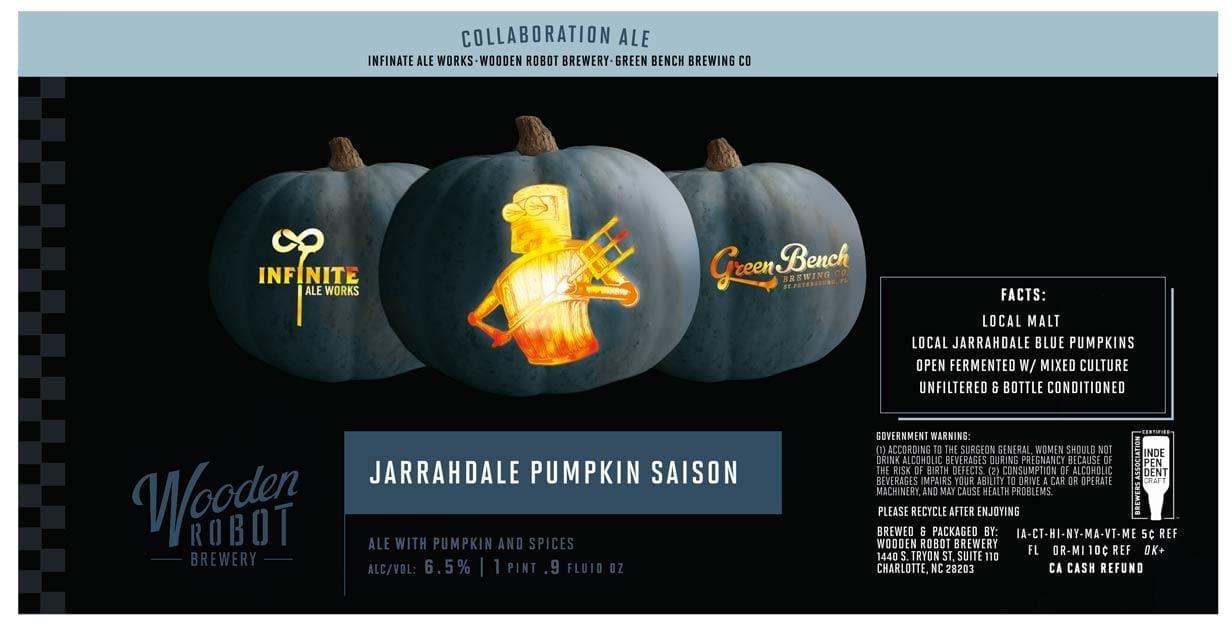 Hopefully you can see why I chose this label. That robot really jumped out at me and how often do you see grey pumpkins on a label?
I’m not sure how this is the first time we’ve featured a collaboration beer in one of our round-ups, but here we are.
All three breweries, Wooden Robot, Green Bench, and Infinite Ale Works, did their own version of this label. The motif is the same – the company logo carved into the grey pumpkins with a cool candlelight glow coming from within.
I was roped in by the Wooden Robot, but I think the Infinite Ale Works logo “works” the best. The Infinite version was created by Andy Stracuzzi of Zed Zed Eye Design in Ocala, FL. He actually supplied the grey pumpkin “template” for the other breweries to use.
Alewerks Brewing Company Pumpkin Latte
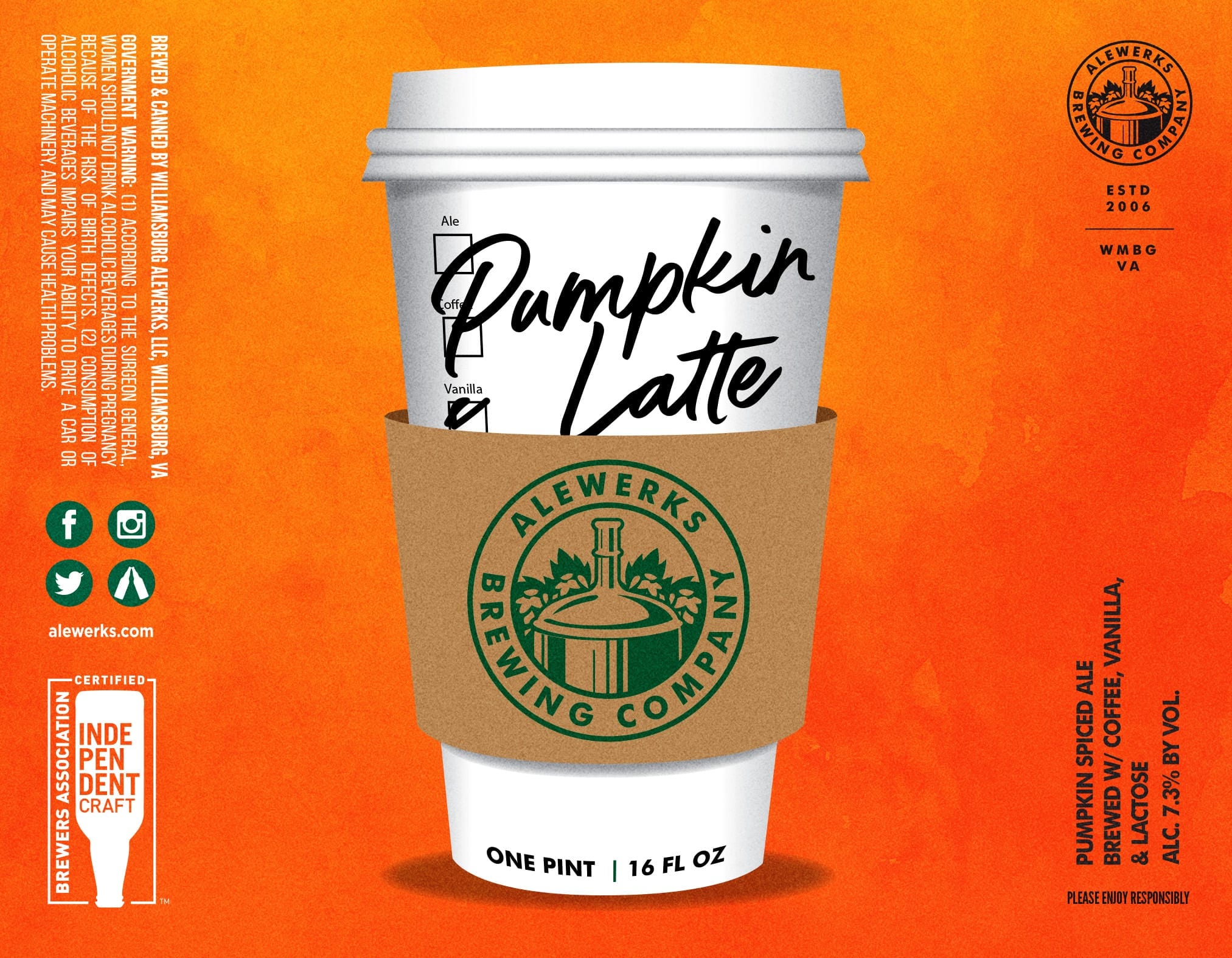
“We did a new pumpkin variant this year that had coffee and vanilla added to it, and called it Pumpkin Latte. It was in 16 oz cans, and while I’m happy with how the label turned out. I designed it. I will say that the beer was a limited edition release and was a resounding success. We still have people trying to track down cans out in the wild as they’re hard to find at this point.”
Catawba Brewing Emperor Don’s Imperial Pumpkin Ale
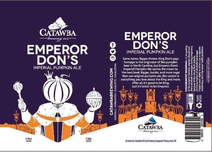
“There would be no Emperor Don’s without King Don’s Pumpkin Ale. The beer was named to honor its original brewer, Don Richardson. The King Don’s label was then designed as a graphic depiction of the beer name.
“Once we had a beer name, tagline, and the “emperor pumpkin” art concept, we turned it over to our talented design team to create the graphics.”
Blue Point Brewing Company Mother Pumpkin
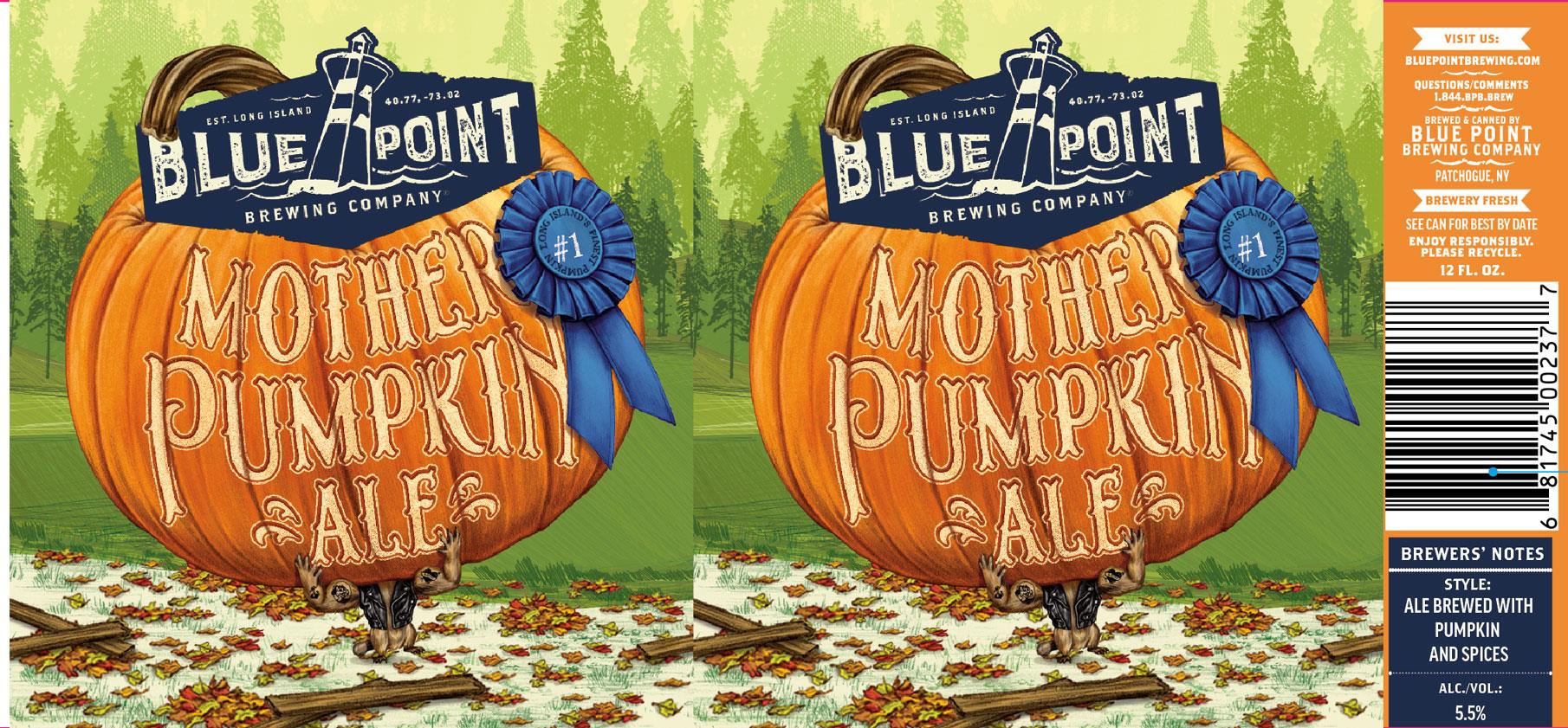

Okay, I get that the gigantic pumpkin is meant to represent the Mother Earth character powerfully portrayed by Lawrence, and I guess the tattooed marmot triumphantly raising the grandeur of nature could possibly be Javier Bardem’s god, the package artwork features the elements of the broken fence and the tourists pointing and closely taking pictures which are a spot-on representation of humanity in the film, but what the fuck is up with the pig in sunglasses absconding in a pickup with the pumpkin strapped down in the truck bed? Is that capitalism? I’m lost…
…uh, I’ve just been informed that this artwork is, in fact, no way associated with the 2017 film of a similar name. I apologize for any confusion.
Great South Bay Brewery Splashing Pumpkin Pumpkin Ale
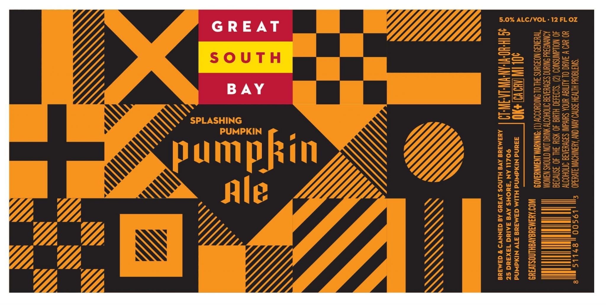
This design reminds me of those QR codes you see on ads and business cards. In fact, I scanned this one with with my phone and it took us here. Sincerely.
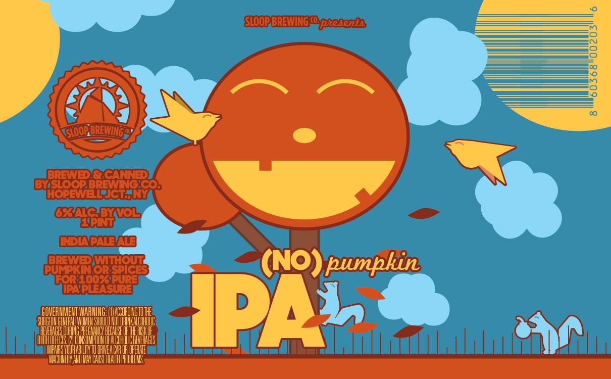
Sloop Brewing No Pumpkin
Yeah, we realize that this label isn’t actually for a pumpkin beer. In fact, it’s an “anti-pumpkin” beer. According to Creative Director, Bob Davidson, “So we just wanted to offer a fun, seasonal alternative to the pumpkin spice miasma that descends upon the country every fall. As with any style of beer, there’s good ones and there’s bad ones out there! Something that plays off of (and with!) the whole pumpkin phenomenon without making a pumpkin beer, I guess. It’s not just beers, of course — pumpkin spice lattes, all that jazz. It’s everywhere. So we figured, hey, let’s make an IPA!
“For the label — we wanted to do some sort of tongue in cheek label playing on your typical pumpkin beer label, so we made a big, smiling jack o lantern — but put it on a tree instead, with leaves falling and a bird perched in it. We’re in upstate NY, so fall is a big deal around here!
“It keeps with our general MO of being happy, fun, and inviting; it’s not scary or anything. We always try to make sure our labels are branded cohesively across all of our different beers, but still have each stand on its own as something different and unique, and this one is no exception. The fonts, a smiling face, the squirrels, and especially the birds are elements that appear across a lot of our labels.
“This is the video we made when we first dropped No Pumpkin a couple years back, which I think is a good window into both what we were looking to do with No Pumpkin and who we try to be as a brewery. At the time it was just very limited cans for the tasting room and ~30 barrels of draft; these days we make an awful lot more of it!”
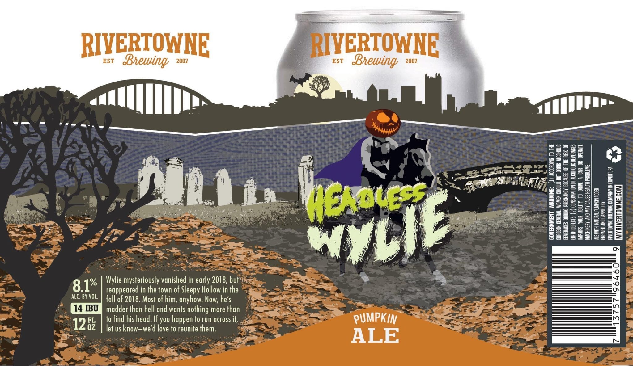
Most Improved: Rivertowne Brewing Headless Wylie

If you have a look at old Wylie when he was that same fish mascot riding a horse for Halloween, you can see how much improved, and less fishy, this new design is. Ride on, Wylie! You’ve earned it!
Flying Dog Brewery The Fear Imperial Pumpkin Ale
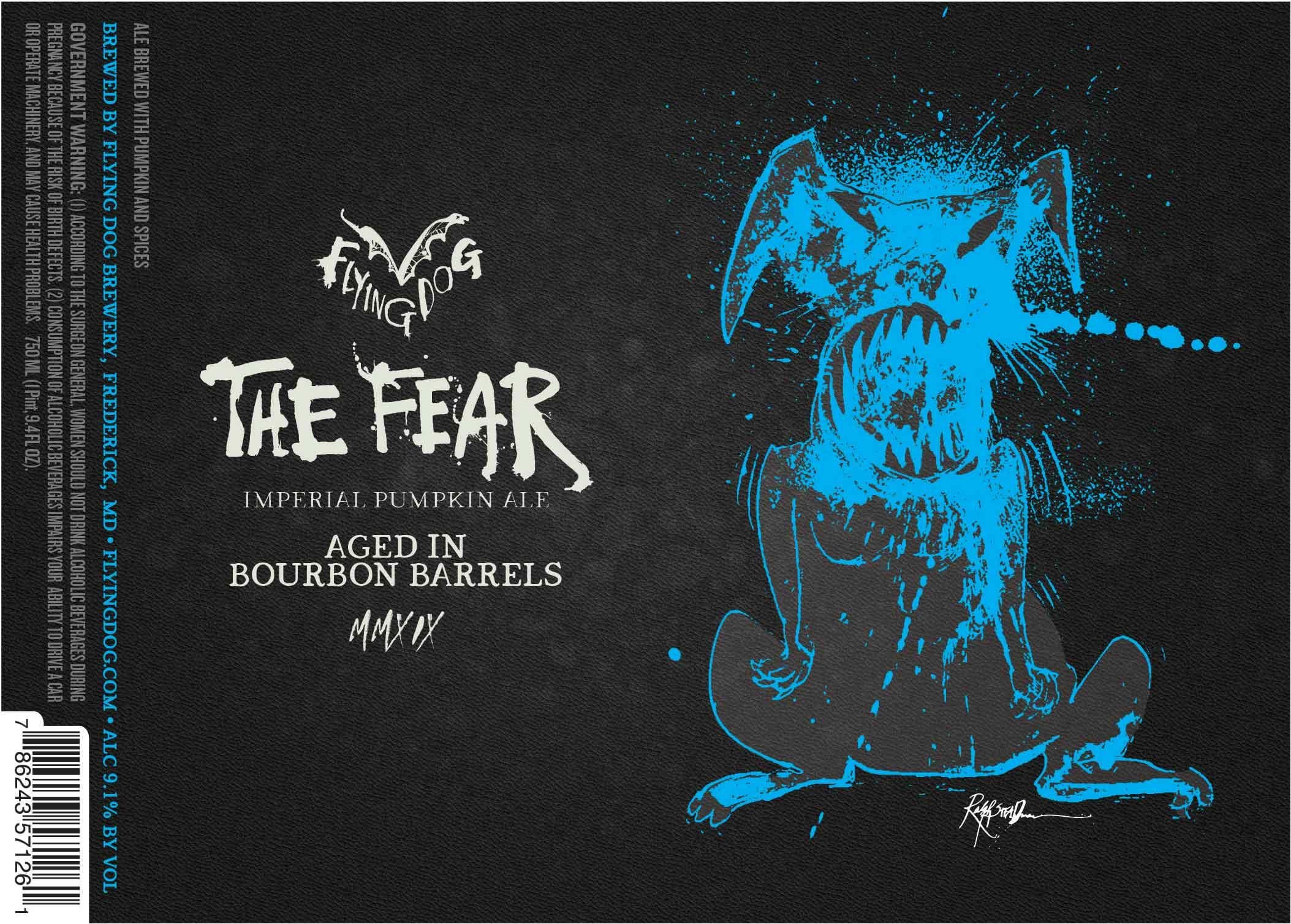
Josh: I’m an unabashed fan of Ralph Steadman, so I’m not going to be impartial here. I like this label and the one that came before it in the non-barrel-aged version. It’s quite simple for one of his labels but works well for a reserve beer.
This reminds me of a doggy Black Beast of Argh and it’s really neat seeing a blue/grey/black color palette rather than his typical black/white/red.
Dogfish Head Punkin Ale
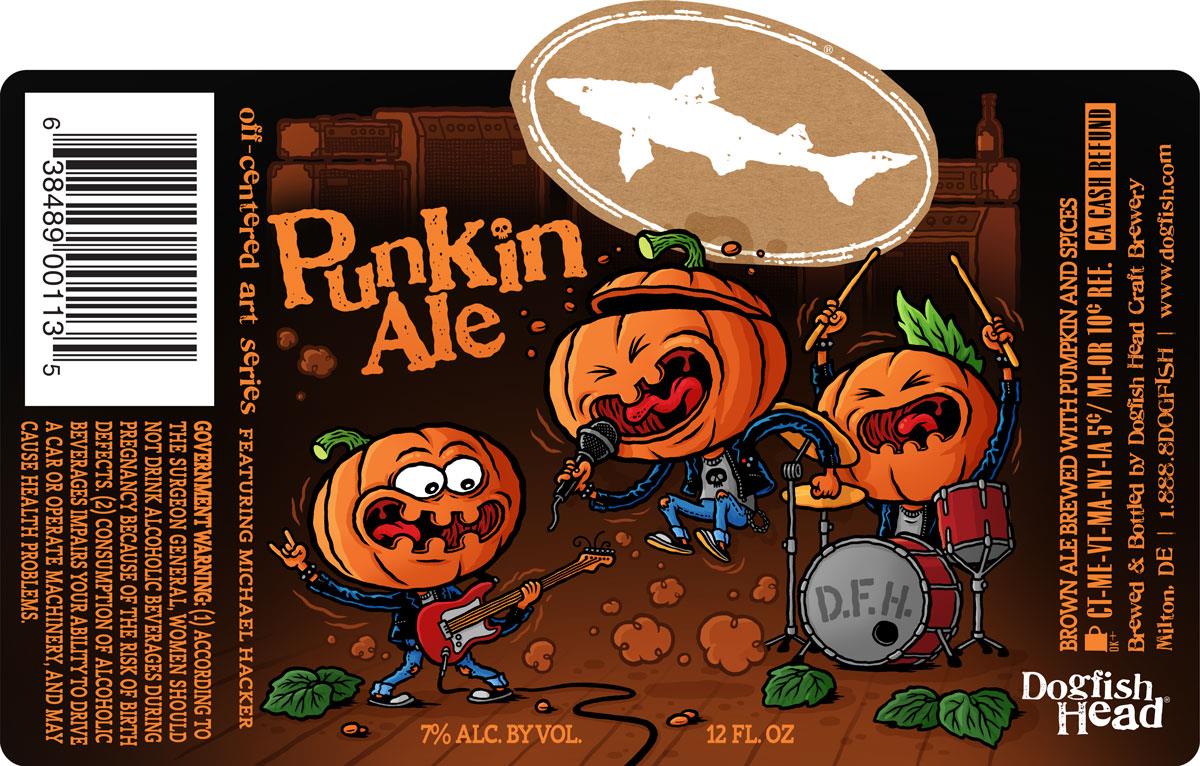
Paul Thens, Creative Manager for Dogfish Head, had this to say about the label: “Being a story-full brand, Dogfish Head was instantly drawn to Michael Hacker’s ability to communicate stories visually. His experience as a comic book illustrator brings a fun and off-centered vibe to his work that fits perfectly with Dogfish Head’s offbeat personality.”
We were even able to get Mr. Hacker to chime in as well!
“Puns and wordplays are a vital part of my work so when I was asked to create a label for Dogfish Head’s Punkin Ale I immediately had to think about a punk show involving head-banging pumpkins in a mosh pit. This first idea finally led to the punk(in) band. The stage-diving pumpkin character is a reference to the “Punkin‘ Chunkin” tournaments which I got introduced to when I started to work on the Dogfish Head Art Series designs.”
Did We Miss Something?
Is there a pumpkin beer label we missed this year that you are dying to tell us about? Leave a comment and let us know!
Remember the last time you tied one on? The next morning, after you pried your wrist out of that bear trap and wiped off the lipstick message on your forehead proclaiming your desire to be everyone's "snuggle doll", you found that your phone had blown up with messages berating your abhorrent behavior the night before? Our newsletter is only about 10% like that and only 1/3 of the frequency. Subscribe!
Email’s pretty safe from butt- and drunk-dialing, so, you know, you won’t be bailing us out anytime soon!
Label images research made possible using the highly recommended LabelVision search tool at ShipCompliant.


May 5, 2020 @ 2:17 pm
Just going through old emails and found that you reached out to us regarding the Roosters label and it went to our spam! I am so sorry! Thank you so much for featuring Roosters Cosmic Autumn Rebellion Pumpkin Chocolate Chip Cookie Ale! This label was inspired by the Flaming Lips song “My Cosmic Autumn Rebellion” and the artwork was by Nickbersdesign @nickbers.com.
May 5, 2020 @ 2:37 pm
Thanks Julie!